


Forms
Custom Form Select
Use a Webflow Dropdown element as a Webflow Form <select> component
Step #2
Implement in Webflow
Apply attributes to elements on the page
Below is a list of elements and options that are used to create this Attributes functionality. Click any of them to see more details.
Required for minimum setup
The only attribute required for setup is dropdown.
Add this attribute

Description
Name
fs-selectcustom-element
Value
dropdown
Webflow Dropdown component that will serve as the designed Select component.
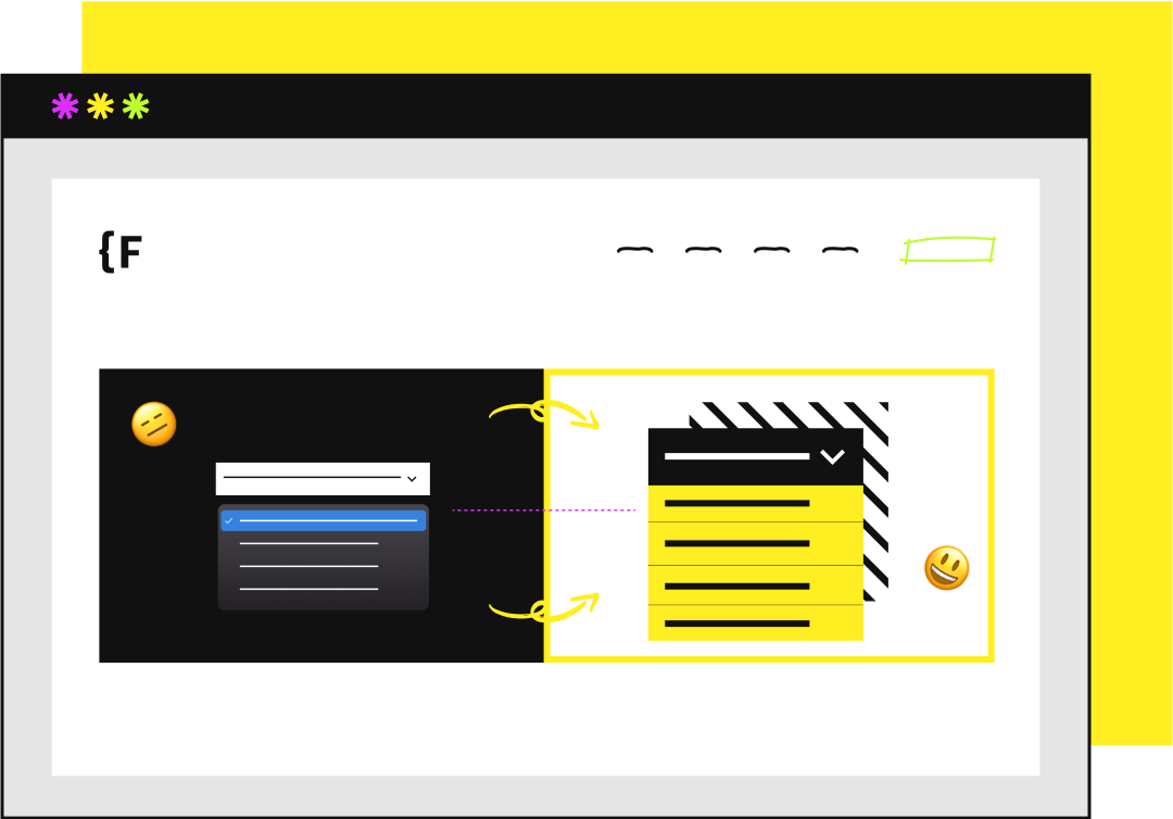
This Dropdown will 'mirror' the content that is in the nested Select. If there are 10 options in the nested Select, those 10 options will populate in this Dropdown List.
It is required to have a Link / Link Block as the "option template". The Link / Link Block template must be inside the the Dropdown List. The Link / Link Block template must have a single text element inside. This text element will be the dynamic text that mirrors the Select component. See screenshot below.
As you select options (Link / Link Blocks) inside the Dropdown List, those options will be selected in the Select component. It will mirror the selections.
The nested Select can be used for Webflow Form submissions, with Attributes' CMS Filter, and Attributes' CMS Sort.

Select
I want to use this Webflow

Select
See how it works
component as the source content for the Dropdown component
No attributes needed for this Select component.
It is required that to have this nested somewhere inside the Webflow Dropdown component.
This Select component will be the source of the content that populates the custom designed Dropdown component. This Select component should hold the final content of the custom Select options.
Integrates with Attributes' CMS Select for dynamic custom Selects!

More attributes to use
Below is a list of attributes that can be used to further customize.

Add this attribute
Description
Name
fs-selectcustom-element
Value
label
Required if more than one text element is used inside the Dropdown Toggle. If there is only one text element inside the Dropdown Toggle, this attribute is not needed.
Place this attribute on the content inside the Dropdown Toggle that should update with the currently selected option inside the Dropdown. This is the text element that should be dynamic based on what's currently selected.
If "Spain" is the option chosen in the Dropdown List, the label text will update as "Spain".

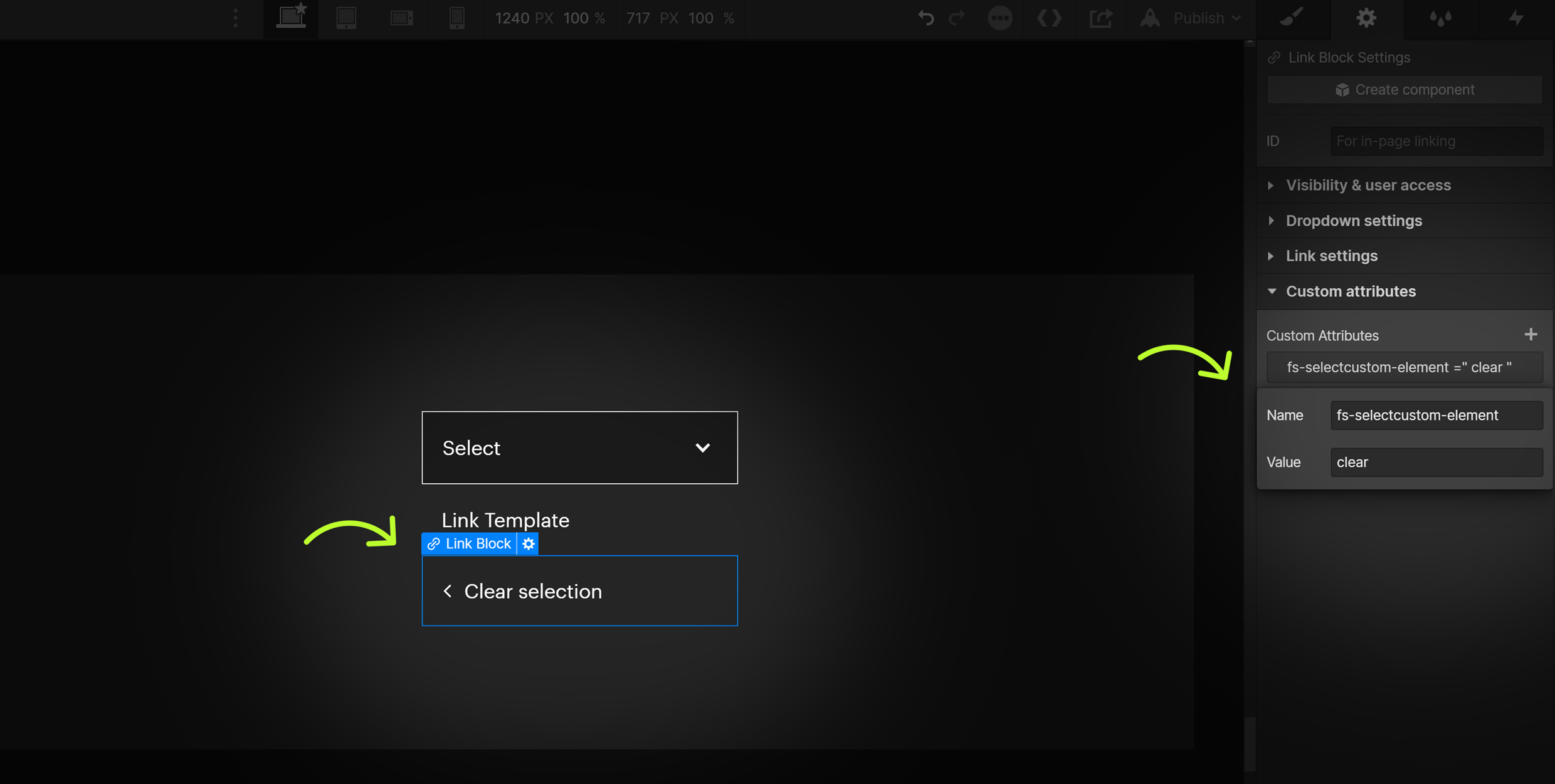
Clear
I want to change the "Select an option" option with a custom "Clear" message when an option is selected
See how it works
Add this attribute
Description
Name
fs-selectcustom-element
Value
clear
Optionally customize the "Select an option" option inside the Select when an option is selected.
For example, if "Spain" is selected, instead of seeing "Select an option" as the first option of the Dropdown List, change the message to "Clear selection".
Place this attribute on a Link / Link Block inside the Dropdown List. This Link / Link Block will be used as the content for the "Select an option" option when an option is selected.
See Example #3 below for visual.
Hide initial option
See how it works
Option
Hide the initial option in the Dropdown List when no option is selected
Add this attribute
Description
Name
fs-selectcustom-hideinitial
Value
true
Use this option to hide the "Select an option" option in the Dropdown when there is no option selected.
For example, when the user first interacts with the Dropdown and clicks "Select an option" in the Dropdown Toggle, the Dropdown List will not show "Select an option" as an available option. The Dropdown List will start will options that hold values, like "Spain".
Leave the value of the "Select an option" option empty.
See Example #3 below for visual.
Where?
Add to the element with fs-selectcustom-element = "dropdown"
States and interactions
'Current' and 'Focus' state management is required for accessibility.
No attributes needed. Fully integrated to Webflow's native states and interactions.
Active state of Link / Link Block elements in the Dropdown List use the Webflow native 'Current' state.
Accessible keyboard navigation uses the Webflow native 'Focus' state.
The Dropdown component used in this solution is fully compatible with native Webflow Interactions.
Active state of Link / Link Block elements in the Dropdown List use the Webflow native 'Current' state.
Accessible keyboard navigation uses the Webflow native 'Focus' state.
The Dropdown component used in this solution is fully compatible with native Webflow Interactions.
Working examples
See this solution working live in this Webflow project.
Example 1
Custom Form Select - Simple
Example 2
Custom Form Select - Required label example
Example 3
Custom Form Select - Clear option with hide initial option
Frequently Asked Questions
Everything you need to know about this attributes solution.
Will the attributes filter work with a dropdown element instead of a select element?
No it must be a form element for filtering, dropdown can be used for sort.
Developer documentation
Check the dev documentation

Next time implement inside Webflow
Use Finsweet Extension