Attributes, by Finsweet, offers a free series of Solutions that provide essential features to improve your Webflow websites.
Accordion
Create accessible accordions inside Webflow without Webflow Interactions.

Accordion • Flash Card
For advanced users familiar with this solution. Includes all attributes from this page. Click on attributes and values to copy them.
Required attributes
Accordion
This is the outer wrapper of one accordion item. This element must contain one trigger and one content element inside.
Trigger
This element triggers the open and close of the accordion item content.
Content
This element wraps the content of the accordion and will expand and close when the trigger is clicked.
Arrow
This element is the arrow inside the accordion trigger.
Optional attributes
Active class
When an accordion has expanded content, any element with the fs-accordion-active class will receive this class as an active state.
Group
This element wraps all accordion items that should be classified as part of the same "group".
Group | Single
This forces one single accordion open at any time.
Group | Initial
This sets which accordion items in the group are open on load.
Can be only one or multiple accordions with a comma separated list as the value
Add this <script> inside the <head> tag of your page or project
This script is the universal Attribute script: you only need to include it once, even if you have multiple Attribute solutions on the page. Learn more .
<script async type="module"
src="https://cdn.jsdelivr.net/npm/@finsweet/attributes@2/attributes.js"
fs-accordion
></script>
Choose if you need a sinlge accordion or a group of accordions
Only define elements for one accordion.
Useful for having groups of accordions coming from a CMS Collection List.
Add these required attributes to the elements

Accordion

This is the outer wrapper of one accordion item. This element must contain one trigger and one content element inside.

If there are 5 accordion items, this attribute should be placed on each item.


Trigger

This element triggers the open and close of the accordion item content.
There is no requirement for parent, child, or sibling relationships between the trigger and the content.

It is required to be inside an accordion element.

Content

This element wraps the content of the accordion and will expand and close when the trigger is clicked.
There is no requirement for parent, child, or sibling relationships between the trigger and the content.

It is required to be inside an accordion element.
Add these required attributes to the elements

Group

This element and attribute is only required to use group options.
This attribute wraps all accordion items that should be classified as part of the same "group".

If using a CMS Collection List, this attribute can be placed once on the Collection Item element.

Accordion

This is the outer wrapper of one accordion item. This element must contain one trigger and one content element inside.

If there are 5 accordion items, this attribute should be placed on each item. If using a CMS Collection List, this attribute can be placed once on the Collection Item element.

Trigger

This element triggers the open and close of the accordion item content.
There is no requirement for parent, child, or sibling relationships between the trigger and the content.

It is required to be inside an accordion element.

Content

This element wraps the content of the accordion and will expand and close when the trigger is clicked.
There is no requirement for parent, child, or sibling relationships between the trigger and the content.

It is required to be inside an accordion element.
Publish your project! Done, easy right?
Add more
options
Arrow
This element is the arrow inside the accordion trigger.
This arrow element will receive the active class when the content is expanded.
Use Webflow native transition and transform CSS properties to create custom animations for the arrow.

For example, apply a rotate 180 degrees transform to the arrow element active state. This will create an arrow rotation effect.
Active
Optionally customize the active class applied to elements in the accordion.
The default class name is .is-active-accordion. This class is applied to the accordion, trigger, content, and arrow.
To keep the default class name, there is no need to add this attribute. To change the class name, set the value as the custom class name you want.
When an accordion has expanded content, any element with the fs-accordion-active class will receive this class as an active state.
fs-accordion-element = "accordion | trigger | content | group"
Apply this attribute to the group element for the active class to cascade down to all elements in the accordion. All elements in the accordion will inherit the group settings.
Add more
group options
Single
This option forces one single accordion open at any time. When a second accordion is opened in a group, the previous opened accordion closes.
By default, this option is set to false and all accordions can be opened without forced close.
Initial
This option sets which accordion items in the group are open on load.
By default, this option is set to "1" to have all items closed on load set the value to "none".
NUMERIC_INDEX - A comma-separated list of indexes that define which accordions should be open.
For example,"1" - The first accordion in the group is open.
"5" - The 5th accordion in the group is open.
"1, 4, 9" - The 1st, 4th, and 9th accordions in the group are open.
Add more
Instances
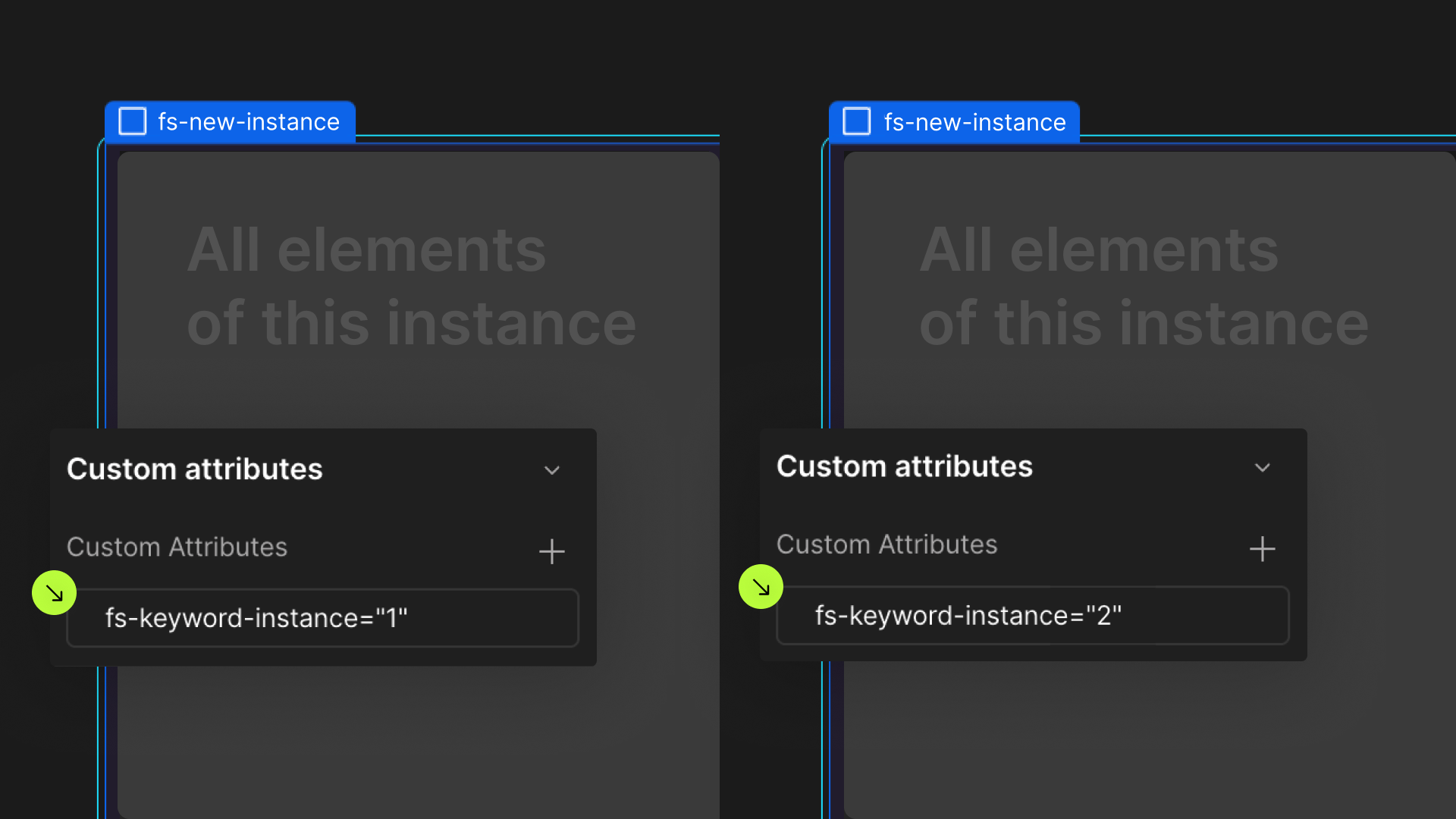
Define an instance on a common parent wrapper

If you wish to create multiple instances of this solution on the same page, please follow the steps below:
- Select a wrapper parent that contains all the elements of an instance.
- Add an
-instanceattribute to it, with a unique value. - Repeat for every instance.
