
Attributes, by Finsweet, offers a free series of Solutions that provide essential features to improve your Webflow websites.
List Load
Set up powerful load functionality on Webflow CMS Collection Lists. Load more, infinite scroll, pagination, and render all items.

For advanced users familiar with this solution. Includes all attributes from this page. Click on attributes and values to copy them.
Required attributes
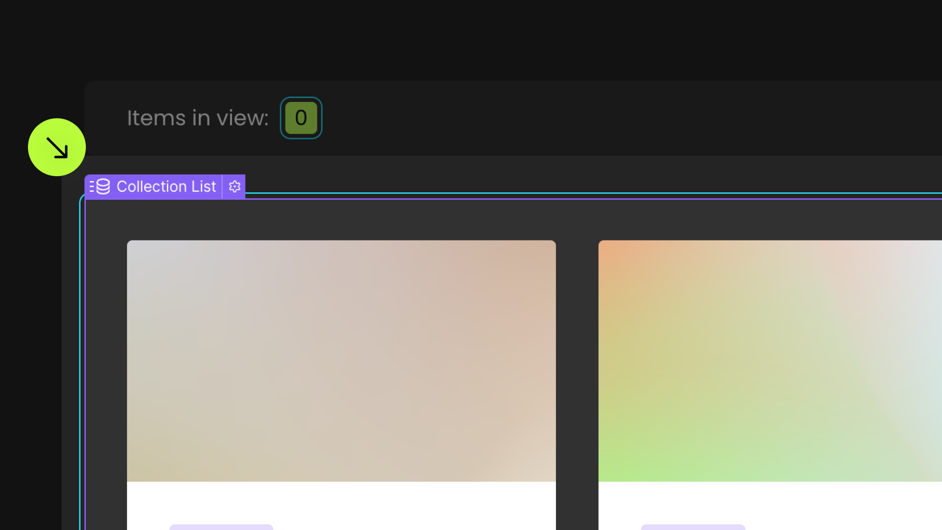
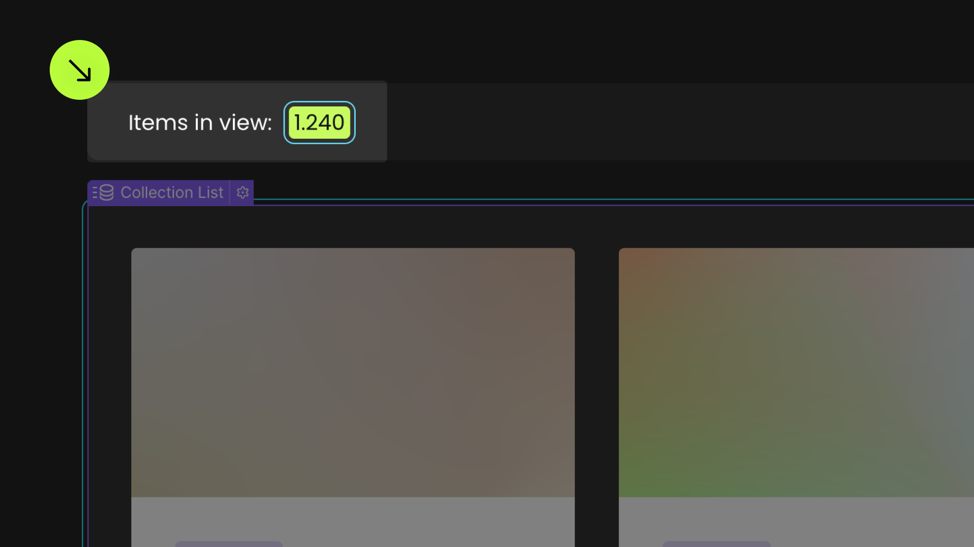
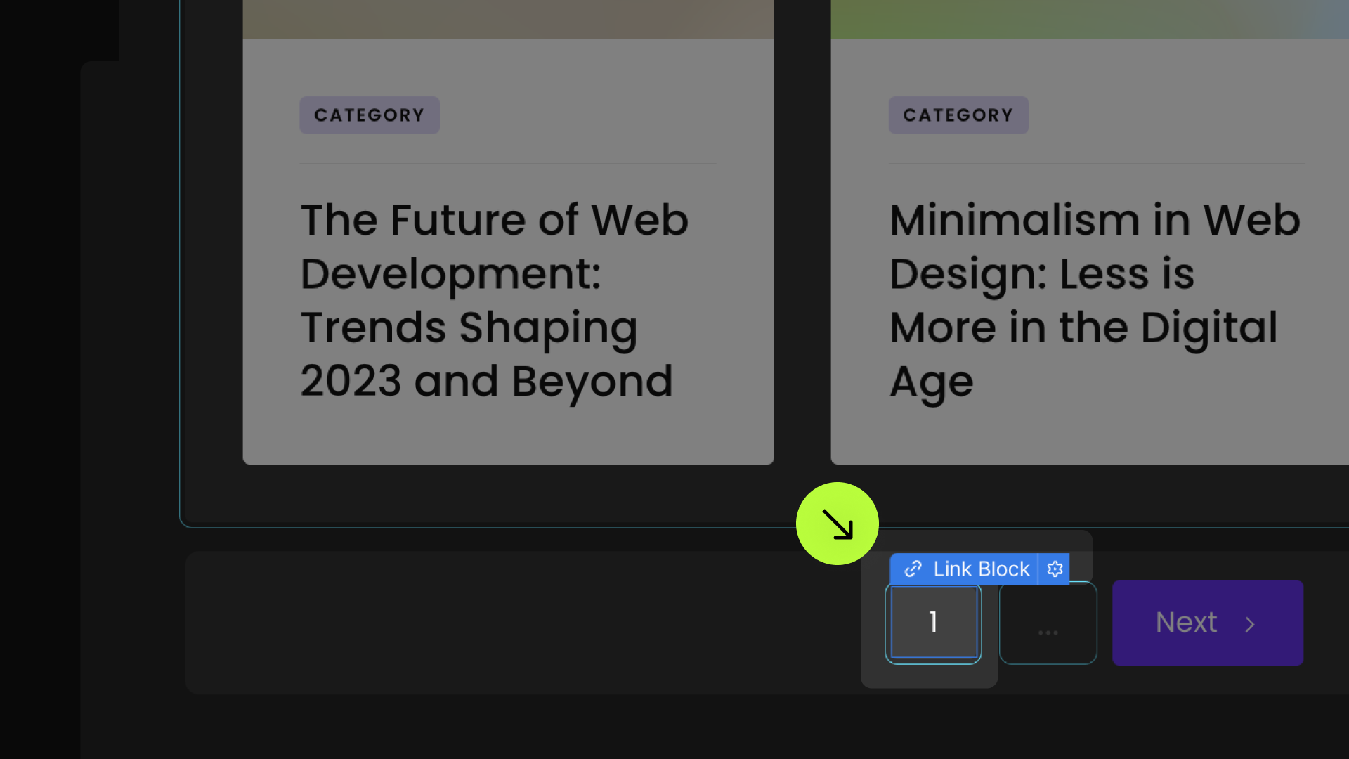
List
Add to Collection List
List loading method
Add to Collection List, chose only one method as the value among: more, all, infinite, pagination
Optional count attributes (for all loading methods)
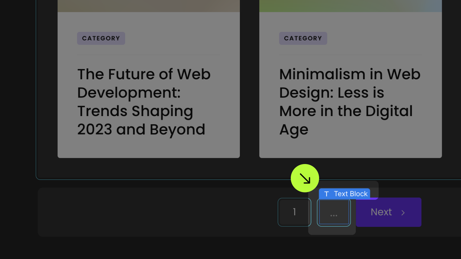
Items-count
Add to Text Block
Visible count
Add to Text Block
Visible count from
Add to Text Block
Visible count to
Add to Text Block
Optional animation attributes (for all loading methods)
Animation
Add to element with fs-list-element="list"
Chose a value among: fade, slide-up, slide-down, slide-right, slide-left, grow, shrink or spin
Easing
Add to element with fs-list-element="list"
Chose a value among: linear, ease, ease-in, ease-out, ease-in-out
Duration
Add to element with fs-list-element="list"
Stagger load
Add to element with fs-list-element="list"
Reset interactions
Add to element with fs-list-element="list"
Disable cache
Add to element with fs-list-element="list"
Optional attributes (for infinite load method)
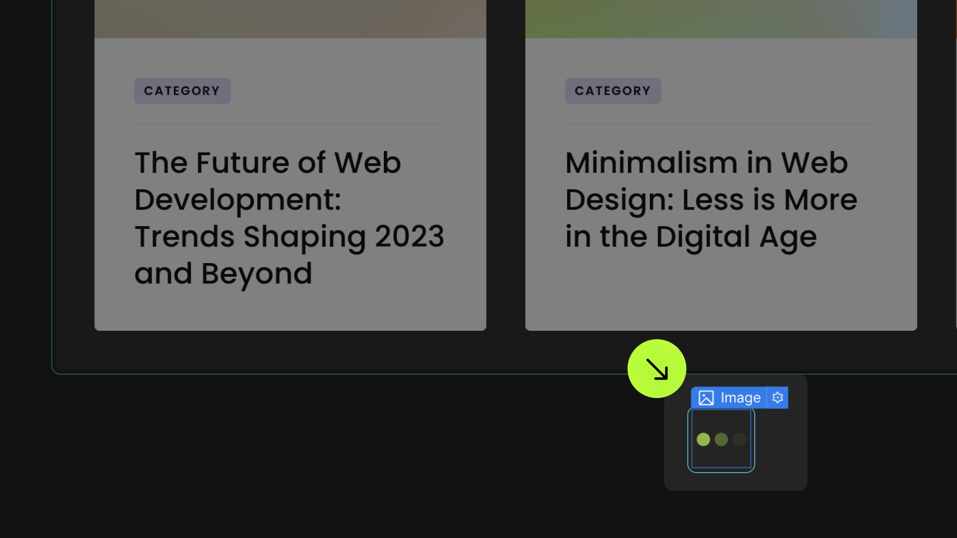
Loader
Add to Image, Embed, Lottie
Threshold
Add to element with fs-list-element="list"
Optional attributes (for pagination load method)
Scroll Anchor
Add to Div Block
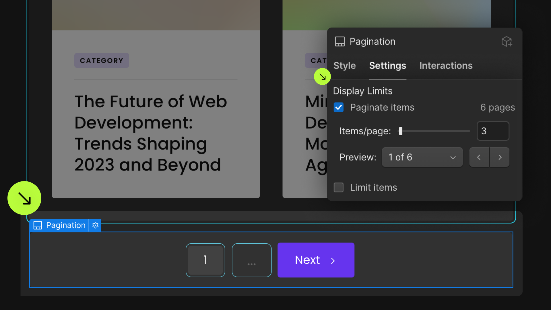
Page Button
Add to Button, Link Block, Text Link
Page Dots
Add to Div Block, Text Block
Add this <script> inside the <head> tag of your page or project
This script is the universal Attribute script: you only need to include it once, even if you have multiple Attribute solutions on the page. Learn more .
Choose the loading method you want
Add these required attributes to the elements
List


Mode: Load More
Ensure that the native Webflow pagination is enabled
Enable 'Paginate Items'
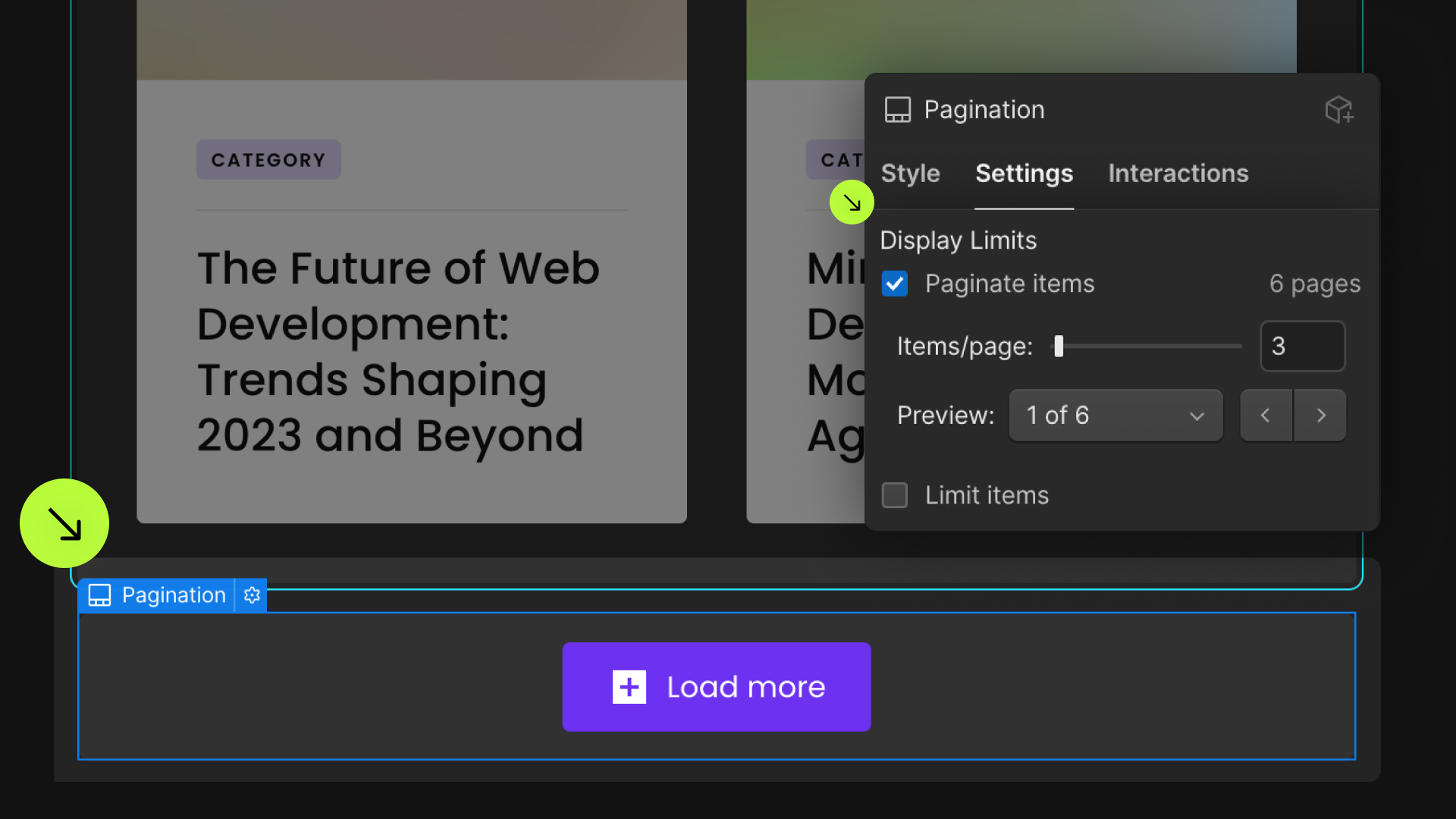
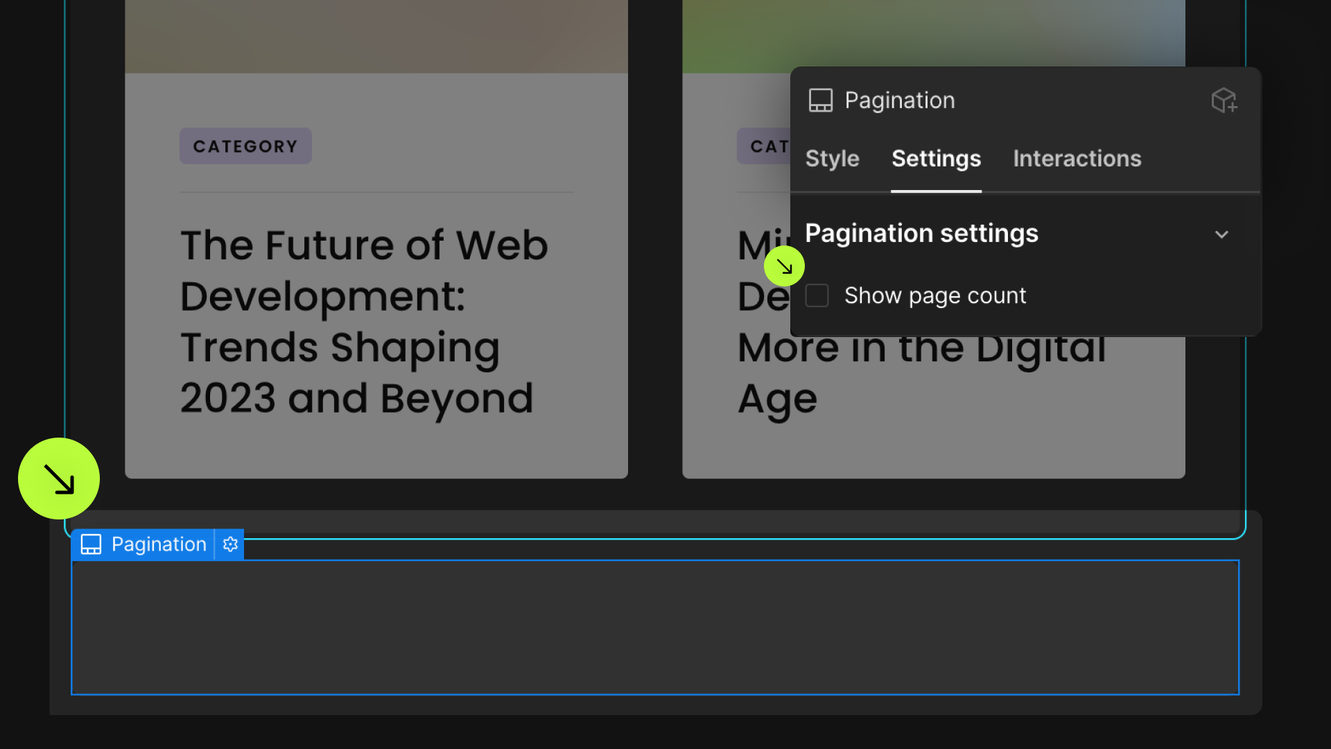
Enable 'Show Page Count' to boost loading speed for the items
Publish your project! Done, easy right?
Items Count


Visible Count

Visible Count From

Visible Count To

Load Count
Reset Interactions
Animate the List
Animate the List Items
Stagger Load
Disable Caching
Add these required attributes to the elements
List
Mode: Render All
Ensure that the native Webflow pagination is enabled
Enable 'Paginate Items'
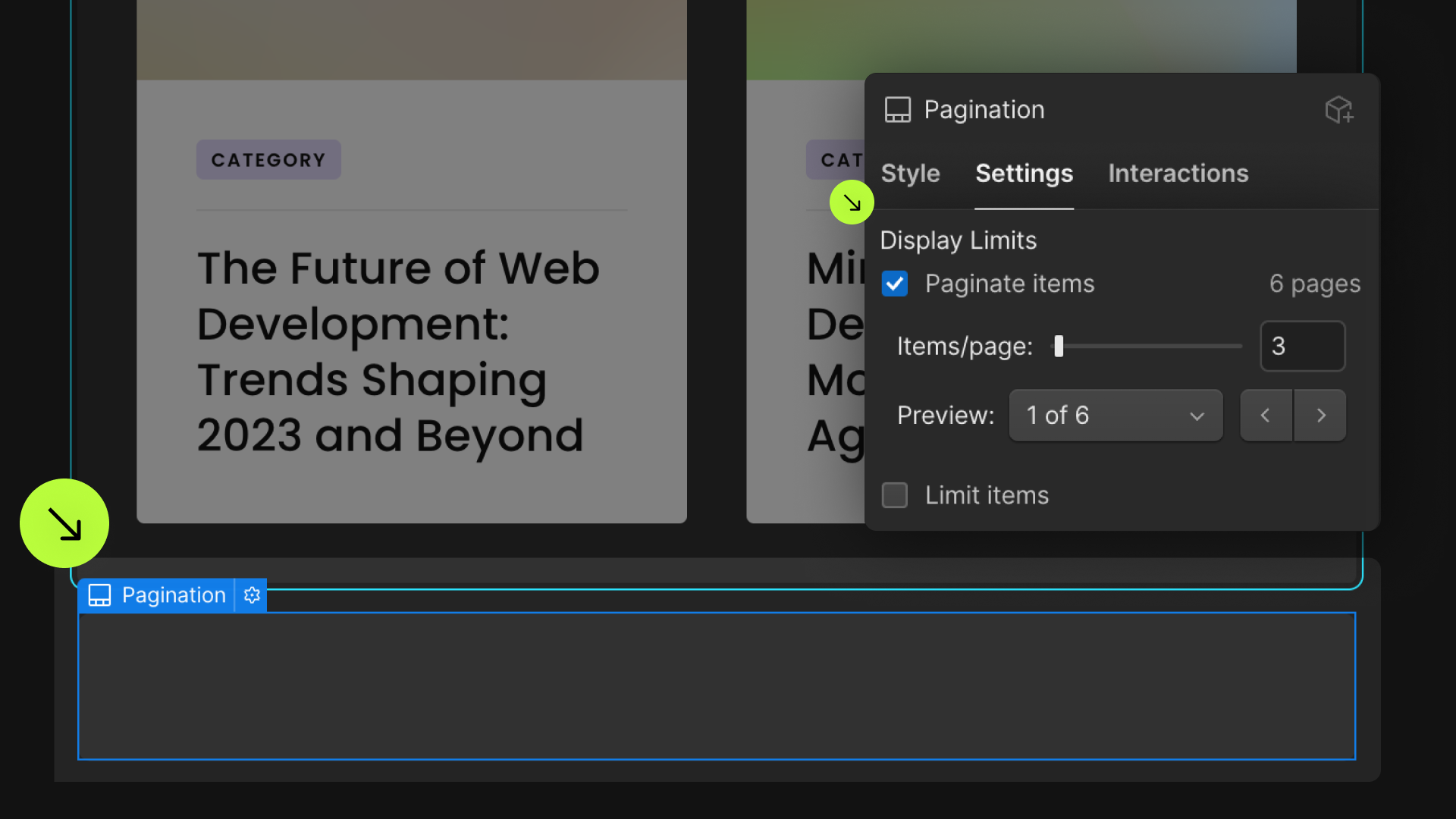
Enable 'Show Page Count' to boost loading speed for the items
Publish your project! Done, easy right?
Items Count
Visible Count
Visible Count From
Visible Count To
Reset Interactions
Animate the List
Animate the List Items
Stagger Load
Disable Caching
Add these required attributes to the elements
List
Mode: Infinite Load
Ensure that the native Webflow pagination is enabled
Enable Paginate Items
Enable 'Show Page Count' to boost loading speed for the items
Publish your project! Done, easy right?
Loader


Items Count
Visible Count
Visible Count From
Visible Count To
Load Count
Threshold
Reset Interactions
Animate the List
Animate the List Items
Stagger Load
Disable Caching
Add these required attributes to the elements
List
Mode: Pagination
Ensure that the native Webflow pagination is enabled
Enable 'Paginate Items'
Enable 'Show Page Count' to boost loading speed for the items
Publish your project! Done, easy right?
Items Count
Visible Count
Visible Count From
Visible Count To
Scroll Anchor Pagination


Page Button


Page Dots
Page Siblings

Page Boundary

Disabled Next & Previous
Query Parameters
Items Per Page
Reset Interactions
Animate the List
Animate the List Items
Stagger Load
Disable Caching
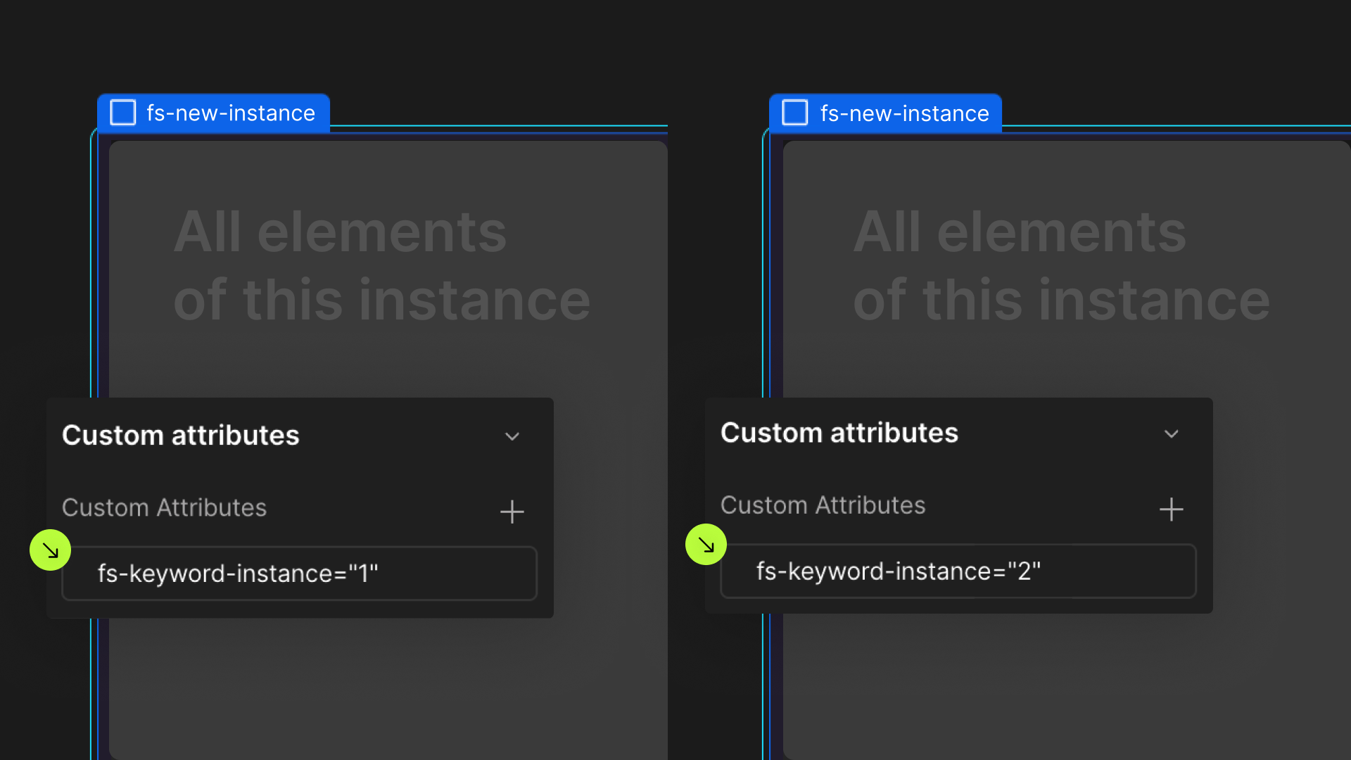
Define an instance on a common parent wrapper