
Attributes, by Finsweet, offers a free series of Solutions that provide essential features to improve your Webflow websites.
List Filter
Create advanced no-code filtering systems for Webflow CMS Collection Lists and static lists.

For advanced users familiar with this solution. Includes all attributes from this page. Click on attributes and values to copy them.
Required attributes
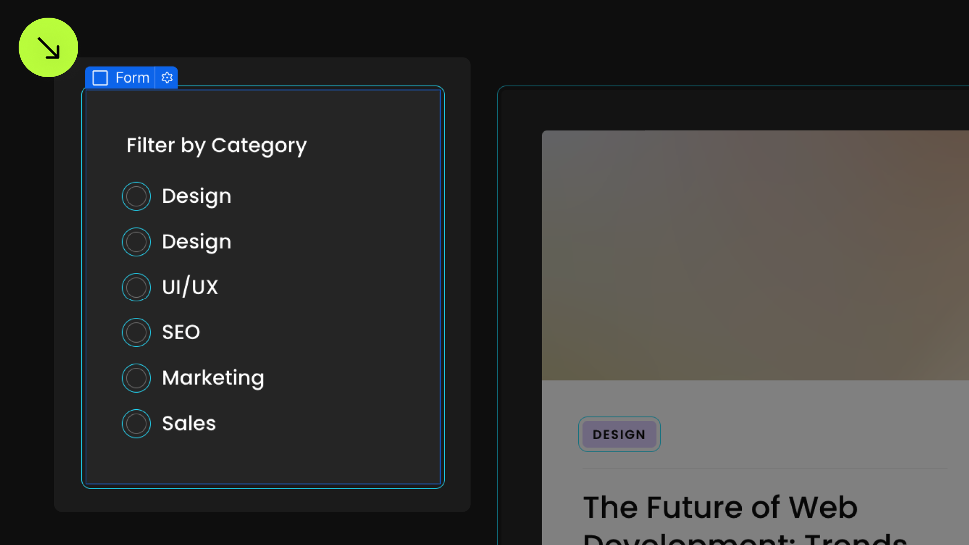
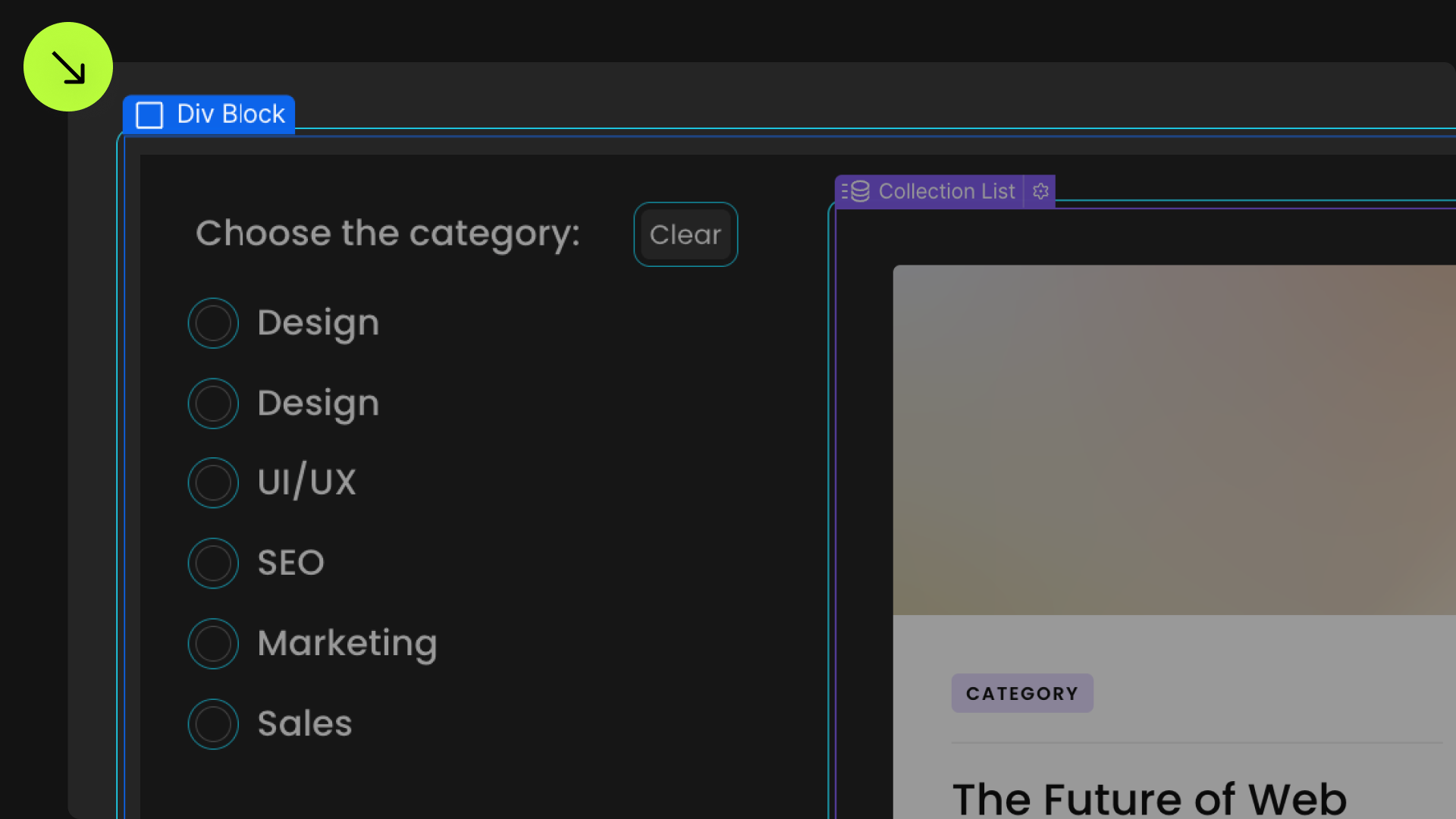
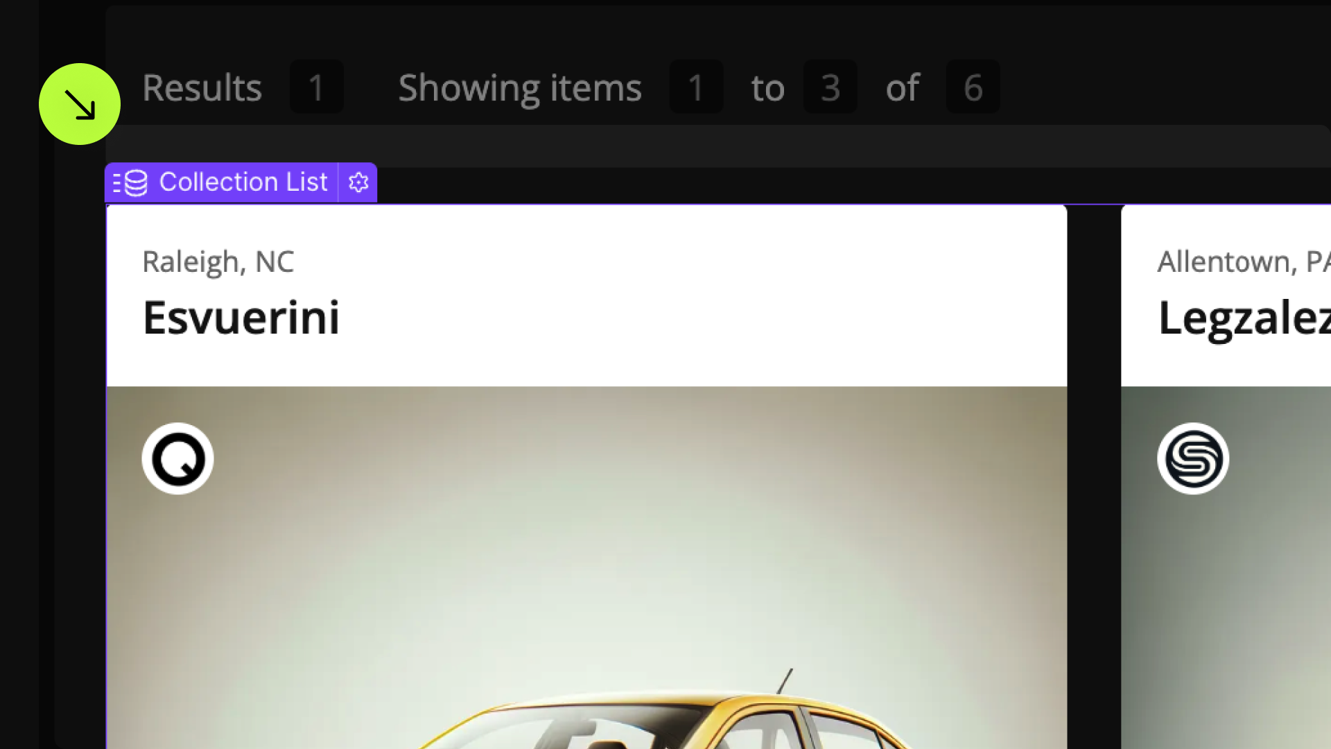
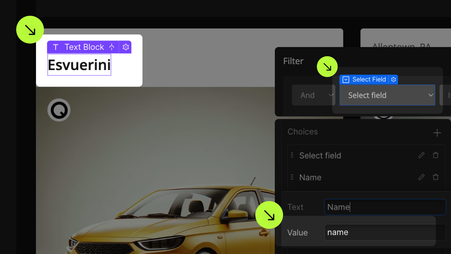
List
Add to Collection List element
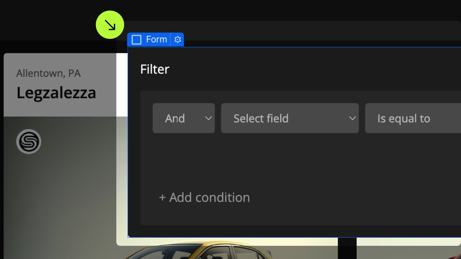
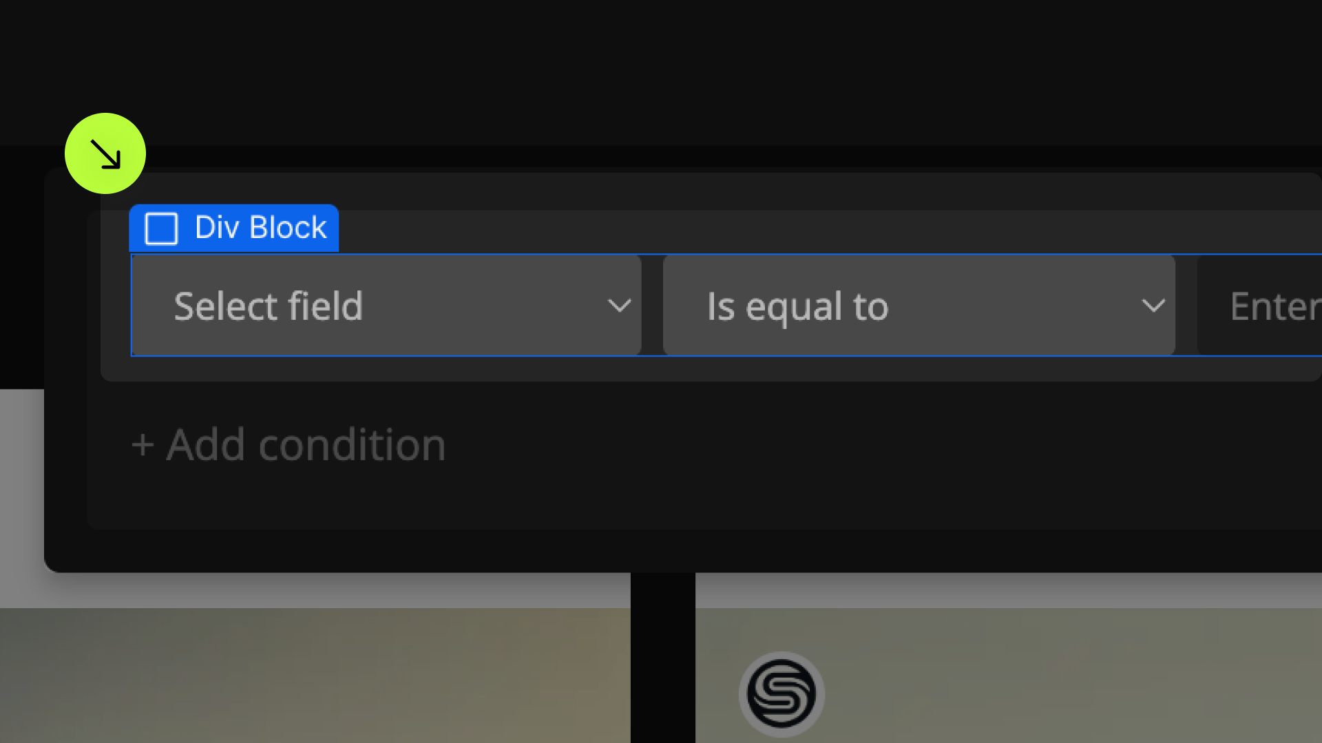
Filters
Add to Form element
Field Identifier
Add to Form filters and to Collection Item fields
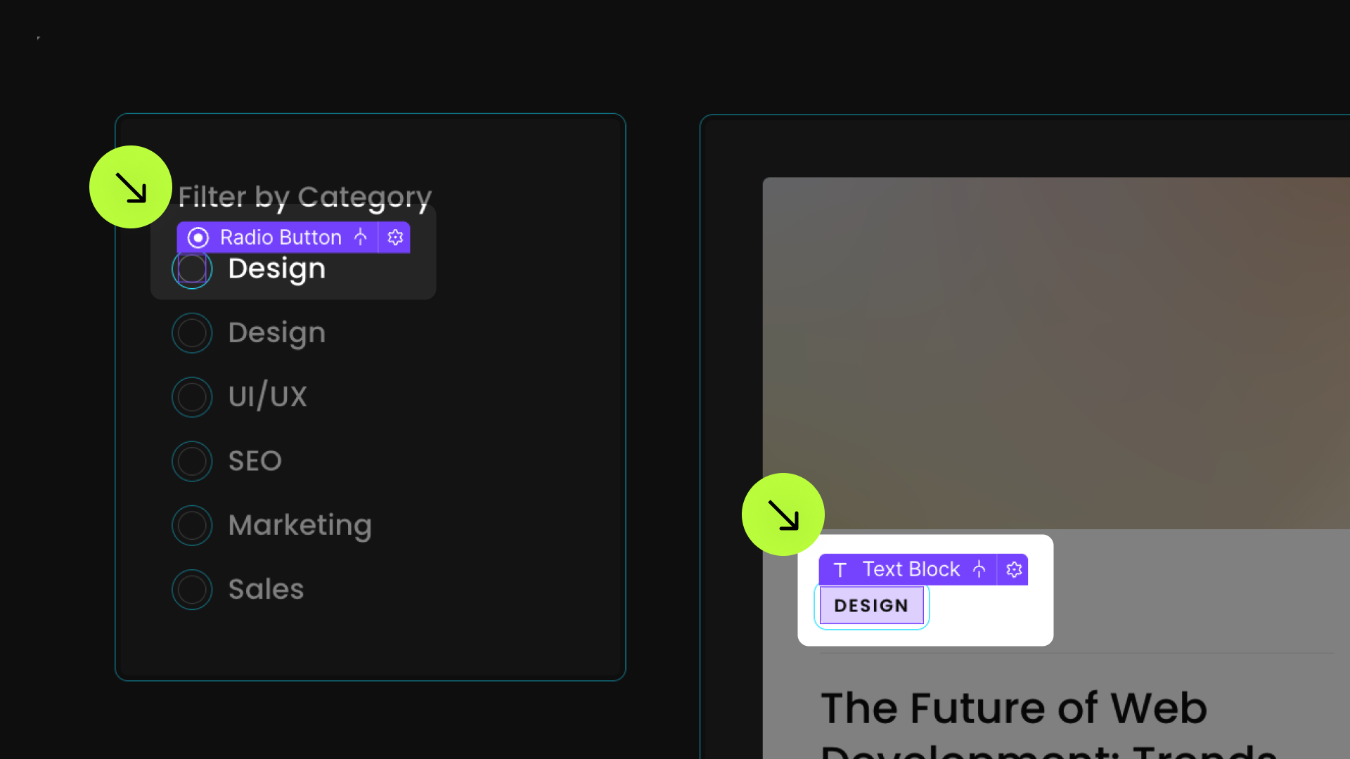
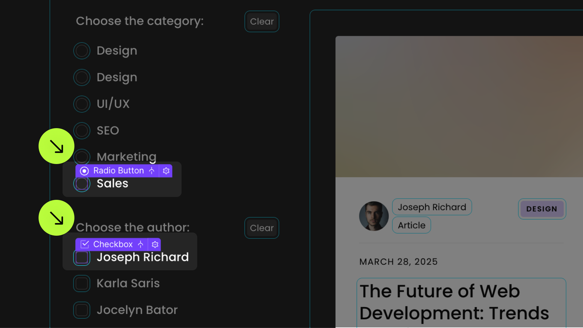
Checkbox or Radio Value
Add to Checkboxes and Radio Buttons
Optional elements
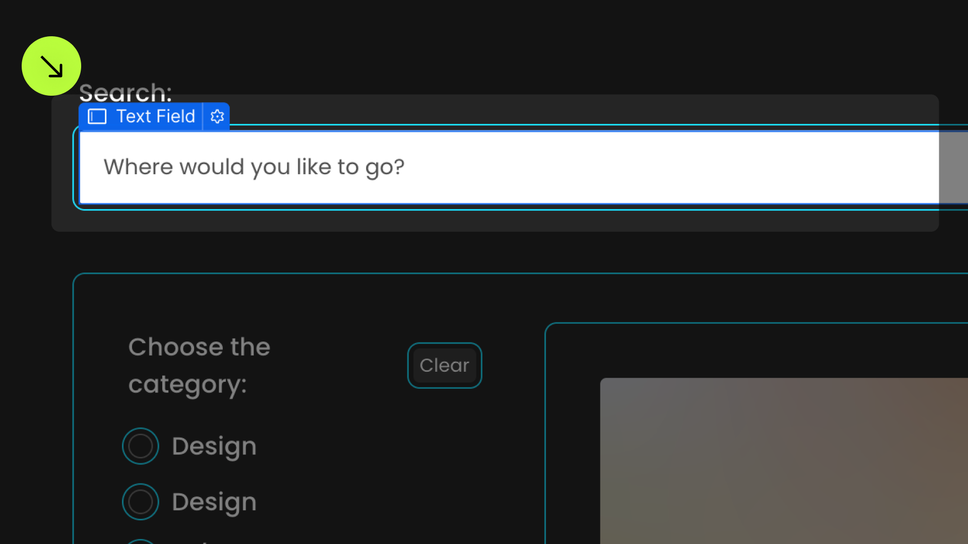
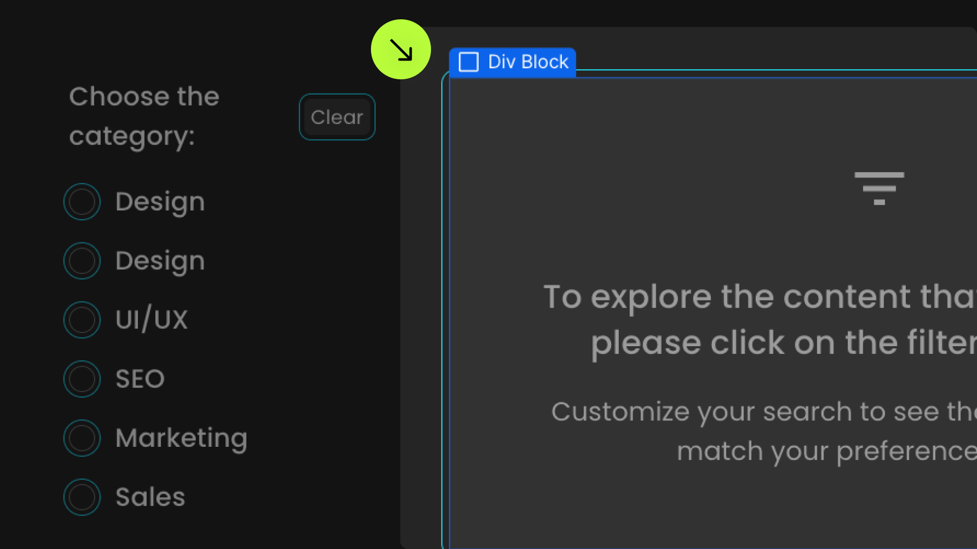
Search Field
Add to Input element
Toggle Button
Add to Checkbox Input
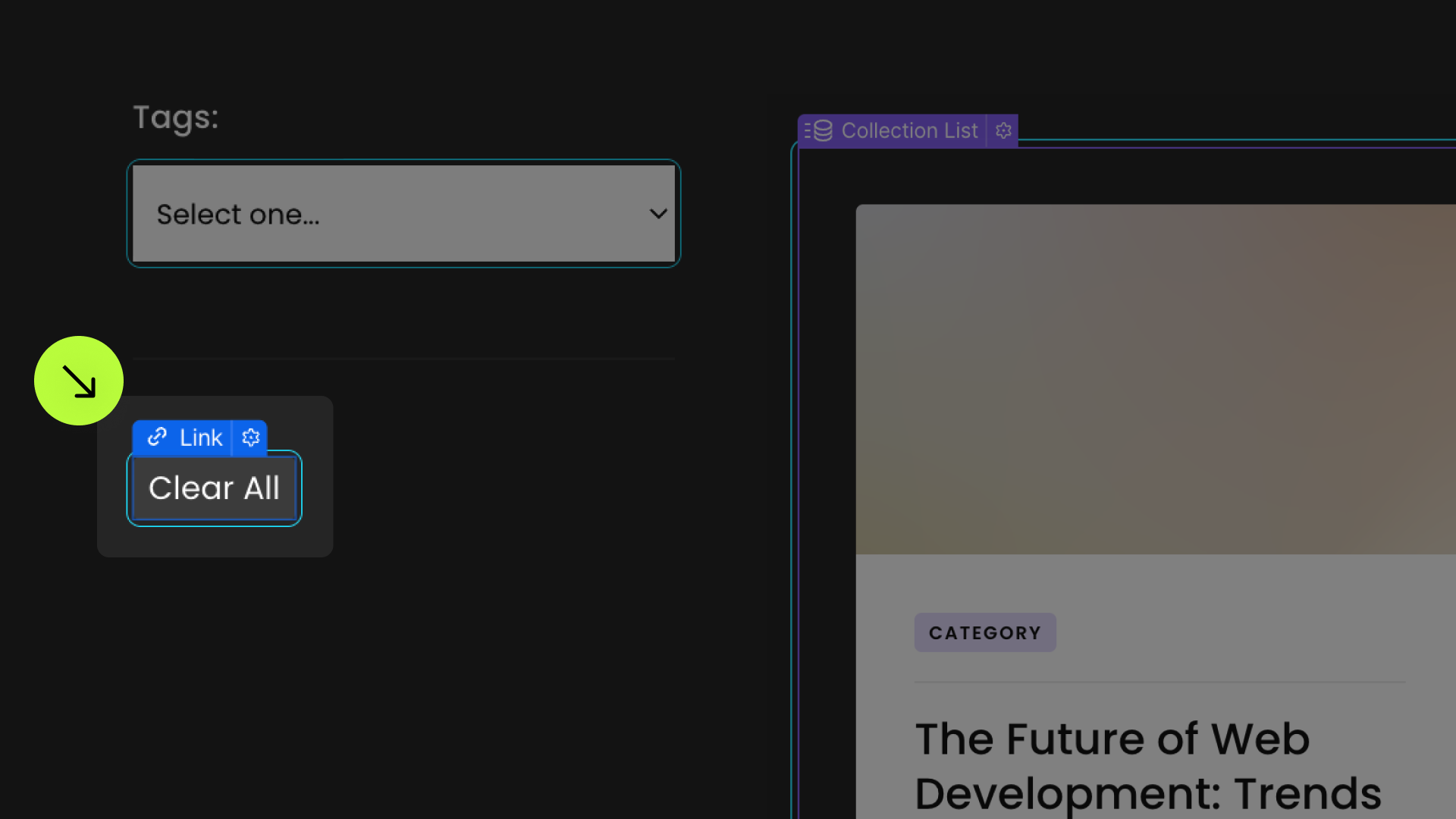
Clear
Add to link elements or Button
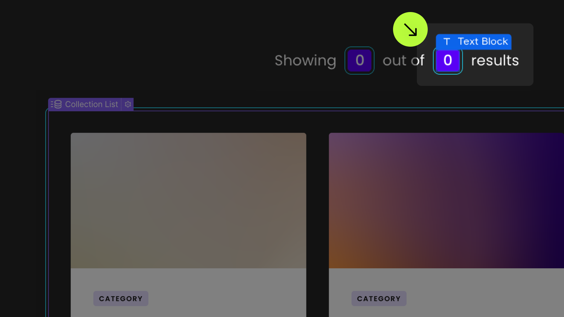
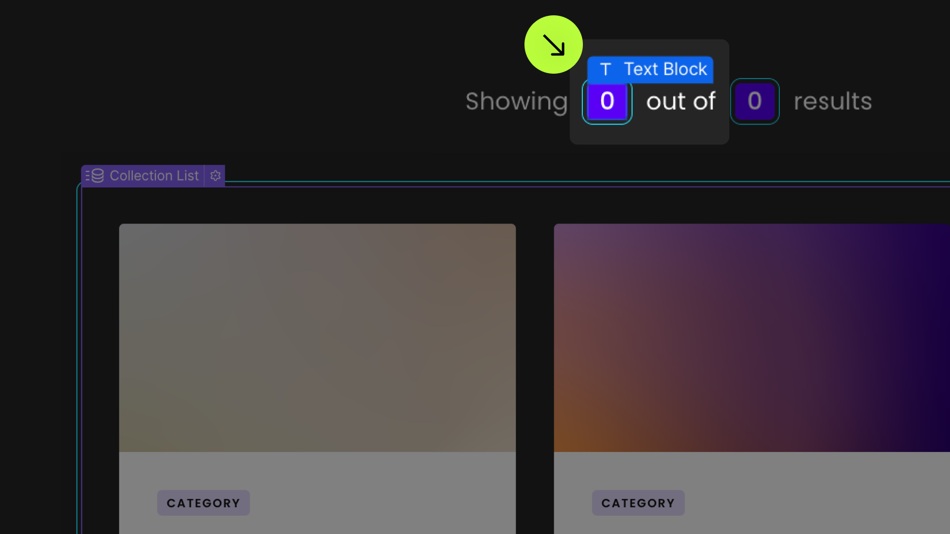
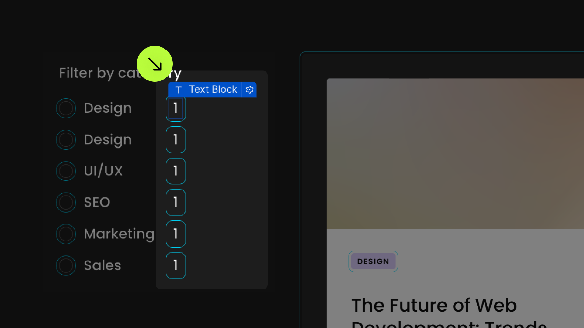
Items Count
Add to Text Block or Span
Results Count
Add to Text Block or Span
Tag
Add to Div Block
Tag Field
Nested inside Tag element
Add to Text Block or Span
Tag Value
Nested inside Tag element
Add to Text Block or Span
Tag Operator
Nested inside Tag element
Add to Text Block or Span
Tag Operator Override
Add to filter input with "fs-list-element = tag-operator"
Tag Remove
Nested inside Tag element
Add to any element
Scroll Anchor
Add to Div Block
Initial State
Add to Div Block
Empty State
Native CMS Collection Empty State
Style as needded
Attributes are only needed for custom Empty State elements
Facet Count
Add to Text Block or Span
Active Class
Add to any Form element
Filter All
Add to Radio Button
Show Query
Add to Collection List element
Optional settings
Clear Specific Filter
Add to Clear element
Highlight
Add to Form element
Debounce
Add to List element to debounce all inputs
Add to any Form element topdebounce that specific input
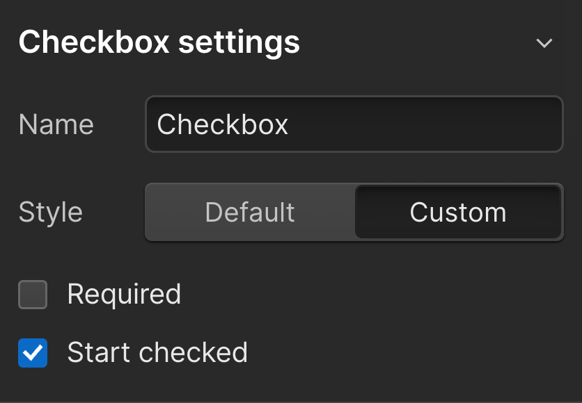
Start Checked: Checkbox
Use Webflow's native "Start checked" Checkbox setting
Start Checked: Radio
Add to any Radio Button
Custom Field Type
Any Form element to define numeric or date field types
Format Tag Numbers
Add to Tag element
Set to true - format will default to the user’s locale
For specific locale use BCP47 language tags
Allow Form submit
Add to List element
Fuzzy Search
Add to Input element
Threshold 0: Maximum Flexibility
Threshold 100: Exact Match
Custom Event
Add to Form element
Empty Filters
Add to any Form element
Filter Values Matching Logic
Add to any Form element
Condition Values Matching Logic
Add to any Form element
Condition Matching Logic
Add to any Form element
Condition Groups Matching Logic
Add to any Form element
Conditions Operator
Add to any Form element
Add this <script> inside the <head> tag of your page or project
This script is the universal Attribute script: you only need to include it once, even if you have multiple Attribute solutions on the page. Learn more .
Pick a setup method for the filtered list
Add these required attributes to the elements
List


Filters

Field Identifier


Checkbox or Radio Value
Publish your project and check out the result on the live site.
* Attributes Solutions must be tested on the published site after each change. They do not run in Design, Edit, or Preview mode.
Search Field
Toggle Button

Clear


Items Count
Results Count
Tag


Tag Field

Tag Value

Tag Operator

Tag Operator Override
Tag Remove


Format Tag Numbers
Scroll Anchor
Initial State
Empty State
Facet Count
Active Class
Animate the List
Filter All Button
Show Query
Clear Specific Filter
Highlight
Highlight Class
Debounce
Start Checked: Checkbox
Start Checked: Radio
Custom Field Type
Allow Form Submit
Fuzzy Search
Custom Event
Empty Filters
Fields Values Matching Logic
Conditions Values Matching logic
Conditions Matching Logic
Condition Groups Matching Logic
Conditions Operator
Add these required attributes to the elements
Understand how to build the Dynamic Filter UI template

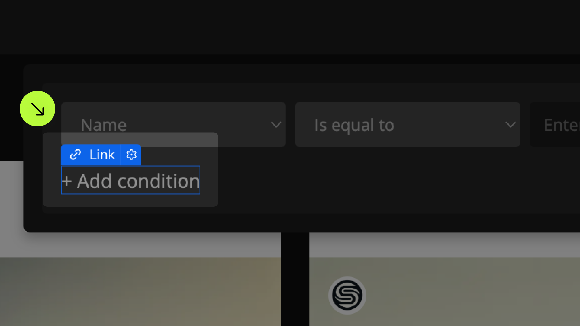
List
Field Identifier


Custom Field Type
Filters

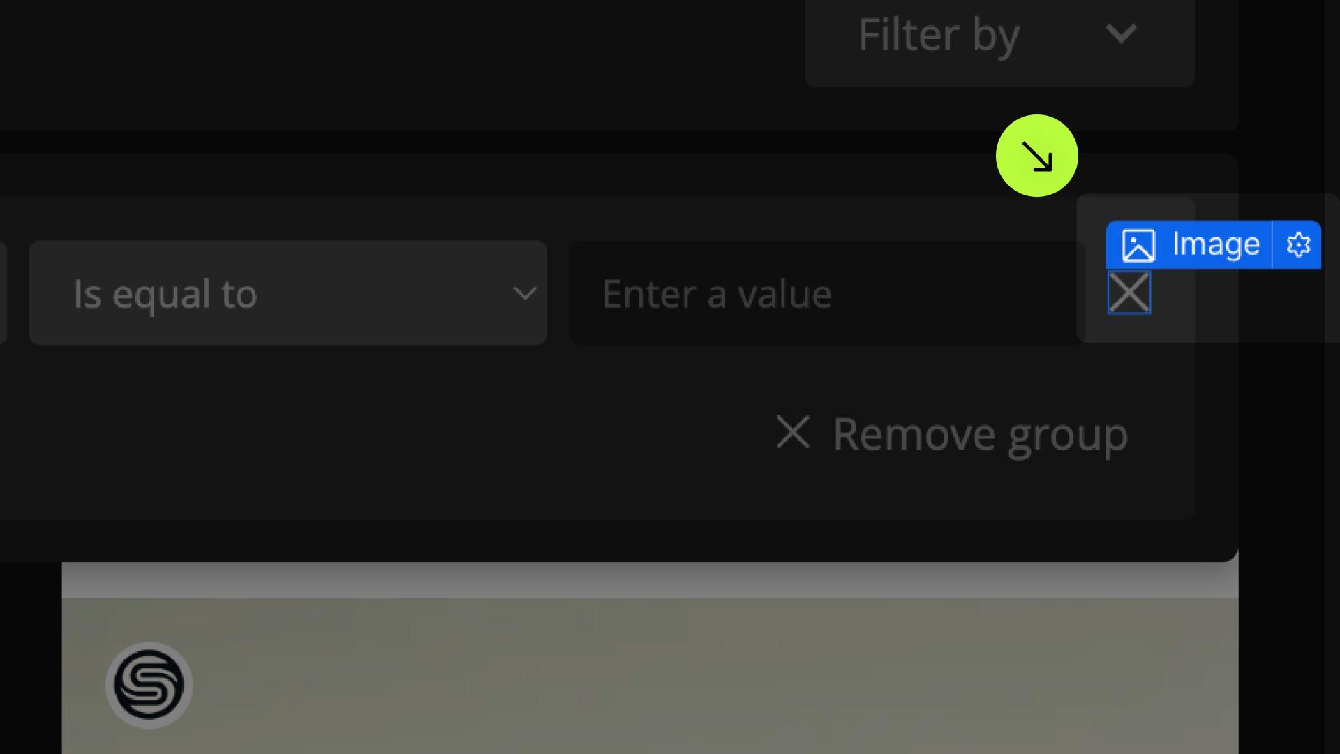
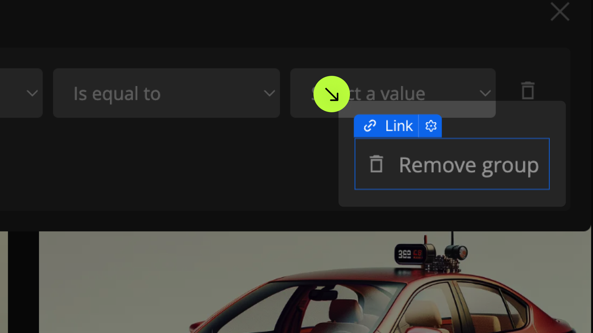
Condition Group

Condition
Field Selector
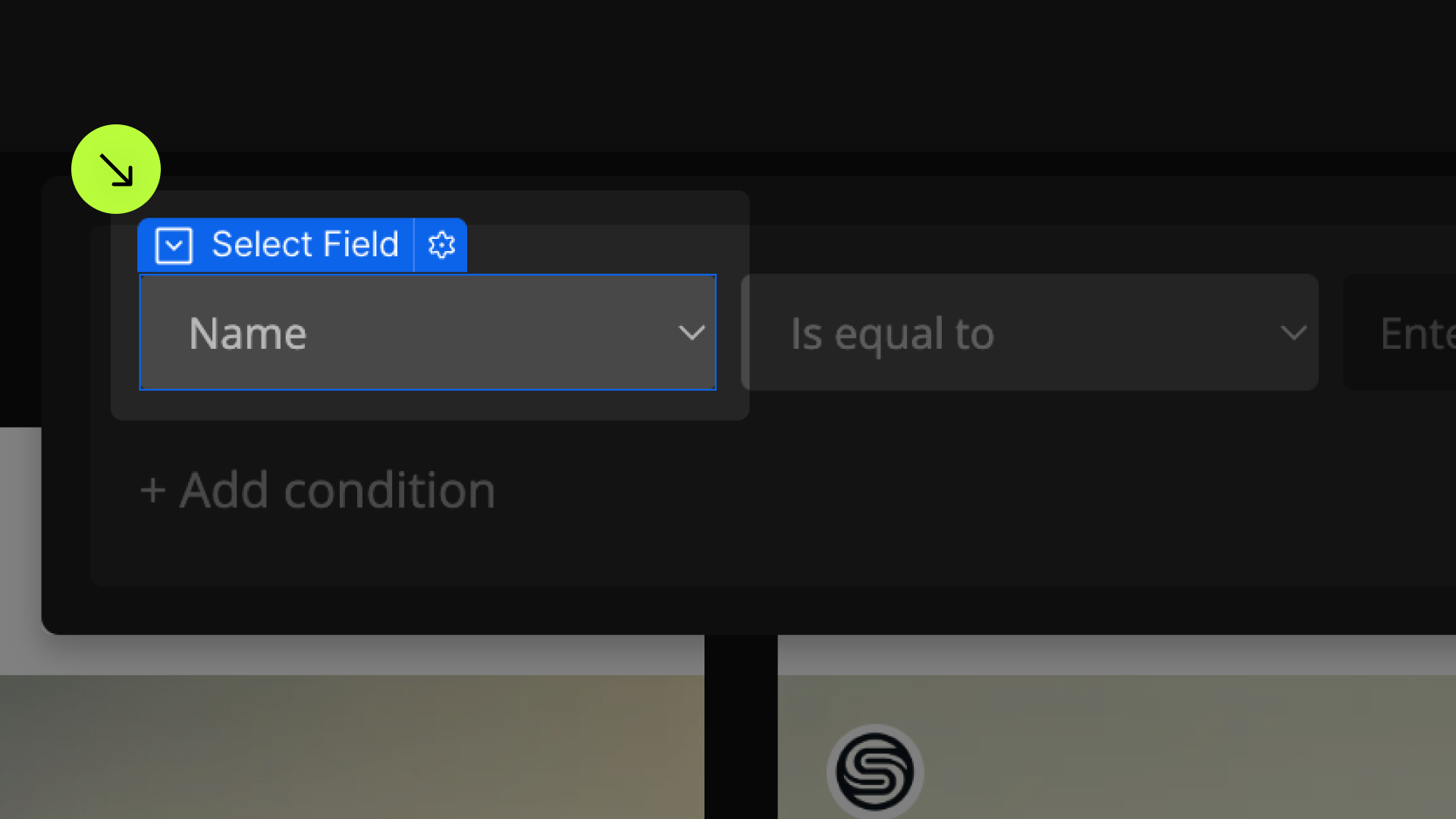
Operator Selector
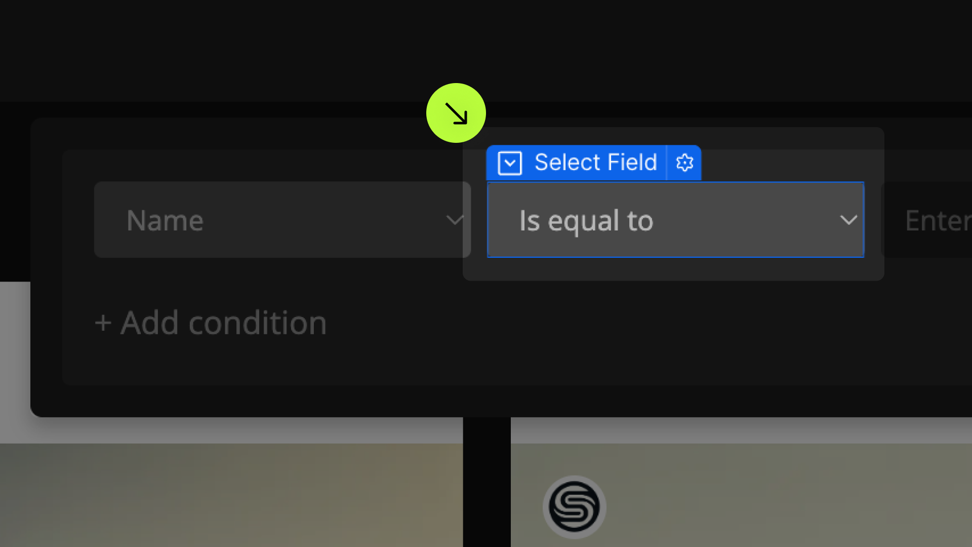
Condition Value
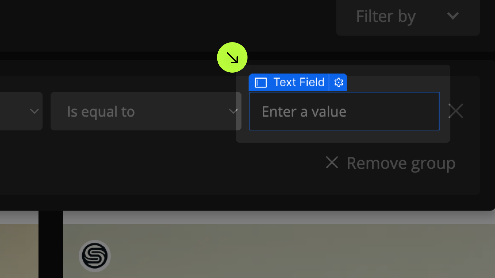

Remove Condition

Add Condition
Publish your project! Done, easy right?
Condition Match

Condition Group Match
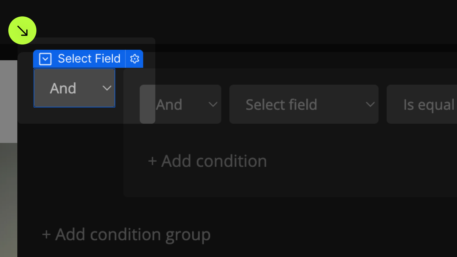
Add Condition Group

Remove Condition Group
Style Inactive Elements
fs-list-element = "condition-group-remove"
fs-list-element = "condition-match"
fs-list-element = "condition-remove"
Clear
Items Count
Results Count
Tag
Tag Field
Tag Value
Tag Operator
Tag Operator Override
Tag Remove
Format Tag Numbers
Scroll Anchor
Initial State
Empty State
Active Class
Animate the List
Highlight
Highlight Class
Debounce
Custom Field Type
Allow Form Submit
Fuzzy Search
Custom Event
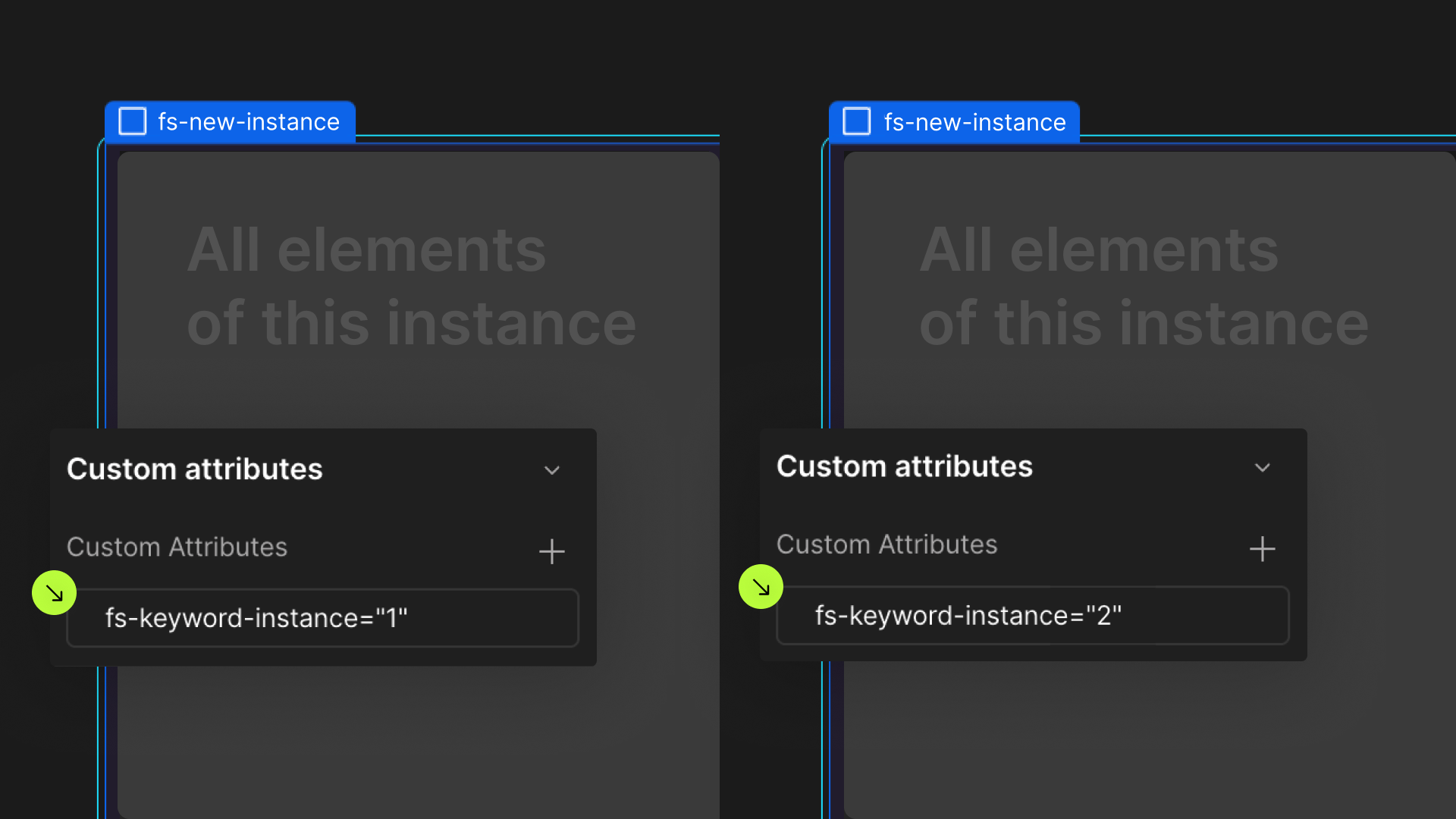
Define an instance on a common parent wrapper