Attributes, by Finsweet, offers a free series of Solutions that provide essential features to improve your Webflow websites.
Range Slider
Build a custom Range Slider Form component natively in Webflow.

For advanced users familiar with this solution. Includes all attributes from this page. Click on attributes and values to copy them.
Required attributes
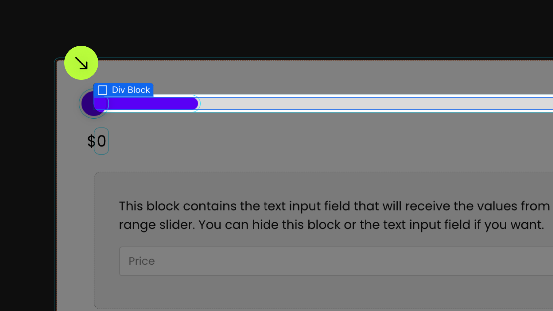
Wrapper
The parent wrapper that contains UI elements of the Range Slider.
Track
The 'track' of the Range Slider.
Fill
The 'fill color' of the Range Slider.
Fill
The 'handle' of the Range Slider.
Optional attributes
Display Value
Display the current value of the Range Slider.
Add to any element inside the Wrapper element
FIELD IDENTIFIER
Add to Text Input Field when filtering a list
Range From
Add to the Text Input Field that should represent the 'from' value (or 'min' value)
Range to
Add to the Text Input Field that should represent the 'to' value (or 'max' value)
Min
Add to the Wrapper element
The minimum value for the Range Slider
Max
Add to the wrapper element
The maximum value for the Range Slider
Steps
Add to the wrapper element
The steps of the Range Slider handle as it is being draggedfs-rangeslider-step
Start
Add to the wrapper element
The starting value of the Range Slider's handlesfs-rangeslider-start
Format
Add to the wrapper element.
Format the display value to a number like this 2,394,338
Max
Add to the wrapper element
Update the slider input as the handles is moved or when the handle is released
Add this <script> inside the <head> tag of your page or project
This script is the universal Attribute script: you only need to include it once, even if you have multiple Attribute solutions on the page. Learn more .
Add these required attributes to the elements
Range Slider Wrapper
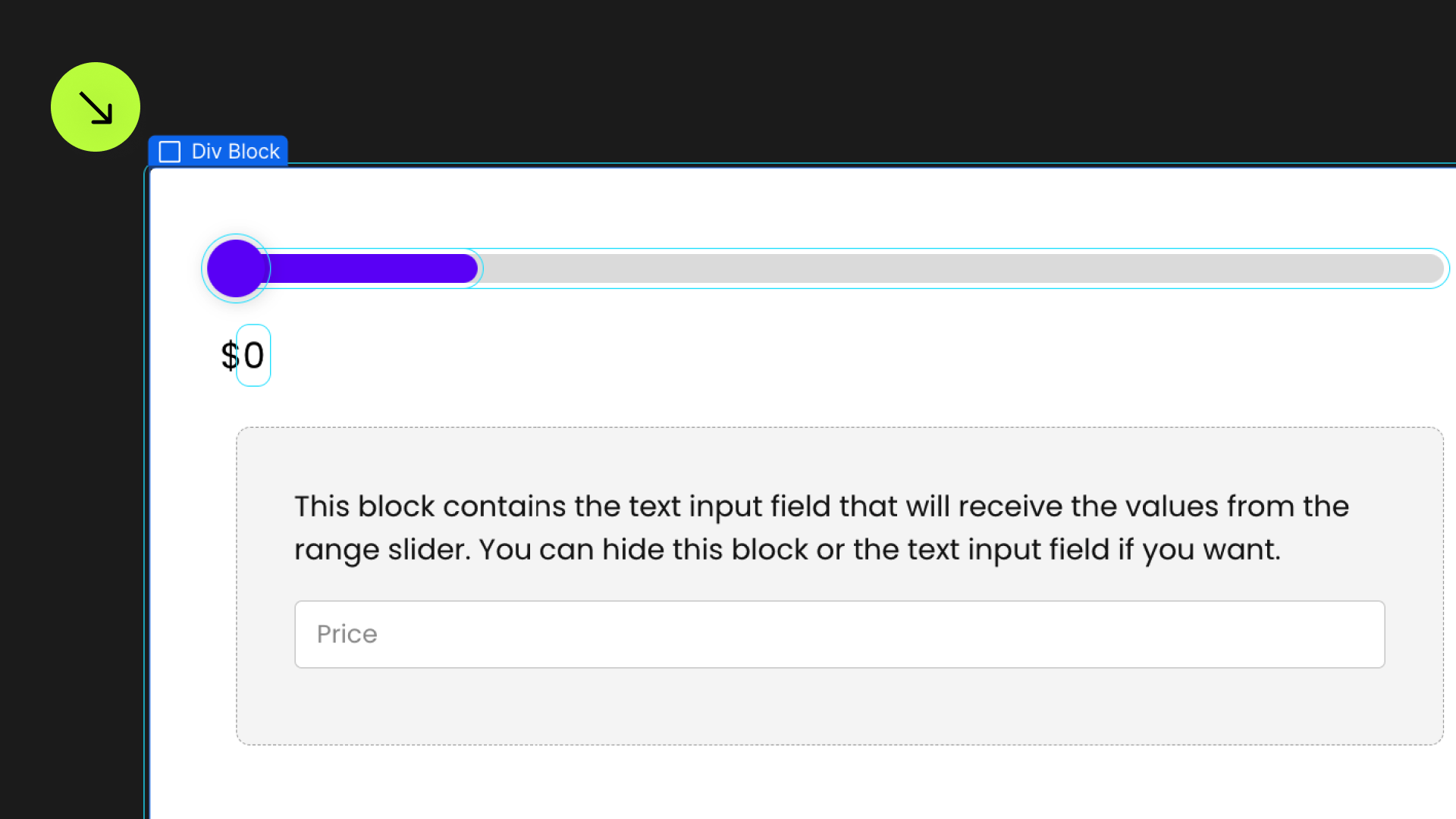
The parent wrapper that contains UI elements of the Range Slider.

Track
The 'track' of the Range Slider. This is the background that shows the entire width of the Range Slider.
Fill

The 'fill color' of the Range Slider. This is the visual color that shows the active selected Range Slider values.
Handle
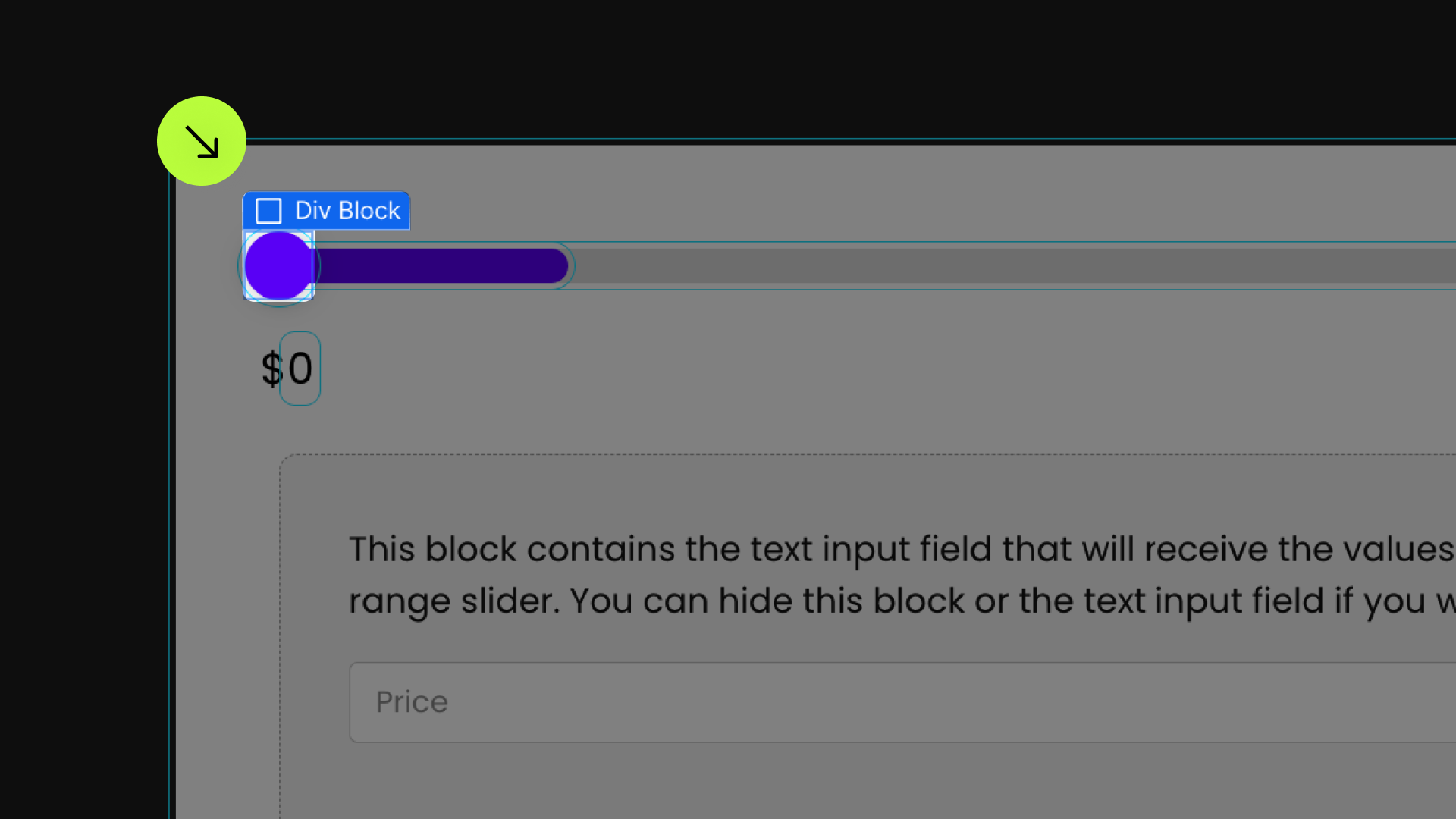
The 'handle' of the Range Slider. This is the circle that the user can drag to change the values in the Range Slider.
This does not have to be a circle. It can be any shape made from a div, or an <img> image element.
If you are using two handles in the Range Slider. Add two handle elements to the Range Slider component UI. The two handles can be siblings of each other. The first handle will be the first (min) handle. The second handle will be the second (max) handle.

Input
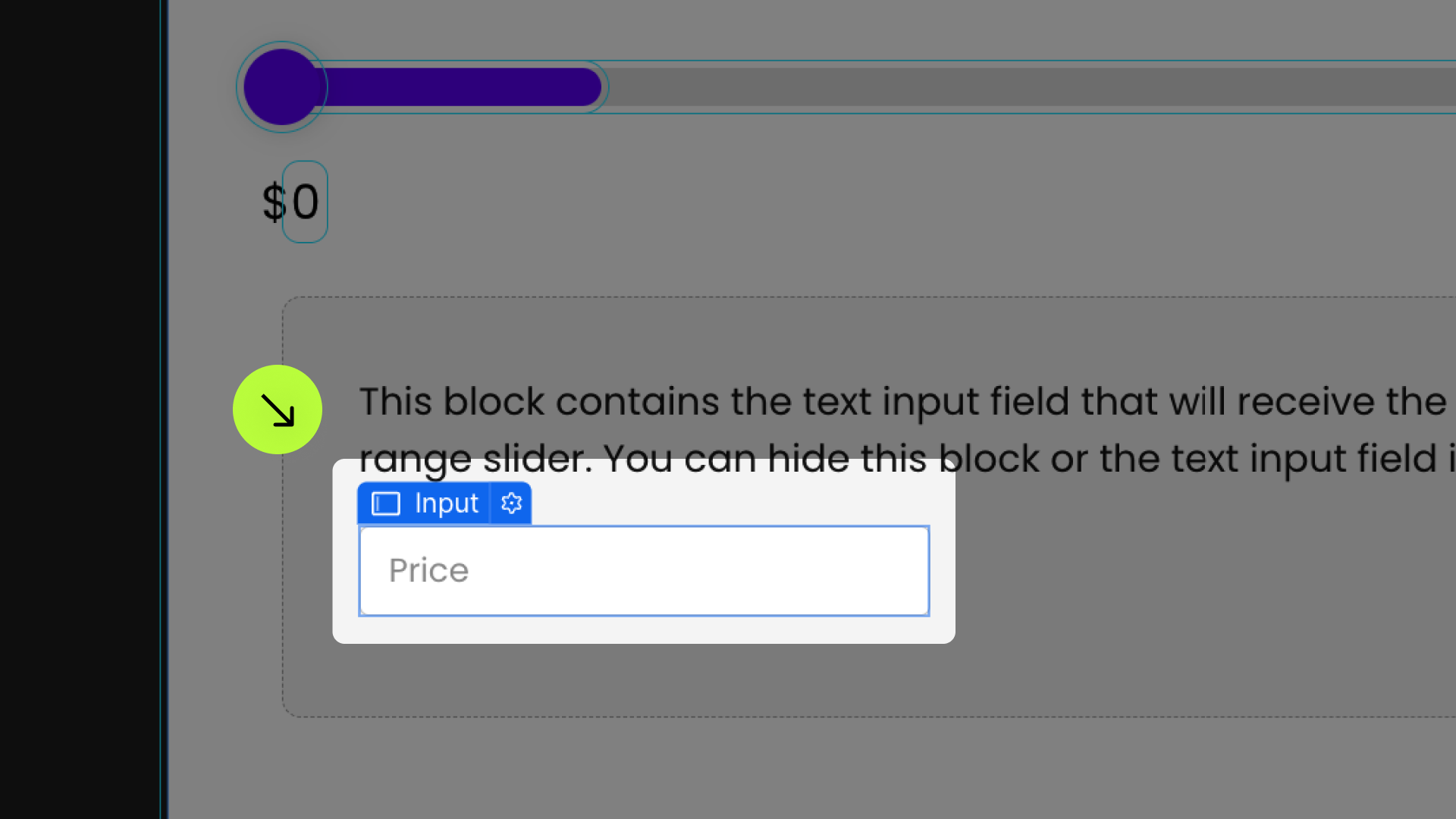
The form input that holds the value of the range slider. If using this Text Input Field for a web form submission, there are no attributes needed.

Publish your project! Done, easy right?
Display Value

Display the current value of the Range Slider.
This element can go anywhere inside the fs-rangeslider-element = wrapper.
When using two handles on the Range Slider, place two display-value attributes inside the wrapper. The first display-value will show the value of the first handle. The second display-value will display the value of second handle.


Update
The value of the range slider <input> will be updated on every single move of the Handle. As the user moves the Handle, the <input> constantly updates.
"move" is the default option.
The value of the range slider <input> will be updated when the user releases the mouse/finger from the handle.
This is useful for when using Range Slider with List Filter. We may not want to constantly trigger a new filter cycle when the user is still moving the handle. Instead we trigger a single filter cycle when the user releases the Handle.
The display-value elements will still be updated real-time as the user moves the Handle.
Format Display
Start
The initial value of the handle on page load.
This attribute is set on the Handle element. If using two handles in the Range Slider, this attribute can be set to each handle.
If not set, the first Handle starts at the min value, and the second Handle starts at the max value.
Steps
As the Range Slider handle is being dragged, the steps indicate the values that can be selected in between the min and max values.
Min
The minimum value of the Range Slider.
Max
The maximum value of the Range Slider.
Filter Field
Lazy Load
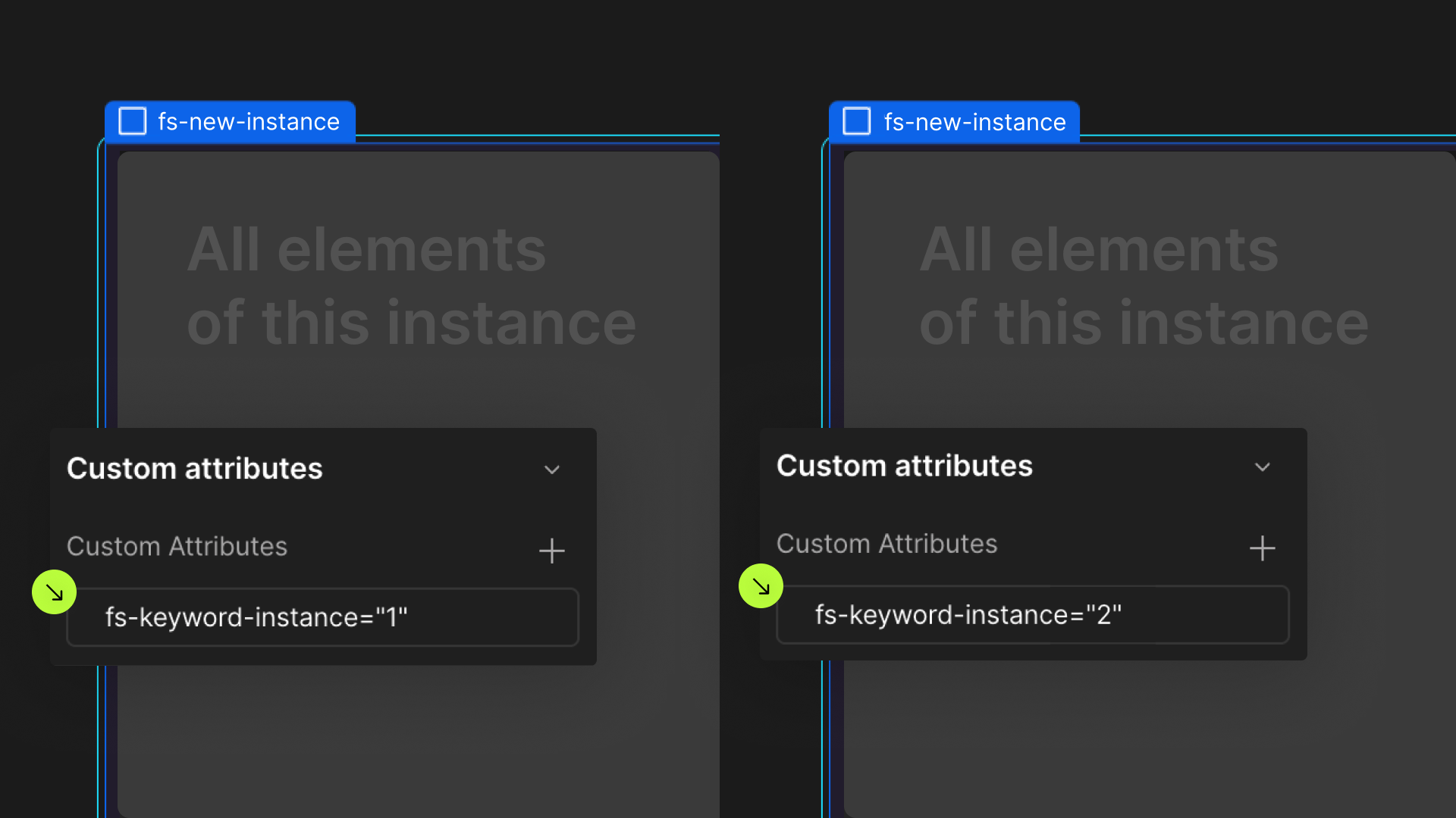
Define an instance on a common parent wrapper