Attributes, by Finsweet, offers a free series of Solutions that provide essential features to improve your Webflow websites.
Input Counter
Increment and decrement (+ and -) counter in a Webflow Form.

Input Counter • Flash Card
For advanced users familiar with this solution. Includes all attributes from this page. Click on attributes and values to copy them.
Required attributes
Input
The form input the user can increment and decrement the value of.
Increment
The increment (or plus) button.
Decrement
The decrement (or minus) button.
Optional attributes
Clear
Clear counter to initial vlaue.
Initial Value
Set an initial value for the input. Add to the element with fs-inputcounter-element = "input"
Arrows
Show the native number arrows. Add to the element with fs-inputcounter-element = "input"
min
The minimum value that can be entered to the input. Add to the element with fs-inputcounter-element = "input"
max
The maximum value that can be entered to the input. Add to the element with fs-inputcounter-element = "input"
step
The "step" between each increment and decrement click. Add to the element with fs-inputcounter-element = "input"
Add this <script> inside the <head> tag of your page or project
This script is the universal Attribute script: you only need to include it once, even if you have multiple Attribute solutions on the page. Learn more .
<script async type="module"
src="https://cdn.jsdelivr.net/npm/@finsweet/attributes@2/attributes.js"
fs-inputcounter
></script>
Add these required attributes to the elements
Input

The form input the user can increment and decrement the value of.
Use the "Number" input type. If "Number" is not set in the input settings, Attributes will be automatically convert the input to type="number".
By default, the native browser input arrows are hidden using custom CSS. These are the small "up" and "down" arrows inside the number input.

Increment

The increment (or plus) button.
Clicking this button will add (1) to the current input value.

Decrement

The decrement (or minus) button.
Clicking this button will subtract (1) from the current input value.

Publish your project! Done, easy right?
Add options
Clear
Optionally add a clear button that will "clear" the current value of the input.
The value will be set to the initial value.

Initial
Optionally set an initial value for the input.
For example, setting a value of "100" will set the initial value of the input to "100". Setting a value of "0" will set the initial value to "0".
The default functionality is no initial value. By not adding this attribute on the input, the input will have no value.
Show Arrows
By default, Attributes hides the native arrows inside the number input. This is to avoid two UI options for incrementing and decrementing the value.
To show the native number arrows, apply this attribute to the input.
Apply native HTML number attributes
min
The minimum value that can be entered to the input.
max
The maximum value that can be entered to the input.
step
The "step" between each increment and decrement click.
For example, if step is set to 2, and the input is at 0, the first increment click will increase the input to 2. The second click will increase the value to 4. The third click will increase the value to 6.
Add more
Instances
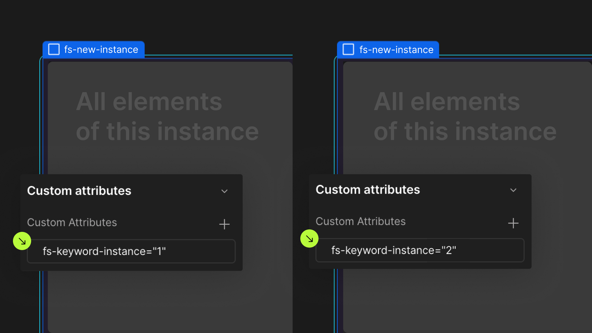
Define an instance on a common parent wrapper

If you wish to create multiple instances of this solution on the same page, please follow the steps below:
- Select a wrapper parent that contains all the elements of an instance.
- Add an
-instanceattribute to it, with a unique value. - Repeat for every instance.
