Attributes, by Finsweet, offers a free series of Solutions that provide essential features to improve your Webflow websites.
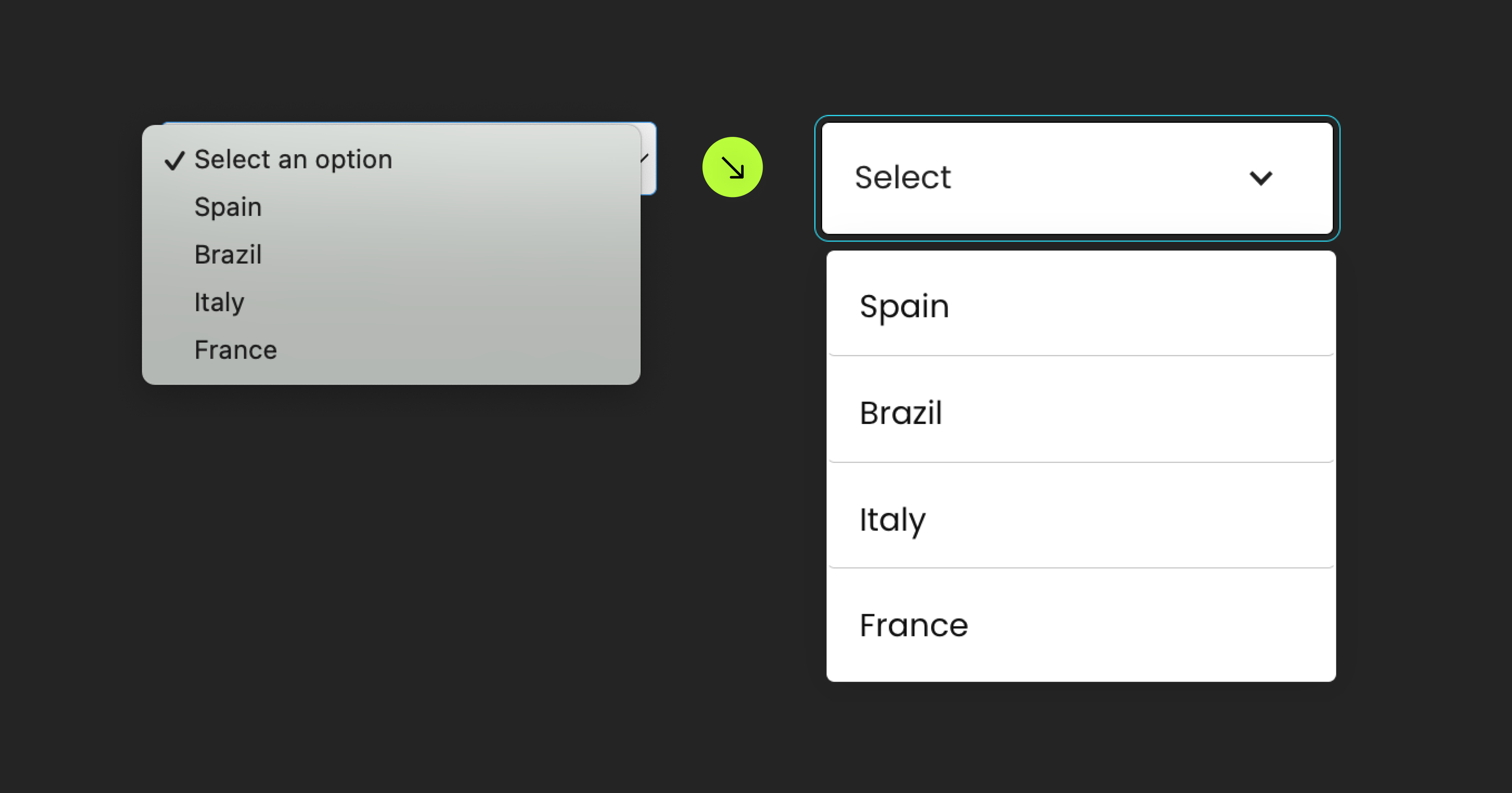
Custom Form Select
Use a Webflow Dropdown element as a Webflow Form <select> component

Custom Form Select • Flash Card
For advanced users familiar with this solution. Includes all attributes from this page. Click on attributes and values to copy them.
Required attributes
Dropdown
define the dropdown that be used as <select>
Select
No attributes needed, the select element should be nested inside the dropdown element
Optional attributes
Label
Required if more than one text element is used inside the Dropdown Toggle
Clear
Optionally customize the "Select an option" option inside the Select when an option is selected
Hide initial option
Use this option to hide the "Select an option" option in the Dropdown when there is no option selected
Add this <script> inside the <head> tag of your page or project
This script is the universal Attribute script: you only need to include it once, even if you have multiple Attribute solutions on the page. Learn more .
<script async type="module"
src="https://cdn.jsdelivr.net/npm/@finsweet/attributes@2/attributes.js"
fs-selectcustom
></script>
Add these required attributes to the elements
Dropdown
Webflow Dropdown component that will serve as the designed Select component.
This Dropdown will 'mirror' the content that is in the nested Select. If there are 10 options in the nested Select, those 10 options will populate in this Dropdown List.
It is required to have a Link / Link Block as the "option template". The Link / Link Block template must be inside the the Dropdown List. The Link / Link Block template must have a single text element inside. This text element will be the dynamic text that mirrors the Select component. See screenshot below.
As you select options (Link / Link Blocks) inside the Dropdown List, those options will be selected in the Select component. It will mirror the selections.
The nested Select can be used for Webflow Form submissions, with Attributes' List Filter, and Attributes' List Sort.
Select

No attributes needed for this Select component.
It is required that to have this nested somewhere inside the Webflow Dropdown component.
This Select component will be the source of the content that populates the custom designed Dropdown component. This Select component should hold the final content of the custom Select options.
Integrates with Attributes' List Select for dynamic custom Selects!
Publish your project! Done, easy right?
Add options
Label
Required if more than one text element is used inside the Dropdown Toggle. If there is only one text element inside the Dropdown Toggle, this attribute is not needed.
Place this attribute on the content inside the Dropdown Toggle that should update with the currently selected option inside the Dropdown. This is the text element that should be dynamic based on what's currently selected.
If "Spain" is the option chosen in the Dropdown List, the label text will update as "Spain".
Clear
Optionally customize the "Select an option" option inside the Select when an option is selected.
For example, if "Spain" is selected, instead of seeing "Select an option" as the first option of the Dropdown List, change the message to "Clear selection".
Place this attribute on a Link / Link Block inside the Dropdown List. This Link / Link Block will be used as the content for the "Select an option" option when an option is selected.
Hide Initial Option
Optionally customize the "Select an option" option inside the Select when an option is selected.
For example, if "Spain" is selected, instead of seeing "Select an option" as the first option of the Dropdown List, change the message to "Clear selection".
Place this attribute on a Link / Link Block inside the Dropdown List. This Link / Link Block will be used as the content for the "Select an option" option when an option is selected.
States and interactions
No attributes needed. Fully integrated to Webflow's native states and interactions.
Active state of Link / Link Block elements in the Dropdown List use the Webflow native 'Current' state.
Accessible keyboard navigation uses the Webflow native 'Focus' state.
The Dropdown component used in this solution is fully compatible with native Webflow Interactions.
Add more
Instances
Define an instance on a common parent wrapper

If you wish to create multiple instances of this solution on the same page, please follow the steps below:
- Select a wrapper parent that contains all the elements of an instance.
- Add an
-instance
attribute to it, with a unique value. - Repeat for every instance.