
Heading Structure
What are Heading Tags?
Heading tags are HTML code tags that allow you to divide web page content into sections according to how relevant they are.
There are 6 heading tags, and each of them determines the position within the page hierarchy.
Here’s an example of how heading tags should be structured on any page:
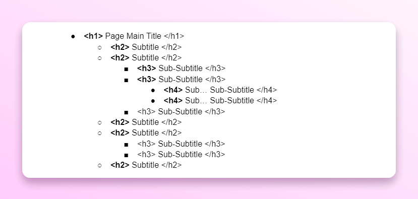
Think of this as a folder structure, outline of a document, or content layers.
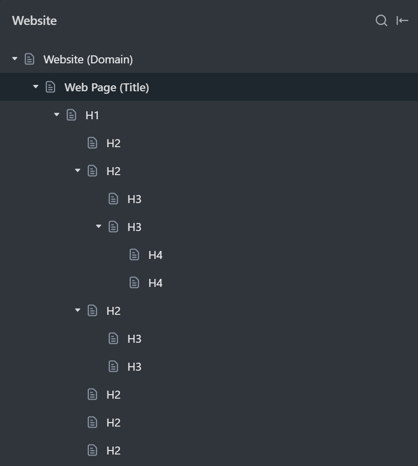
It’s important to note that H2 can only go under H1. H3 can only go under H2. The same happens for each lower heading tag like H4, H5, or H6.
Headings should follow basic children and parent relationships.
What is the difference Between a Heading Tag and a Heading Style?
In Webflow, you can style any text, heading, or paragraph element however you want. This means you can make a text element look like a heading.
Here’s a text block that looks like a heading, but it doesn’t have an actual heading tag in it.

Elements that look like a heading and have an actual heading tag, have different values for users and SEO.
You will learn more about how to use this to your advantage in the “optimize headings” section below.
What is the difference Between a Heading and a Header?
Headings are sometimes improperly called headers, but in web development heading and header are not the same thing.
<header> is an HTML container tag that is used to define a “document header”.
The header is a section, heading is an element.
<header>
<h1>Heading of the document.</h1>
<p>In this section we are discussing .......</p>
</header>
So to match the correct industry lingo, you should call <h#> tags headings. And you shouldn’t call them headers unless you are talking about header tags.
What is the difference Between a Title Tag and a Heading Tag?
The title tag is commonly confused with the H1 of the page. But they are not the same.
Web page title (tag) is part of metadata information that browsers, crawlers, and other online tools use to “know what this page is about”.
The title tag goes into <head> of the page and is not visible to users. But it can be visible outside of your website, like in browser tabs, links on search results, etc.
The H1 heading tag is visible to users and is found inside the <body> tag.
What is Heading Structure?
Heading structure (or heading hierarchy) is the relationship between web page headings based on heading level.
Heading hierarchy allows page visitors to know where to find information and how important each subject is.
Having a proper heading structure or hierarchy means:
- Heading levels are not skipped
- There is a clear hierarchy
- Headings (content) follow a logical, easy-to-follow order (page outline)
- There are no navigational or unrelated headings added to the page structure
- If any heading needs subheadings, there are at least 2 subheadings for it (best practice)
Does Heading Structure Affect SEO?
Yes, getting the heading hierarchy right and structuring web page information correctly is one of the most important SEO tasks for any given page.
To quote Google’s John Mueller himself:
“When it comes to text on a page, a heading is a really strong signal telling us this part of the page is about this topic… general signal that you give us that says… this part of the page is about this topic. And this other part of the page is maybe about a different topic.”
Crawlers will use your heading tags to contextualize and establish content relationships between different page sections.
Heading tags are even more important for users because users usually skim through content and only read parts that they are interested in. That’s why it’s important that the heading captures their attention.
Understanding Heading Structure Basics
It’s hard to teach complete beginners how to “get headings right for SEO”. But there is one way of thinking that can help you start understanding it…
Your website is a library. Each web page you have is like a book in your library.
The H1 heading is like the title of that book. You should read only H1 and know whether or not you want to open that book. Whether or not you were looking for that book.
Your H2 headings are like chapters in that book. If H1 matches your needs, you should be able to look at the book summary (chapters) and see what you will learn if you read this book.
Your H3 headings are like subtopics within each chapter. If a chapter has to be divided into parts, it will be done with H3s.
Now H4 headings are rare, but you still find a few H4s that will divide H3 subtopics into even smaller topics here and there. Even in this article, I used a few H4s.
H5… H6… Nobody uses them. Unless you are writing a scientific paper or a 20 thousand-word article, it’s very unlikely you will ever go deep enough into the topic to need H5 or H6 headings.
How to Optimize Your Headings for SEO?
Let's look into how we can optimize our headings for search engines.
Think of heading tags as your navigational bookmarks on the page. And those bookmarks consist of keywords you want to rank for.
You want to keep it short, and simple, and you should try to sprinkle in the main keyword for each section.
Why should you keep the language simple?
Because keyword phrases consist of very simple, straightforward, and easy-to-understand language.
Anybody, regardless of whether or not they know your website or industry should be able to read and understand your headings.
Keep a clear heading hierarchy
Think of headings as folders, and subfolders on your computer.
Follow a logical order starting from <h1> to <h6>.
Your <h1> should be the main title of the page and there should generally be only one <h1> tag per page. Subsequent headings (<h2>, <h3>, etc.) should be used to indicate subsections in a hierarchical manner.
The best advice for optimizing your heading tags for SEO is to get a tool like HeadingsMap, that will allow you to see the outline of your web page.
You will be able to see your heading structure without content, images, design, or any other distracting elements.
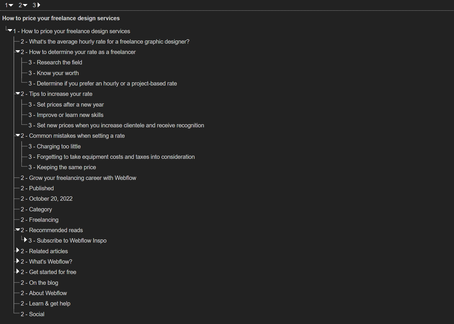
If you read only the heading structure… You should ask yourself:
- Can you fully understand what you will learn on this web page?
- Can anyone, without any prior knowledge, explain to you what they will learn here by reading only the headings?
- Do these headings cover everything there is to cover on this single subject?
- Are all headings necessary? Are more headings needed?
- Do these headings seem very similar to headings on competitor pages that are already ranking for keywords this page was intended to rank for?
If the answers to these questions are all yes, most likely you have a good enough heading structure.
Don’t Skip Heading Levels
Maintaining proper heading structure throughout the entirety of the page is one of the easiest SEO mistakes you can avoid on your Webflow website.
Don’t put H3s under H1.
Don’t put H4s under H2s or H1s.
Instead, put H2 headings under H1, and H3 under H2.
Keep it simple
In one of the sections below, you will learn how to match creative copywriting, design, branding, and SEO heading tags for best results… Using the power of Webflow!
But in general, if you take one takeaway from this article, let it be this:
Keep it simple.
Creative heading issue is one of the most common Webflow SEO issues that stop websites from ranking high. Example:
❌ <h1> We Empower SMEs to Take Back Control of Their Time with Improved Workflows </h1>
What does this business do? What is this page about? No clue.
️✅<h1> Calendar and Task Management Software </h1>
Can you see the difference?
I don’t even need to see the page, to know exactly what I will find there.
Make sure, each heading tag, especially H1 is as direct and simple as possible.
Once again, you should be able to read only headings and not even see the page, while still fully understanding what this page is about, what it’s for, and what you will learn/get if you visit it.
Use Headings to Break Up Text
Large blocks of text can be daunting. Use headings to break up content into manageable sections.
This creates a much better experience for your users since they can just scan the content, and immediately know what they’ll find in each section.
Don’t Use Headings in Navigation, CTAs, and Repeating Elements
If you need headings inside elements that will repeat on different pages, style text blocks as headings instead of using actual heading tags.
Let’s dig deeper into it…
How to make designers, and SEOs happy at the same time
When designers, SEO experts, and developers work on the same website, they focus on different areas to make that site a success.
When it comes to headings, SEO experts try to make sure that:
- Keyword cannibalization doesn’t happen across the whole website
- Headings are optimized and match search intents (or keywords)
- The heading structure covers a topic completely and in needed depth
- Unrelated text is not added to the heading hierarchy
For instance, you should avoid having identical or very similar headings on two different pages, especially if they are at the same level in your website's hierarchy.
No two pages on your website should have the same user goal, thus headings used on those pages should differ to reflect each page's unique goal.
Otherwise, you will have two different pages on your website targeting the same search intent. And search engines don’t like that.
Difference Between Heading Design and SEO Heading Tags
You saw earlier in this article that in Webflow, we can style text blocks to look like a heading.
Website visitors will not be able to tell the difference.
So here’s the pro tip…
You can also style heading tags to not to look like a heading.
Or style heading tags, to look like a different importance heading.
H2 That Looks Like H4
In Webflow, heading tags will inherit global heading styles that were set in your stylesheet.
We can find and change these styles by opening the style selector and selecting HTML Tag.

This will mean that whenever headings are default or will not have a visible style set in their style panel, they will use that global tag style.
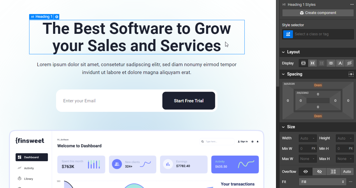
But sometimes, designers might want to make certain headings bigger or smaller. To make them more highlighted or less noticeable.
Then…
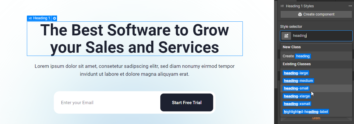
You can change the appearance of the heading tag, regardless of the heading level.
H1 that Looks Like a Tagline
Sometimes, the headings that you need for SEO and the headings that you need for UX or visitor conversion don’t match.
Here’s an example. Imagine that an SEO Expert provided you with a few H1-H2 headings that must be on that page, based on keyword research they did.
But for branding and user experience, you want to have a more benefit-oriented heading.

How do we match this so that SEO strategy doesn’t suffer and branding copy stays relevant?
Here’s how!
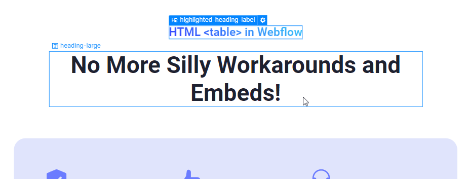
We styled our H2 as a tagline and used a text block styled as a h2 heading.
Your SEO specialist is happy.
The copywriter and designer are happy.
Marketers are happy.
The developer saved the day.
Multiple H1 Headings
While it’s true that when HTML4 changed to HTML5, multiple <h1> tags on the same web page were introduced.
Google also said that they are okay with multiple heading tags, one heading tag, or even no heading tags at all.
But!
Google also said that you should concern yourself with user value, not SEO on this subject.
This is another way of saying that headings matter for the user.
Can You Use Multiple H1 Tags on Your Web Page?
Yes, but we don't recommend it.
Here's a more elaborate answer...
Is it ok to use multiple H1 tags for development and design purposes? Yes.
For SEO? It’s ok.
For accessibility? It’s a no, because users with screen readers could get confused.
New screen readers are great, and multiple H1's aren't a problem if the semantic context is properly set. But, old screen readers often don't interpret semantic HTML elements properly, so if you have more than one H1, the screen reader won't communicating the hierarchy of information clearly.
Imagine listening to website content, and hearing two titles. It would confuse you.
That's why we recommend sticking to only one H1 per page, and using H2's for everything else, but it's up to you.


