Classes strategy 2
Theory of best workflow practices for classes in Webflow Designer. Learn about global classes, stacking classes, and why we don't deep stack in Client-First.
Custom class creation
Make sure to understand the definition of a custom class in Client-First. See the definition in Classes strategy.
Client-First recommends creating and using custom classes for many of elements inside the project.
Although there is a mix of custom classes and utility classes, a majority of most projects will be custom classes
Benefits of custom classes
1. Fast creation
Webflow as a platform was designed around visually styling our web page with the Styles panel. The Styles panel is our big win in Webflow. We can create new classes and apply styles to that class very quickly.
We believe applying classes through the Styles panel should be done freely and frequently inside our workflow.
In traditional website development, creating custom classes for many elements is time-consuming. Classes and styles are written by hand, and writing CSS properties by hand is time-consuming. This is why fully utility-based class systems are recommended in traditional web development.
In Webflow, we have the benefit of the Styles panel, and we must take advantage of it.
In this video, we write out the styles for team-list_ by hand.
In this video, we visually create the styles for team-list_ in Webflow.
2. Easier to customize and safer to edit
Editing the styles of a custom class vs. utility class is very different.
Customizing an instance-specific custom class can often be very straightforward and quick. In our team-list_ example, we need to add an additional style to our display: flex settings.
We are influencing this element specifically and do not have to worry about making a global site-wide mistake. By editing global classes, we may accidentally update elements in the project that we do not want to edit. Editing global utility classes takes more thought and carefulness.
3. Tablet and mobile responsive updates
Desktop design may be very different from tablet and mobile design. There are likely customizations across breakpoints for many elements in our project.
Using custom classes, we can freely make updates across breakpoints. Elements with a dedicated custom class have the flexibility to be styled uniquely on tablet or mobile.
In this example, we change the team-list_ to look different on tablet and mobile. The custom class allows us to make this change with the Styles panel.
When using utility classes and making responsive style updates, we need additional utility classes that give variations for responsive breakpoints.
4. Working with clients
Clients often have feedback and requests that don't follow the default.
"Make this spacing smaller", "Make this box bigger", "Change the color from blue to red", "Change the order of this on mobile", etc.
Client requests can be "random" in that they don't always follow the defaults of a utility class system. Custom class use can help us better manage these random requests.
Clients ask for updates during development and after launch. We feel more comfortable updating a specific element with a custom class rather than a utility class system.
If the client update doesn't fit into the utility class system in the project, the update becomes more difficult. We will need a new class to complete the update.
With a custom class, we can implement style updates quickly.
Using global classes
Make sure to understand the definition of a global class in Client-First. See the definition in Classes strategy.
A global class should be simple, powerful, and meaningful.
Benefits of global classes
1. Manage style values globally across the website.
A global class should be meaningful — It may hold a value to an important set of styles that are managed on a global level.
For example, the Client-First container classes. container-large has a max-width value of 80rem (1280px). If we want our container max-width reduced across the entire website, we can update container-large to 75rem (1200px) in one style change.
This is a global change that updates all instances of container-large throughout the project.
container-large is a powerful global controller inside our project.
2. Faster build time, efficient use of common styles, client convenience.
We may want to use a CSS style as a utility class to help us build faster. For example, hide-tablet or hide-mobile-portrait.
These classes will allow us to selectively change the visibility of elements throughout the website as we're working — without creating additional classes and combos specifically for hiding an element. This utility class can help us work faster inside Designer.
In the example below, we want to hide the last two items in this list for mobile-only. We use hide-mobile-portrait to hide the last two without creating a new class.
Understand that this is not a CSS property that would need to be updated globally. It is unlikely that we would want to show all instances of hidden mobile elements in the project. The goal of this utility class is to improve workflow, while reducing additional custom classes.
Meaningful use of global classes
If a global class does not fall under one of these two benefits, it may not be a beneficial use of a global class.
We can ask ourselves these questions:
Does this style have any benefit of being managed globally?
Does this lead to faster build time, efficient use of recurring styles, or client convenience?
We only want to create and manage a global class if it falls under one of these use cases.
Position absolute example
For example, let’s look at a global utility class called position-absolute, which adds CSS property position: absolute to an element.
There is no reason to change the styles of this class globally. What CSS properties will we update in position-absolute? There is no meaningful reason to update this class globally across the project.
position: absolute is usually not a CSS property that can exist independently. It likely requires additional CSS properties to create a meaningful position.
It’s unlikely that a position-absolute style will improve our build speed since it needs the addition of stacked classes. There will likely be further class stacking for tablet and mobile responsive updates.
Therefore we suggest applying CSS properties like position directly to a custom class.
We do not recommend using a class such as position-absolute as a global class.
Dark section example
Global classes should have a purpose for global updates. An update to the class should significantly benefit global site-wide updates.
For example, we may use the class section-dark to apply color: #ffffff and background-color: #000000 to a section. If section-dark is applied to many sections throughout the project, we can make powerful global updates to our dark sections.
For example, changing background-color: #000000 to background-color: #111111 can be made to one class, section-dark, and that update will be reflected across the entire project.
Stacked global classes
Stacked global classes can help us apply multiple global styles to a single element.
We must approach class stacking with a strategy. Our build can become unmanageable if we stack too many classes on an element.
Stack similar classes
We recommend stacking global classes from the same CSS property or category type. For example, we want to stack:
- Margin classes with margin classes
- Padding classes with padding classes
- Width classes with width classes
- Typography classes with typography classes
Stacking of similar classes is not a strict rule. It is a practice that helps us stay more organized and flexible inside the project. By using this method, we eliminate many cases of deep stacking.
If we have a mix of class properties on an element, our class list grows and introduces a deep stacking problem.
Examples
Let’s look at two examples — margin and typography.
Margin
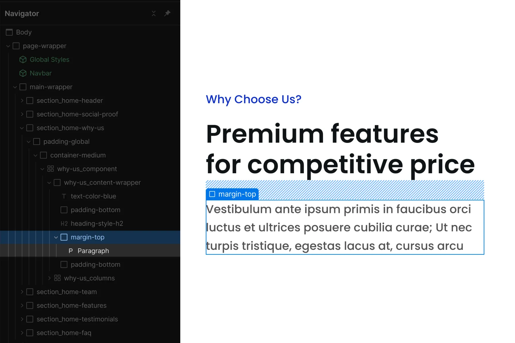
Client-First spacing system uses a stacked global class approach. First, we apply the direction class, margin-top. Then we apply the size class, margin-large.
We do not want to add more classes on top of this.
For example, we would not add a max-width category class on top of our margin classes.
We approach deep stacking if we add additional classes on top of margin-top margin-large. If we place max-width-small in addition to the spacing wrappers, we prevent quick changes to our margin-large class. We have to remove max-width-small before changing margin-large.
This concept applies to all other class categories. We want the Div Block with the margin classes to have margin classes only.
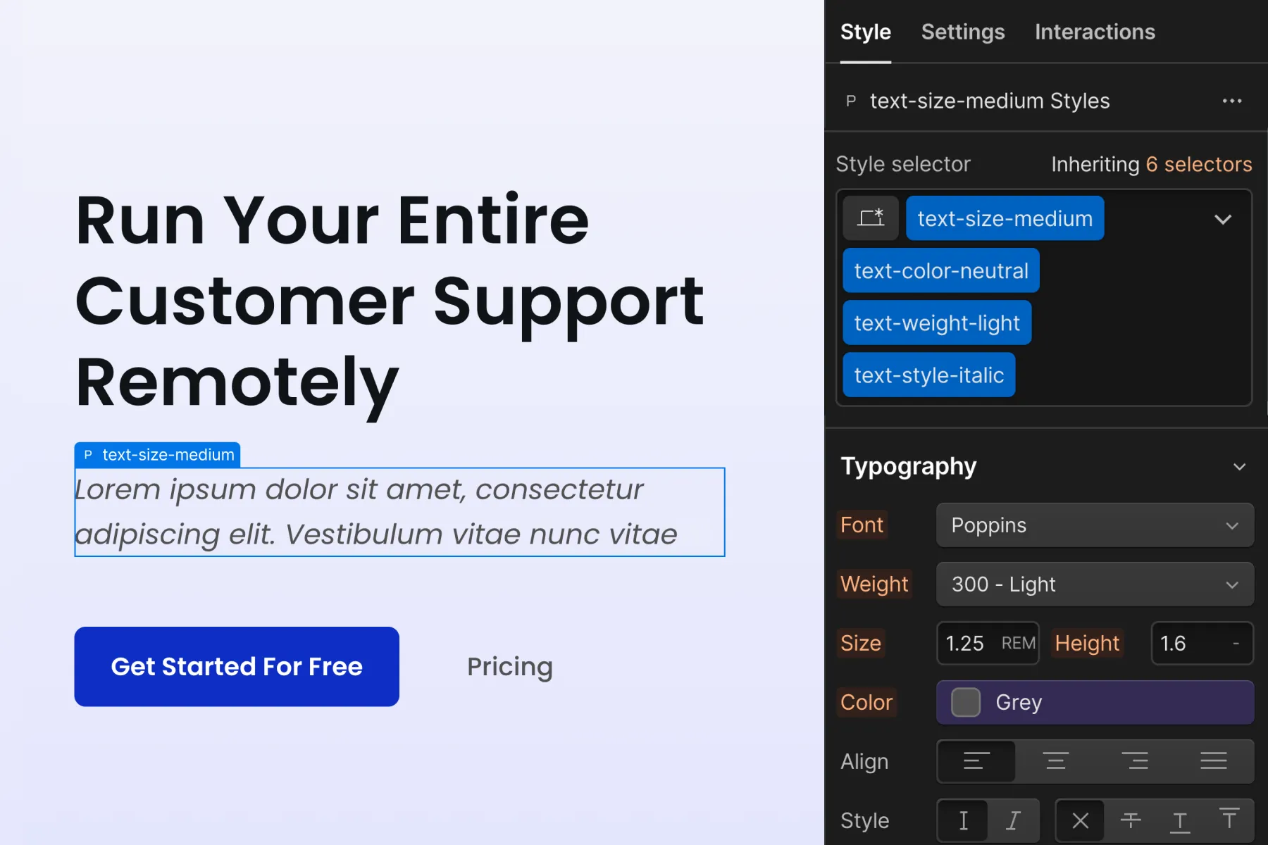
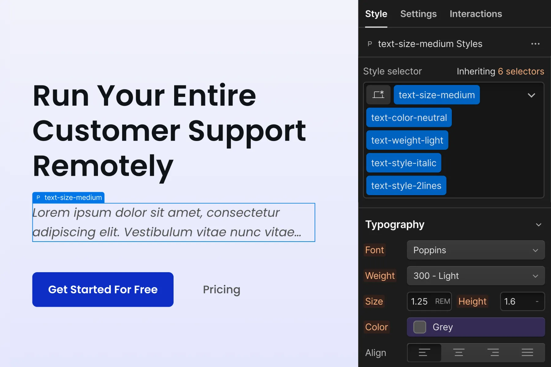
Typography
A text element may require multiple global typography classes. In this case, we can stack multiple classes on the text element.
For example, a large size text that also has a gray color. A text element can get the classes text-size-large and text-color-neutral to receive the styles.
As with margin, we do not want to add more classes on top of this.
We want our typography classes easily accessible inside the styles panel. If we're going to update text-size-large, we do not want to remove many classes after it to access the base class.
Don't add new styles to stacked global classes
We don't want to add new styles to stacked global classes because it will create a new class (a combo class) to the CSS of the project.
Creating instance-specific combo classes from global utility classes, defeats the purpose of true global utility classes. This practice can lead to organization issues as the website scales.
Let’s continue with the examples above — margin and typography.
Margin example
We never want to create a new class with our stacked margin classes. If we have margin-top and margin-large, we should not apply any styles to this stacked combination.
Applying styles like this will create a new class. We will write a new set of styles to the CSS style sheet.
Typography example
We never want to create a new custom class with stacked typography classes. If we have text-size-large and text-color-neutral, we should not apply a new custom style to the stacked classes.
This also results in the creation of a new combo class.
Solutions
Instead of creating a new class from stacked global classes, we propose using these two strategies.
1. Start with a custom class from the beginning.
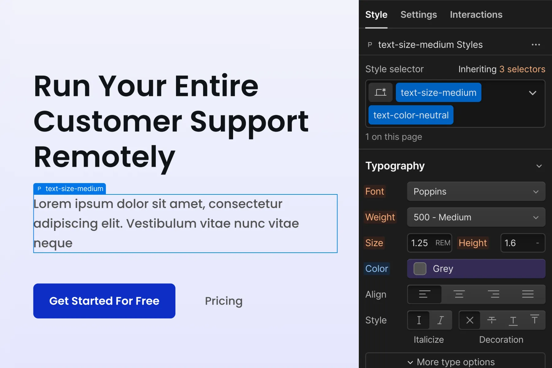
Instead of creating a combo class text-size-large text-color-neutral, create a home-header_text custom class with size, color, and the additional CSS style. This gives us complete style flexibility to add custom styles to the element.
However, we will not inherit any global styles of the text. If we use this method too much, we will no longer have the benefits of globally controlled typography.
2. Use an additional class to create the combo class.
We create our combo class by adding a new class in addition to our utility classes. The class is called is-home-header, and a combo class is created for all three classes.
This method maintains important style properties in text-size-large text-color-neutral, while customizing the instance with is-home-header. is-home-header holds all of our custom styles for this instance.
This method is most valuable when we want certain CSS styles to stay global across the project. In this example, CSS properties font-size (text-size-large) and color (text-color-neutral) remain globally controlled.
Combo classes
What is a combo class?
A combo class is a variant to a base class. A combo class inherits styles from the base class and adds more styles on top of it.
We define the "base class" as the first class in our list of stacked combo classes in a combo class. We add a class on top of the base class to create a unique variation.
The combo class will only work when combined with the base class(es) before it. In the video below, understand that is-brand does not work alone. It only works as an addition to the base button class.
The key difference between a stacked global utility class and a combo class is:
- A combo class creates a new class and adds a new style declaration to the CSS file of the project.
- Stacked global classes do not create a new class or style declaration in the project.
-is prefix
To stay organized and straigthforward with our combo class use, we use is- as a prefix in the class name. When we see is- we know this class is created as a combo class on top of another class.
Inheriting styles from the base class
Combo classes have one core requirement for creation — the combo class must have a clear benefit for inheriting styles from the base class.
In a combo class, we define the "base class" as the first class in our list of stacked combo classes. The base class should hold the default styles that any custom variant builds in addition to.
The class added on top, which creates the combo class, is the variant. Each variant should have a good use case to inherit the styles from the base class.
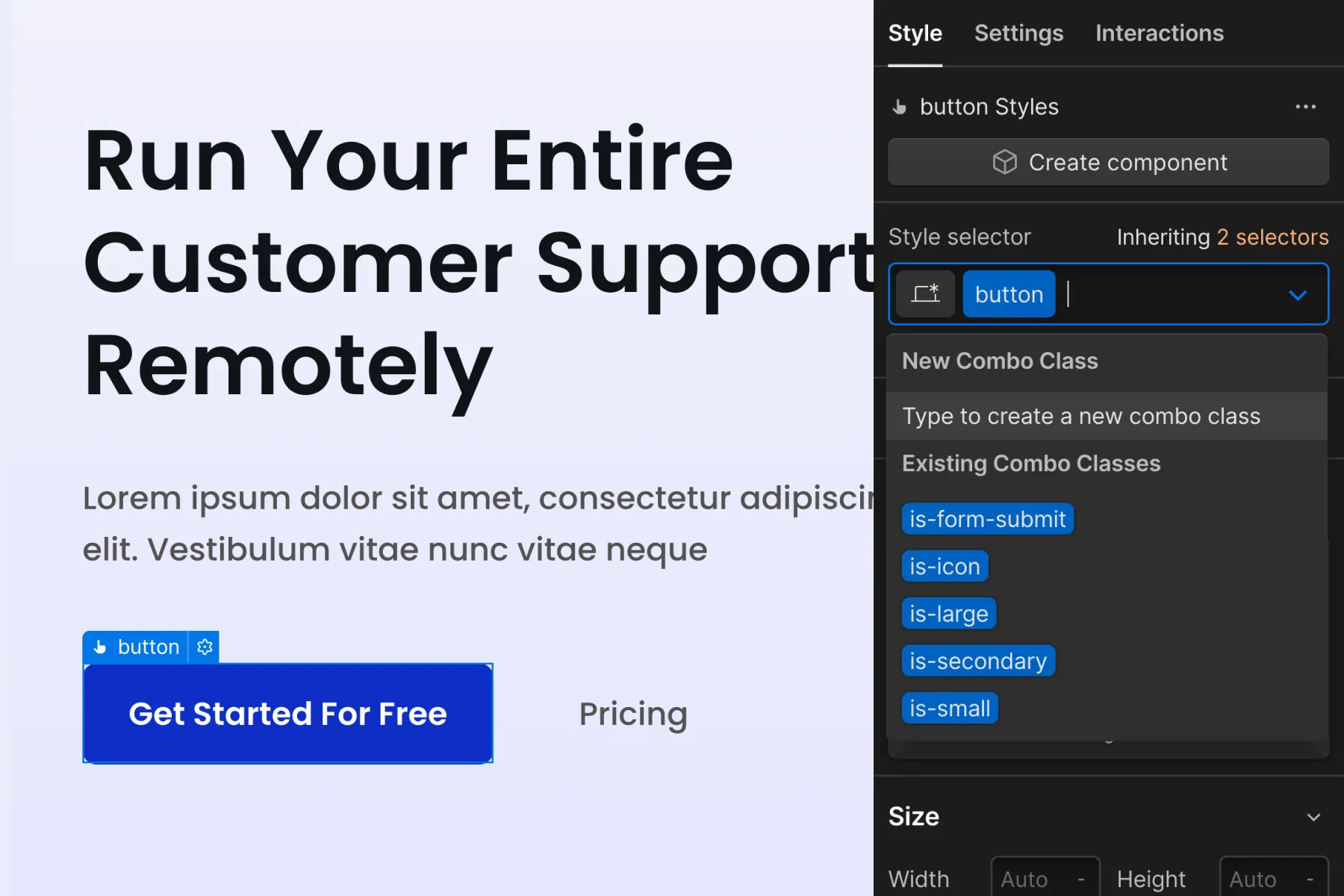
Button example
Let’s look at an example of a button combo class system.
The button class is our base class. All style variants below are on top of the button class.
is-primary, is-alternative, is-inactive, is-dark
We can add these styles to button to show a variation. It's crucial to understand that the is- classes will not work alone. They will only work as an addition to the button class.
The button class is an important base class in this example.
We want all of our buttons, regardless of the variant, to have the same padding and font-size. We define these properties in our button base class.
Each of the is- variants inherits these important global styles from the button.
This button combo class system allows us to globally update the padding and font-size CSS properties for all buttons across the project. All default buttons, and all variant buttons, will receive the global style update.
There is a clear benefit of being able to manage these styles globally. We can make significant site-wide changes to all buttons with one class update.
This button combo class strategy is an excellent example of powerful and efficient use of combo classes.
Combo classes with purpose
Combo classes are powerful, and we must use them with care and purpose. A poorly built combo class system can cause scaling and organization problems inside the project.
There must be some use case to inherit styles from the base class. If there is no use case, there may not be a reason to use a combo class system. It may be better to create a single custom class that holds all stacked styles.
Container example — Unneeded combo class system
We will review an example of a container combo class system with no clear purpose of combo class benefit.
Our container class modifies several settings: margin: 0 auto, width: 100%, and a variable max-width value.
It is tempting to create combos of container is-large, is-medium, is-small. It seems like a perfect use case for combo class because we have two shared CSS properties and one variable size property.
However, the two shared CSS properties — margin and width — are not CSS properties we should manage globally on a base class. It is not good practice to change these properties to any other values. For example, we would not want to change width: 100% to width: 90%. Additionally, we would not want to change the margin: 0 auto values.
Since we do not need to manage margin or width in the base class of container, there is no benefit in a combo class management system. The only property value we need to modify is our max-width class.
Instead of container is-large combo class we apply all styles directly to a single class — container-large. We always prefer to work with a single class instead of a combo class. If a combo isn't needed, we don't want to use it.
Additionally, with the size name in the class name, we improve the scannability of our class names in the Navigator panel. We will see container-large as the class name instead of container only.
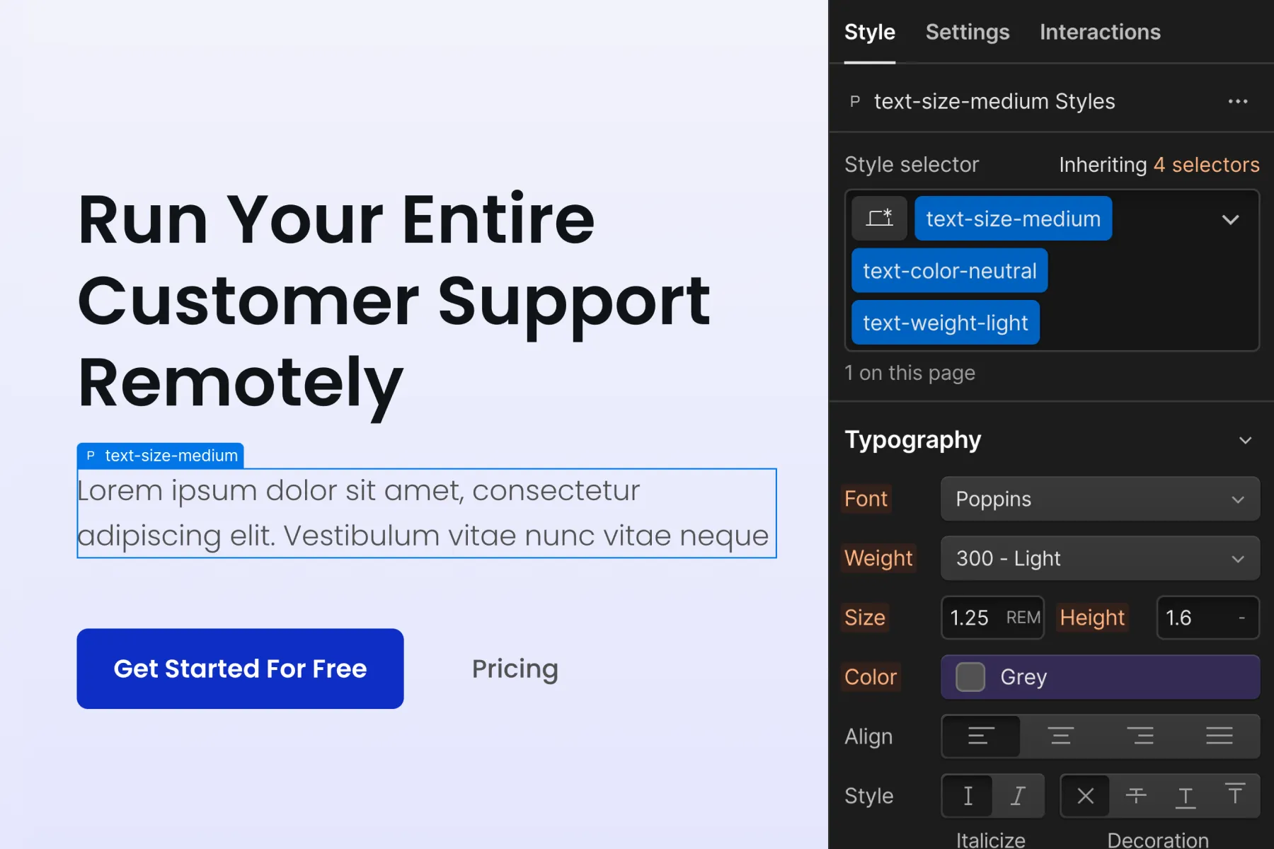
Typography example — Inheriting desktop, customizing for mobile
We need to customize a text element because it is unique on mobile. On desktop and tablet, this element follows the default text-size-large style. On mobile, it requires a unique update that does not fit into our global utility class by default.
1. Start with a custom class from the beginning.
We have the option to create a new custom class to manage the typography across all breakpoints. For example, home-header_text-subtitle. With this strategy, we do not use the utility class system. The downside to this strategy is that we no longer maintain the global size values for desktop and tablet. If we wanted to make a global update to our text-size-large on desktop, the custom class does not get that change.

2. Use an additional class to create the combo class.
If globally managed typography is important in our project, we can consider a new combo class. For example, text-size-large is-home-header. The benefit of this implementation is that we can maintain our global styles on desktop and tablet and then only customize them for mobile. When we make a global change to our text-size-large class on desktop this element will receive those updates through the global system.
Using this strategy with other utility classes
This concept works for other utility class systems in the project. For example:
icon-medium is-footer
button-primary is-nav
heading-medium is-mobile-effect
Make sure there is a purpose in creating a combo class from a global utility class. There should be a clear use case to maintain the global styles and then add additional styles.
Don't deep stack! The is- combo class strategy becomes less effective when there's a series of stacked global classes. For example, text-size-large text-color-primary text-style-underline is-testimonials-title are too many stacked classes.
We want to avoid deep stacking at all times.
Don’t deep stack
Reasons to not deep stack
1. Workflow problems in Webflow Styles panel
We don’t have free control over combo classes in Webflow.
- We are unable to reorder stacked classes inside the Styles panel.
- We can not make edits to deep stacked classes on mobile breakpoints.
- We do not have complete control to manage stacked classes inside Designer visually.
Removing all of the later classes in a deep stacked class list is a difficult process. As the class list becomes longer, there is a higher chance for error and frustration when making edits.
We believe this is a non-efficient workflow and an inherent issue with Webflow UX.
We have designed this Client-First principle specifically around the way Webflow’s Designer UI allows us to interact with stacked classes.
2. Many steps for small changes
The limitations in the section result in a time-consuming process when editing deep stacked classes.
Deleting a list of classes to remove a single class early in the deep stacked list is not a fun practice. We may become frustrated with these extra steps if this is a constant practice in our workflow.
Additionally, we have workflow issues with class editing for mobile breakpoints. When we need to make customizations specific to mobile, we may have style conflicts from earlier stacked elements.
3. Increased learning curve
We believe that deep stacking leads to a larger learning curve because there is a deeper requirement for understanding what the classes do.
A user entering the project must
- Have a strong understanding of CSS
- Understand what each class in the stacked list is doing
- Understand the nuances of class stacking in Webflow
We believe this increases the learning curve for our project.
When we use Client-First, we want to lower the learning curve continually. We should push ourselves to create elements, use classes, and implement strategies that are easy to understand, manage, and scale. This is what makes a powerful Webflow project.
4. Writing CSS in Webflow is fast
We don't need to save time writing CSS in Webflow.
Explained in full above Custom class creation > Benefits of custom classes > 1. Fast creation.
5. There is a tiny CSS savings
Example of small CSS savings — For example, load times of a 52kb CSS file vs. a 65kb CSS file is a negligible.
We do not believe the relatively low savings in the CSS style sheet outweigh the benefits of custom class creation.
Deep stack limits
In Client-First we stack, but we don't want to deep stack. Below we look at the number of classes stacked on an element.
1 or 2 classes on an element
Great. This is common.
3 classes on an element
Ok, but why do we need 3 stacked classes? Is it necessary?
4 classes on an element
Absolute maximum stacking. Do we really need 4 stacked classes?
5 classes on an element
Too much. It will be difficult to manage. Create a custom class.
Strategies to avoid deep stacking
1. Use one single custom class
Rather than stacking multiple classes, we can start with one single custom class. We can style the element with one class without any class stacking. Our stacked styles will be applied to a single custom class.
2. Nest another Div Block
When our classes stack too high, we can create a nested Div Block that manages an important style.
The core structure used in Client-First takes this approach. Instead of stacking many classes on one element, we break up classes by type and use several nested layers of elements.
A nested layer separates styles that have different purposes. We maintain our global utility class system while avoiding deep stacking.
This same concept applies to Client-First spacing system. For example, by implementing a spacing wrapper concept, we separate margin-top and margin-large from other elements.
3. Create a combo class
For example:
section_header + is-mobile-reverse + background-color-brand + text-color-alternate
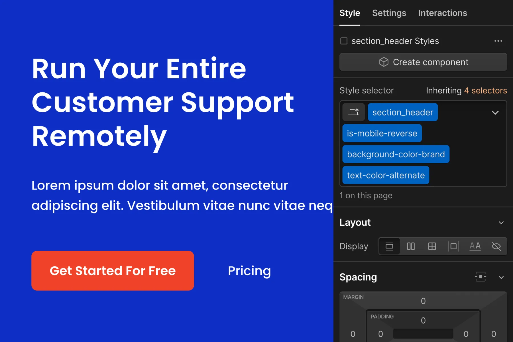
Can turn into:
section_header + is-home-header
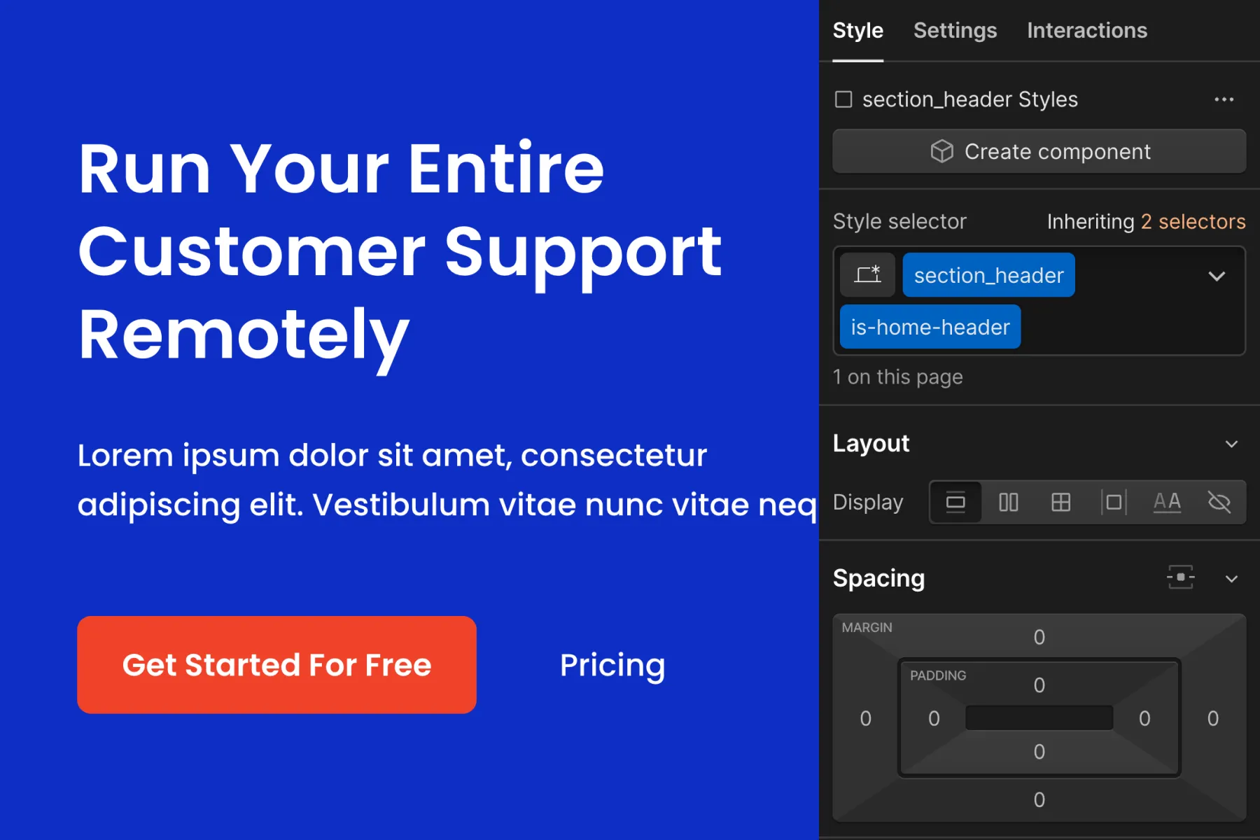
We inherit the important global styles from section_header, for example, padding, z-index, and transition.
Our is-home-header class is a combo class, which adds background-color, text color, and responsive layout changes to the instance.
Instead of stacking four classes, we have reduced the stacking to two classes. This is easier to manage and more flexible for updates.
No layout system
No flex, grid, column, or layout classes
No flex, grid, column, or layout classes are included with Client-First.
We do not recommend a fully global managed flex or grid class system inside Webflow. We encourage custom class creation using flex, grid, or any column layout system.
Example 1 of what we don't like
Let’s build a grid layout with utility classes. This example is not a practice of Client-First. Instead, it is an example of why we do not have a formal layout system included in Client-First.
grid-3-col gap-large tablet-grid-2 mobile-grid-1
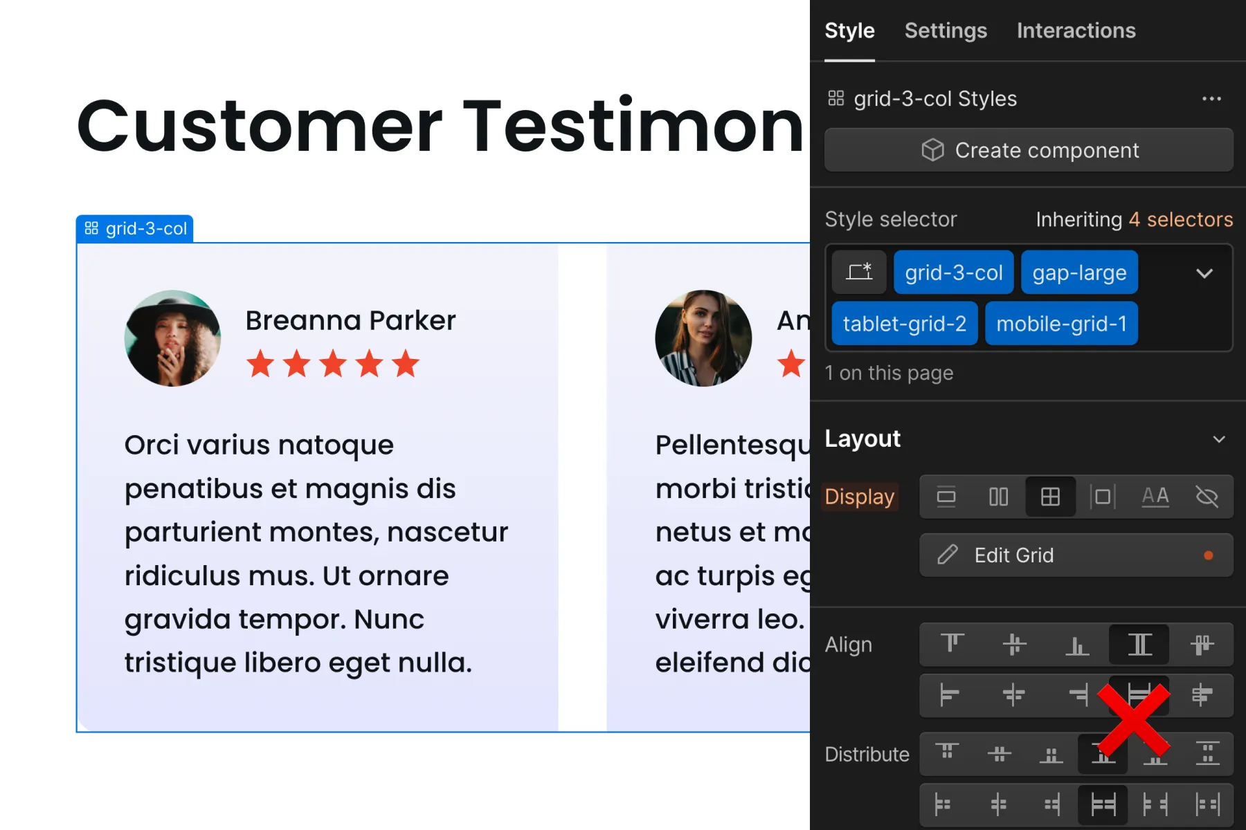
Now imagine the client asks to create less space between the items on tablet. The gap-large that we needed on desktop is no longer needed on tablet. We need a much smaller gap. However, we’re inheriting our gap-large from desktop.
Our class list can get long when adding custom tablet and mobile add-ons to our utility layout system. Tablet and mobile responsiveness variations can result in super deep stacking.
To satisfy every use case of every layout size option across all breakpoints, we need a large and complex layout system. We will have to create a new class to achieve the layout if there's no utility class available for our responsive customization.
Many steps are required to go from a blank Div Block to a finished responsive element.
Example 2 of what we don't like
It's possible to reduce the number of classes in a utility class system by grouping multiple CSS properties into one class.
For example, flex-a-l-j-c + flex-mobile-a-c establishes the flex settings on the base breakpoint and the mobile variation.
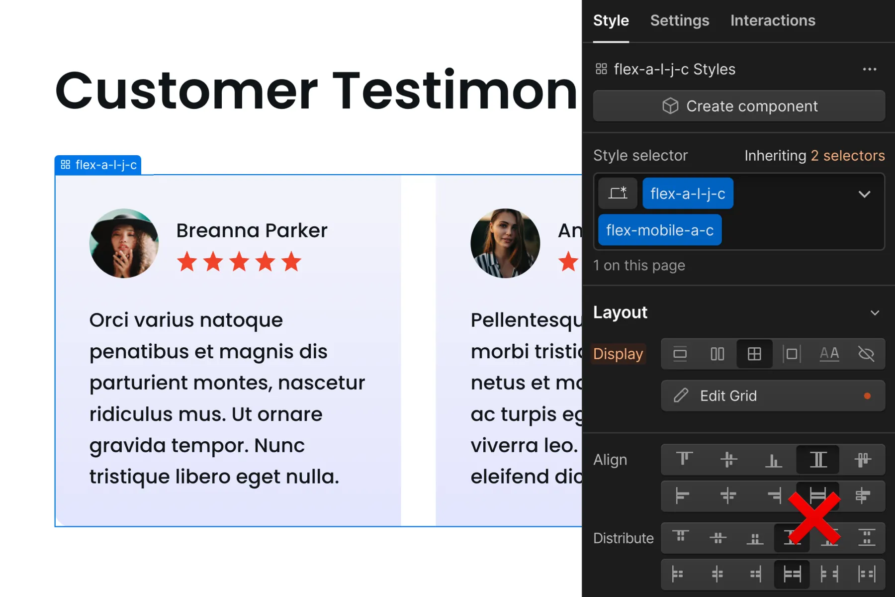
This naming is unclear to someone who doesn't know this layout system. As the original developer, we may know it, but that doesn't mean other developers or our clients will.
We don't want to see col-2-d + col-5-t + col-12m either.
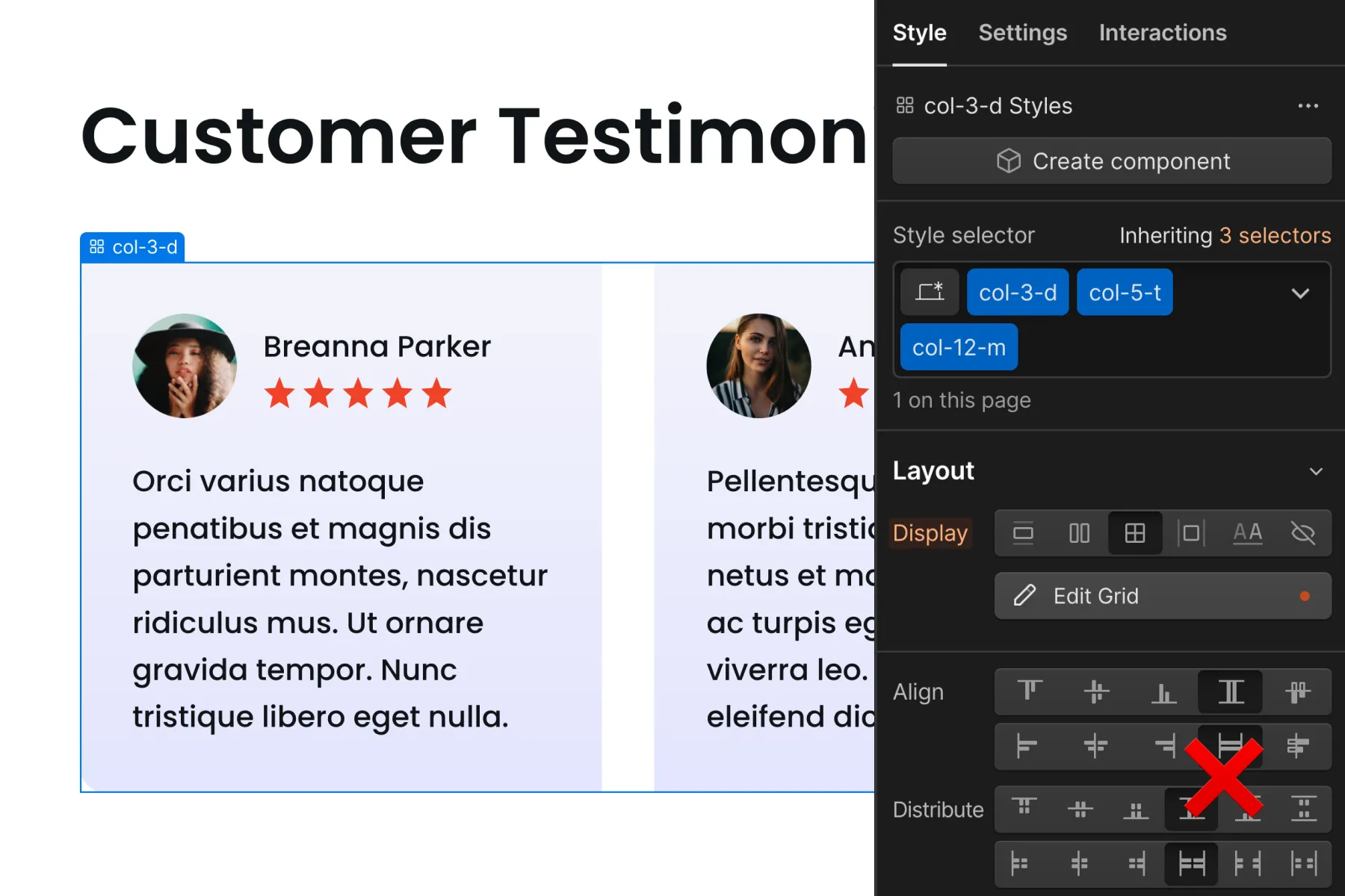
Although this convention may be clearer, we still need to understand how this system works. It's unclear what our options are to continue building in the project.
What do the numbers mean? What do the letters mean? What are the columns? How do responsive updates work? What do I do when I need a unique customization?
Example of what can work with Client-First
We can use the power of global classes to create layouts in Client-First. Global layout systems can be Client-First friendly. If that's what is best for our build, do it.
For example, grid_col-2 and grid_col-3 can be used as the default 2 and 3 column layouts. On desktop they are all equal. A combo class is-specific-instance can be created for tablet and mobile instances that are different from the default.
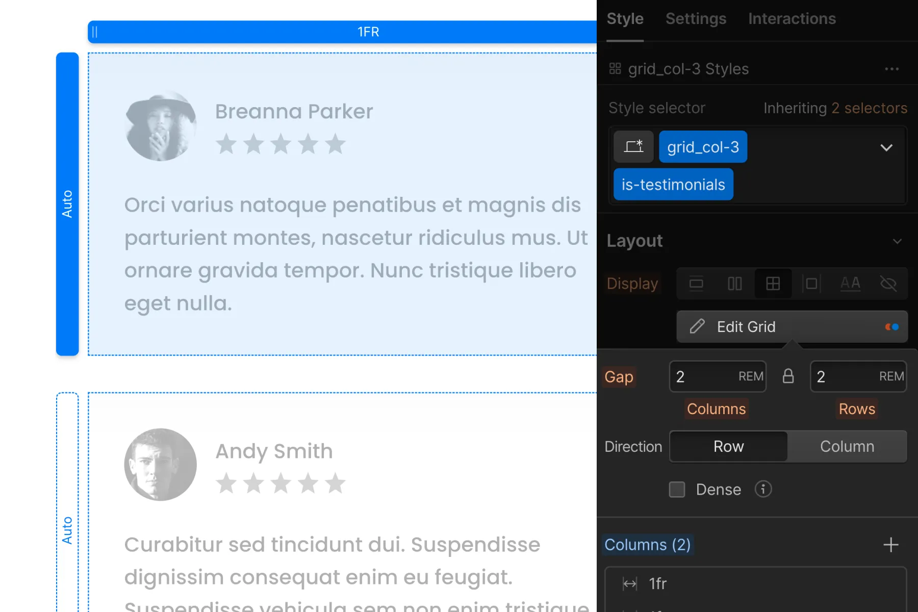
We do not want to lock everybody into a deep global class layout system for every layout, section, or page of our build. Using a combo class system like this can be Client-First friendly while maintaining layout unity.
Create layouts with custom classes
We can create simple and complex layouts using custom classes. We can use custom classes for all layouts in our projects if we want.
Custom classes are excellent for building layouts. Custom classes allow us to:
- Quickly build page structures
- Quickly make edits in the future
- Make all responsive customizations
- Prevent accidental site-wide layout breaking
- Hand off our project with a minimal learning curve