Utility class systems
Review the utility class systems included with the official Client-First project cloneable. We start each project with this set of utility classes.
Intro
Client-First cloneable includes utility classes and styles that help us start any Webflow project.
These classes are not specific to any website, design, style, or layout. Utility classes manage important CSS properties used throughout many pages, sections, or elements.
Some utility classes allow us to make powerful global changes to elements throughout the build. For example, a class that applies universal horizontal padding.
Some classes are for improved workflow. For example, a class that applies display: none.
It's important to know that all included utility styles inside Client-First are optional. If the build requires us to organize spacing differently or use a unique structure for outer page structure, we may do it. We find that most projects work very well with the utility classes inside Client-First.
Most important utility systems
Three primary global utility class systems come with Client-First — Core structure, typography, and spacing.
We have identified these as our most essential global-use classes when building in Webflow. Each global utility class system has a dedicated strategy page to explain how we use it.
Structure
Defined and flexible Core Structure we can use on all or most pages.
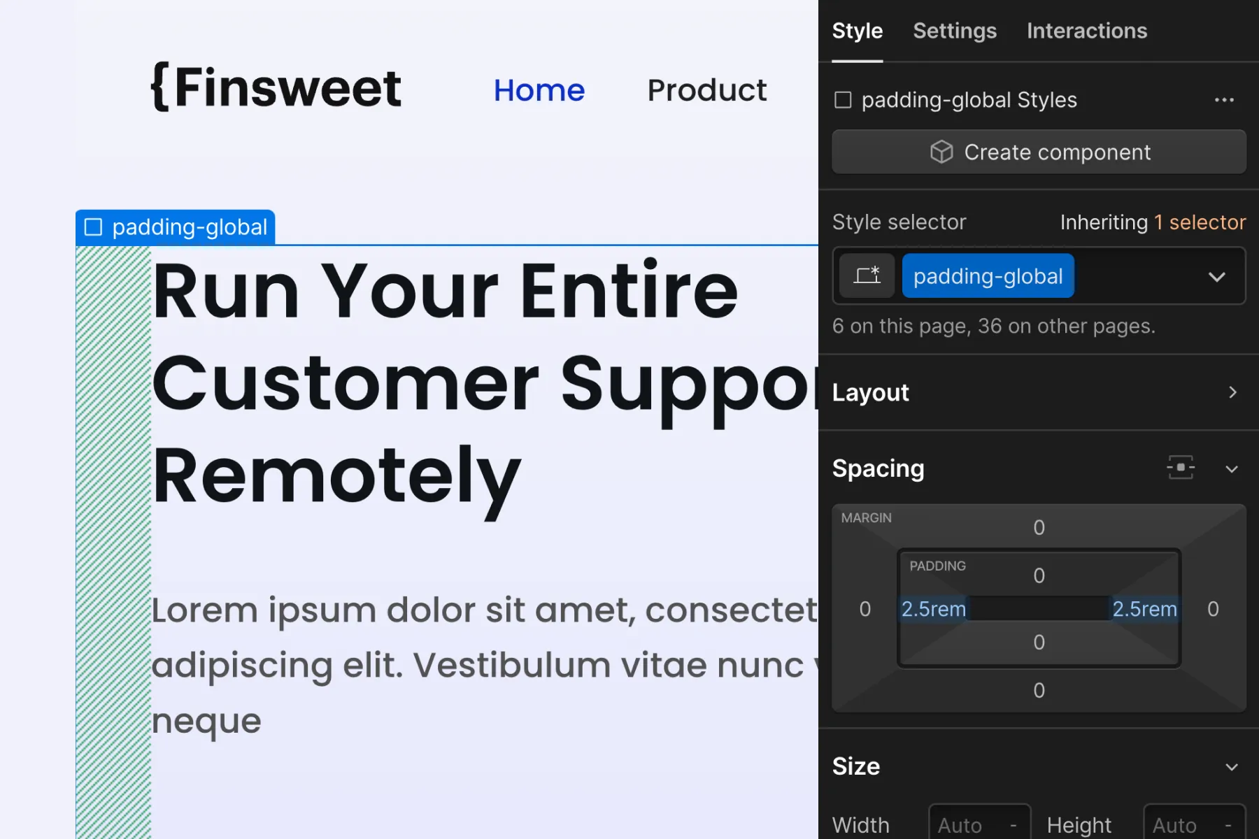
Global horizontal padding
Global horizontal padding manages the left and right padding of a page's content.
- padding-global
Container size
Global max width values that serve as max-width containers for content.
- container-large
- container-medium
- container-small
Learn more about core structure in Core structure strategy.
Section padding
Section padding manages a global vertical spacing system for sections.
- padding-section-small
- padding-section-medium
- padding-section-large
The padding-section-[size] utility class should be used on the div block with the padding-global class applied to reduce nesting elements as example below:
Typography
Client-First includes a global utility system for headings, typography sizing, coloring, and customizations.
HTML tags
We always use the HTML tag to define default Heading styles.
- body
- H1
- H2
- H3
- H4
- H5
- H6
Heading style switch
Change the default Heading style.
Use class prefix heading-style- on H1, H2, H3, or any other piece of text to change the text to a specific H heading size. For example, if we have an H2 that should be styled like an H3, we can use H2 for SEO purposes and apply heading-style-h3 to the element.
- heading-style-h1
- heading-style-h2
- heading-style-h3
- heading-style-h4
- heading-style-h5
- heading-style-h6
Text size
Use class prefix text-size- on a text element to change the size of the text.
- text-size-large
- text-size-medium
- text-size-regular
- text-size-small
- text-size-tiny
Text style
Use class prefix text-style- on a text element to change the style of the text.
- text-style-allcaps
- text-style-italic
- text-style-link
- text-style-muted
- text-style-nowrap
- text-style-quote
- text-style-strikethrough
- text-style-2lines
- text-style-3lines
Text weight
Use class prefix text-weight- on a text element to change the weight of the text.
- text-weight-xbold
- text-weight-bold
- text-weight-semibold
- text-weight-normal
- text-weight-light
Text alignment
Use class prefix text-align- on a text element to change the alignment of the text.
- text-align-left
- text-align-center
- text-align-right
Text color
Use class prefix text-color- on a text element to change the color of the text.
- text-color-primary
- text-color-secondary
- text-color-alternate
Buttons
Use class prefix button- to use a button style.
- button
- button is-secondary
- button is-text
Learn more about typography in Typography strategy.
Spacing
Spacing system that keeps vertical and horizontal spacing global on our website.
To learn more about margin and padding classes, review the Spacing strategy page.
Margin direction
- margin-top
- margin-bottom
- margin-left
- margin-right
- margin-horizontal
- margin-vertical
Margin size
- margin-0 0rem
- margin-tiny 0.125rem
- margin-xxsmall 0.25rem
- margin-xsmall 0.5rem
- margin-small 1rem
- margin-medium 2rem
- margin-large 3rem
- margin-xlarge 4rem
- margin-xxlarge 5rem
- margin-huge 6rem
- margin-xhuge 8rem
- margin-xxhuge 12rem
- margin-custom1 1.5rem
- margin-custom2 2.5rem
- margin-custom3 3.5rem
How it works:
Padding direction
- padding-top
- padding-bottom
- padding-left
- padding-right
- padding-horizontal
- padding-vertical
Padding size
- padding-0 0rem
- padding-tiny 0.125rem
- padding-xxsmall 0.25rem
- padding-xsmall 0.5rem
- padding-small 1rem
- padding-medium 2rem
- padding-large 3rem
- padding-xlarge 4rem
- padding-xxlarge 5rem
- padding-huge 6rem
- padding-xhuge 8rem
- padding-xxhuge 12rem
- padding-custom1 1.5rem
- padding-custom2 2.5rem
- padding-custom3 3.5rem
How it works:
Remove all spacing
Sets all margin and padding to 0. Useful for removing native Webflow component spacing.
- spacing-clean
Learn more about spacing in Spacing strategy.
Useful utility systems
Utility classes we like to use in most of our projects to build faster.
Responsive hide
Show and hide elements by screen size.
- hide - hide on all devices
- hide-tablet - hide from tablet resolution
- hide-mobile-landscape - hide from mobile landscape resolution
- hide-mobile-portrait - hide from mobile portrait resolution
Display inline flex
Apply CSS property display: inline-flex, which is not a supported CSS property in Webflow.
- display-inlineflex - Sets display: inline-flex at the base desktop breakpoint.
Use case: Using the CSS property display: flex is usually important in our project. However, display: flex causes elements to take up 100% of the space by default. This makes it difficult to use flexbox for buttons. display: inline-flex allows elements to behave as inline, while maintaining flex capabilities inside them.
Max width
Add max-width to any element on the page.
Use container- classes for the primary outer content max width. Use max-width- classes for max width use cases nested within the container-.
- max-width-xxlarge 80rem
- max-width-xlarge 64rem
- max-width-large 48rem
- max-width-medium 32rem
- max-width-small 20rem
- max-width-xsmall 16rem
- max-width-xxsmall 12rem
Max width full
Sets max-width: none.
- max-width-full - sets max-width to none
- max-width-full-tablet - sets max-width to none on tablet
- max-width-full-mobile-landscape - sets max-width to none on landscape
- max-width-full-mobile-portrait - sets max-width to none on portrait
Icon sizes
Sets a height or height and width of icons. Icon 1x1 sets both width and height values. Useful for social icons, company logos, footer assets, etc.
- icon-height-small
- icon-height-medium
- icon-height-large
- icon-1x1-small
- icon-1x1-medium
- icon-1x1-large
Background colors
Background colors help apply a recurring background-color CSS property to elements in our project.
- background-color-primary
- background-color-secondary
- background-color-tertiary
- background-color-alternate
Useful utilities to build with
More advanced uses. Not required to use.
- z-index-1 - sets z-index: 1
- z-index-2 - sets z-index: 2
- align-center - sets margin-left and margin-right to auto, centers an element inside its parent div.
- layer - sets position: absolute with 0% on all sides. Add this class to a div to make it expand the entire size of the parent element. Make sure the parent div has a position that is any other than static.
- pointer-events-none - sets pointer-events: none, which prevents all click and hover interaction with an element.
- pointer-events-auto - sets pointer-events: auto, which enables all click and hover interaction with an element
- overflow-hidden - sets overflow: hidden
- overflow-scroll - sets overflow: scroll
- overflow-auto - sets overflow: auto
- aspect-ratio-square - sets aspect-ratio: 1 / 1
- aspect-ratio-portrait - sets aspect-ratio: 2 / 3
- aspect-ratio-landscape - sets aspect-ratio: 3 / 2
- aspect-ratio-widescreen - sets aspect-ratio: 16 / 9
Global embed
Client-First comes with a symbol embed block that holds our global site-wide custom CSS styles. This embed block symbol should go on every page of the project.
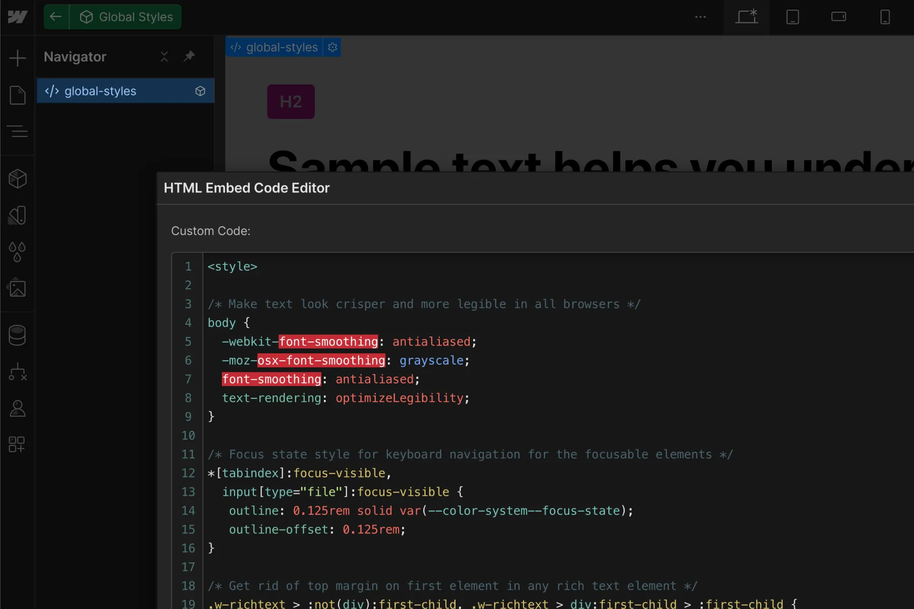
Custom CSS styles are best implemented through the native embed block — not Page Settings or Site Settings custom code.
Styles are added to an embed so we can see the CSS inside Designer
The ability to see our CSS inside the Designer canvas is the primary reason we use the symbol embed block instead of Site settings.
When the code is in Site Settings, we can only see the CSS on the published site.
When the CSS styles are in an embed inside Designer, we can see these styles visually while we work inside Designer. In most cases, it's preferred to see custom CSS styles directly inside Designer.
Update a few Webflow default styles.
We have several styles inside the symbol that overwrite default Webflow styles, which we prefer not to have in our project.
Built for adjustments and updates
The Client-First utility styles and the global embed block styles can be changed based on our project.
The cloneable starter project includes comments for each style inside the embed. If you are unsure what the custom CSS does, leave it and do not delete it. Each line in the global embed is there for a reason and is likely beneficial to the project.
Learn more about the Global embed
The Global embed page explains each CSS snippet in the embed. Understand each snippets use case and why it's part of the Client-First cloneable.