Spacing strategy
Make intelligent spacing decisions inside Client-First. This documentation page explains strategies for applying spacing throughout our project.
Intro
Spacing strategy
This page explains how to implement all spacing methods recommended by Client-First.
Client-First spacing strategy should bring more consistency to our project. We want to create less chaos and confusion. Our workflow and project quality improves if we use Client-First spacing strategies intelligently.
We organize this docs page into two parts:
- Part 1: Utility classes
- Part 2: Custom classes
Part 1: Utility classes
Part 1 of Client-First spacing is about global utility classes. We include several strategies for using utility classes inside the project.
Different projects, use cases, and implementations may favor one strategy over another. Having multiple spacing strategies with utility classes gives us flexibility when building our projects.
Client-First utility class spacing gives us options for implementation:
- Spacing block strategy: Option 1 (spacer- classes) or Option 2 (padding- classes)
- Spacing wrapper strategy (margin- / padding- classes)
These utility class systems are included with the Client-First utility classes.
Spacing block strategy
Option 1:
spacer-[size]
Option 2:
padding-bottom + padding-[size]
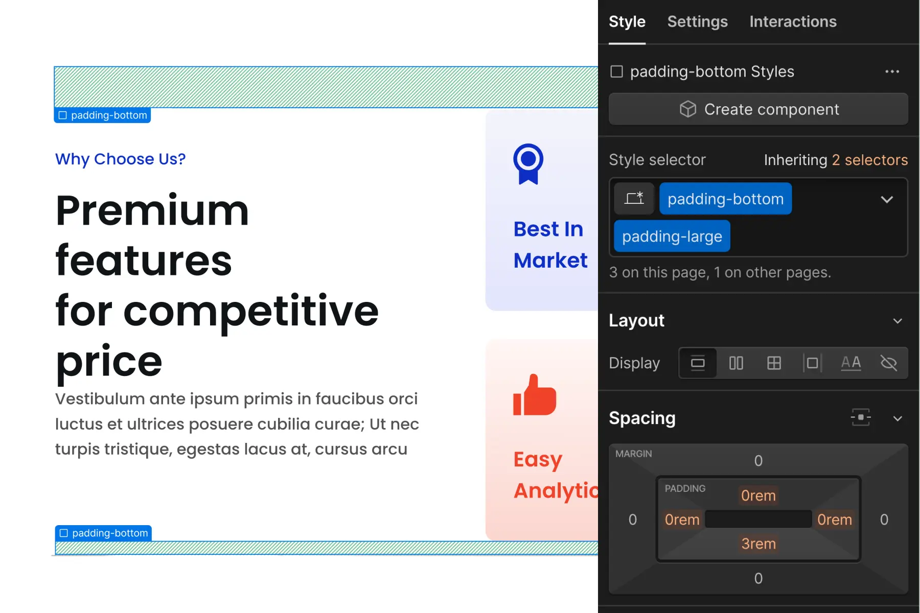
In Client-First, a "spacing block" is an empty Div Block with utility class(es) that creates space between two sibling elements.
1. Add a Div Block to the page with the class—
spacer-[size]
2. Add content elements to the page as siblings of the spacing block.
3. The spacing block creates space (padding) between elements.
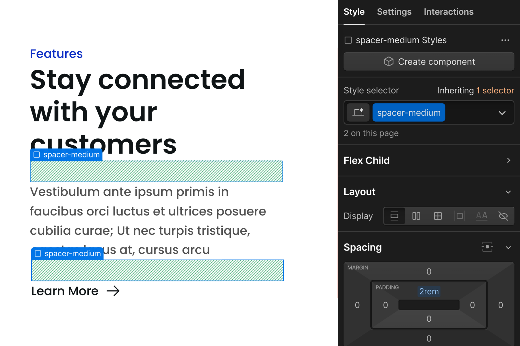
Spacing blocks can be used to create space between any elements vertically.
Option 1 or 2?
The spacer- system is similar to the padding-bottom + padding-[size] system, and they both achieve the same outcome.
Client-First gives you the option to choose which implementation method works best for your workflow.
The primary difference is that spacer- classes use one class, while the padding- based classes use two classes.
With the two class implementation, we apply padding-bottom class (direction) and then add our padding-medium class (size) in addition to it. Together, the two classes apply padding-bottom: 2rem to the element.
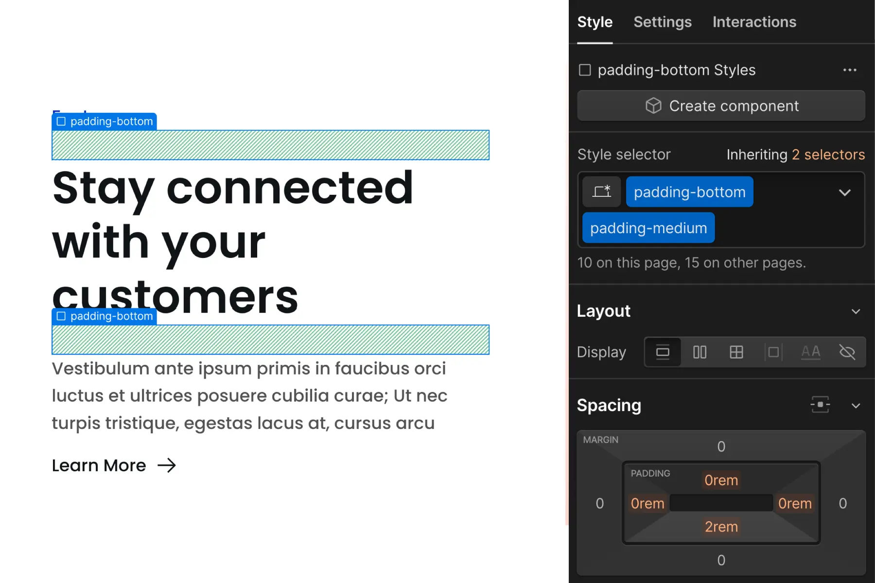
The decision to use one or the other is up to you as the developer.
One benefit of the spacer- class system is the option to add responsive variants. This is explained later in the page.
Spacing wrapper strategy
padding-[direction] + padding-[size]
and
margin-[direction] + margin-[size]
In Client-First, a "spacing wrapper" is a Div Block that wraps a child element and creates space between a sibling element.
1. Add a Div Block "spacing wrapper" to the page with two classes —
margin/padding-[direction] + margin/padding-[size]
2. Nest a content element inside the spacing wrapper.
3. The spacing wrapper creates space (margin or padding) between itself and a sibling element.
We add a Div Block to the page and apply margin-bottom class (direction) and then add our margin-medium class (size) in addition to it. Together, the two classes apply margin-bottom: 2rem to the element.
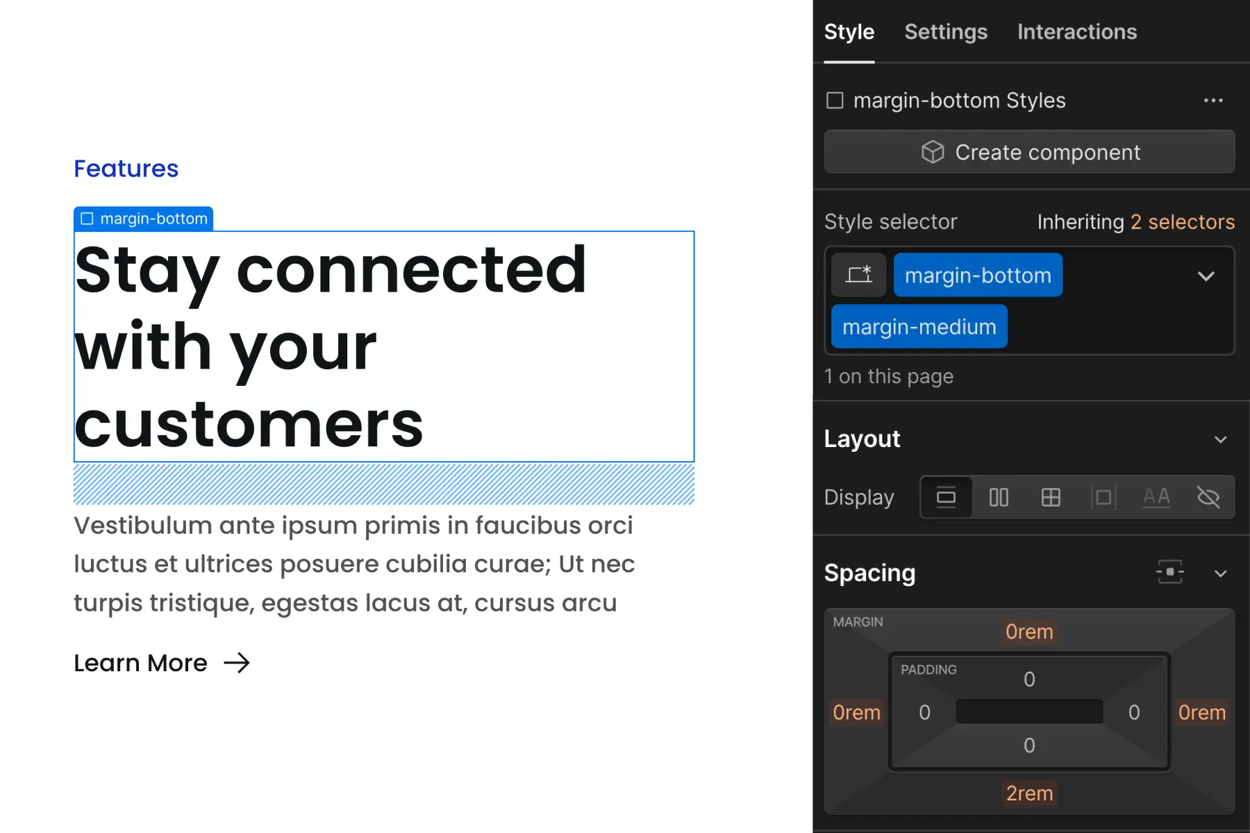
We nest an element inside the spacing wrapper to create space between the nested element and something else.
Use cases for: Utility spacing in general
1. Use default global spacing values
Benefit: We keep our spacing values more consistent and unified throughout the project
We want to unify our website's spacing across sections and pages. If we're using 4rem, 8rem, 12rem as our primary spacing values across the project, we want those values to be consistent everywhere.
The more we use the Client-First utility spacing system, the more consistent our spacing will be throughout the project.
Benefit: We have default and automatic spacing updates across tablet and mobile breakpoints.
A spacing block or spacing wrapper automatically implements unified site-wide spacing adjustments across all breakpoints.
If we apply spacing blocks and wrappers to 100 elements across the project, that's 100 fewer tablet and mobile styles we have to apply in our project.
For each breakpoint level, elements spaced with blocks and wrappers will receive the default spacing values used across the project.
Benefit: We can make global site-wide spacing updates throughout the project.
We can update many spacing values across the project with one CSS property value change. The update influences every element that uses a utility spacing class. For example, if a client says, "I want less spacing between all of the content", this update can be made relatively quickly by adjusting the global utility spacing values.
2. Workflow and scalability benefits
Benefit: If we are using a utility class strategy, we can reduce the number of custom classes used for margin and padding CSS properties
We want to reduce the number of custom classes created specifically for spacing. Spacing blocks and wrappers can help us create fewer classes for our project.
We can rely on the utility classes already created for the spacing. As we use the utility spacing system more, we will rely less on creating custom classes for spacing.
Benefit: We avoid deep stacking classes on top of an element.
Client-First is against deep stacking inside Webflow projects. We want to avoid deep stacking at all times. Spacing wrappers and blocks help us avoid deep stacking classes on our elements. Learn more about deep stacking in Classes strategy 2.
Benefit: If used correctly, spacing wrappers can help us work faster.
Spacing blocks and wrappers in Client-First exist to help us work faster and maintain our project better.
If we use wrappers and blocks, and this results in a slower workflow or project management difficulty, we may be misusing spacing wrappers.
It's not required or recommended to use utility spacing everywhere.
Applying margin and padding CSS properties directly to custom classes is acceptable. There are use cases where it’s more efficient to apply spacing on a custom class. We discuss custom class use in the second part of this article.
3. Spacing of typography and buttons
In this example, we have an H3, Paragraph, and Button. We can create spacing for these elements without creating a new class.
We use spacing blocks or wrappers to create space between each text element, which helps us avoid the creation of custom classes.
Our Typography strategy encourages that we use few or no custom classes on our typography elements. We want to avoid creating new custom classes specifically for spacing typography elements.
Instead, we can pair our global typography strategy with our global spacing strategy to create text content layouts without custom classes.
Benefit: Avoid utility class deep stacking on text elements.
In Client-First, we want to keep our Headings and Paragraph font clean from non-typography classes.
Ideally, there are no classes applied to our typography elements. Using the default tag styles is best. If the typography has a variation from the default, we can place text- or heading- classes on it.
We want to avoid margin- or padding- classes directly to the text element. We will quickly approach deep stacking issues if we apply typography and spacing classes to text elements.
Spacing blocks and wrappers help us avoid deep stacking.
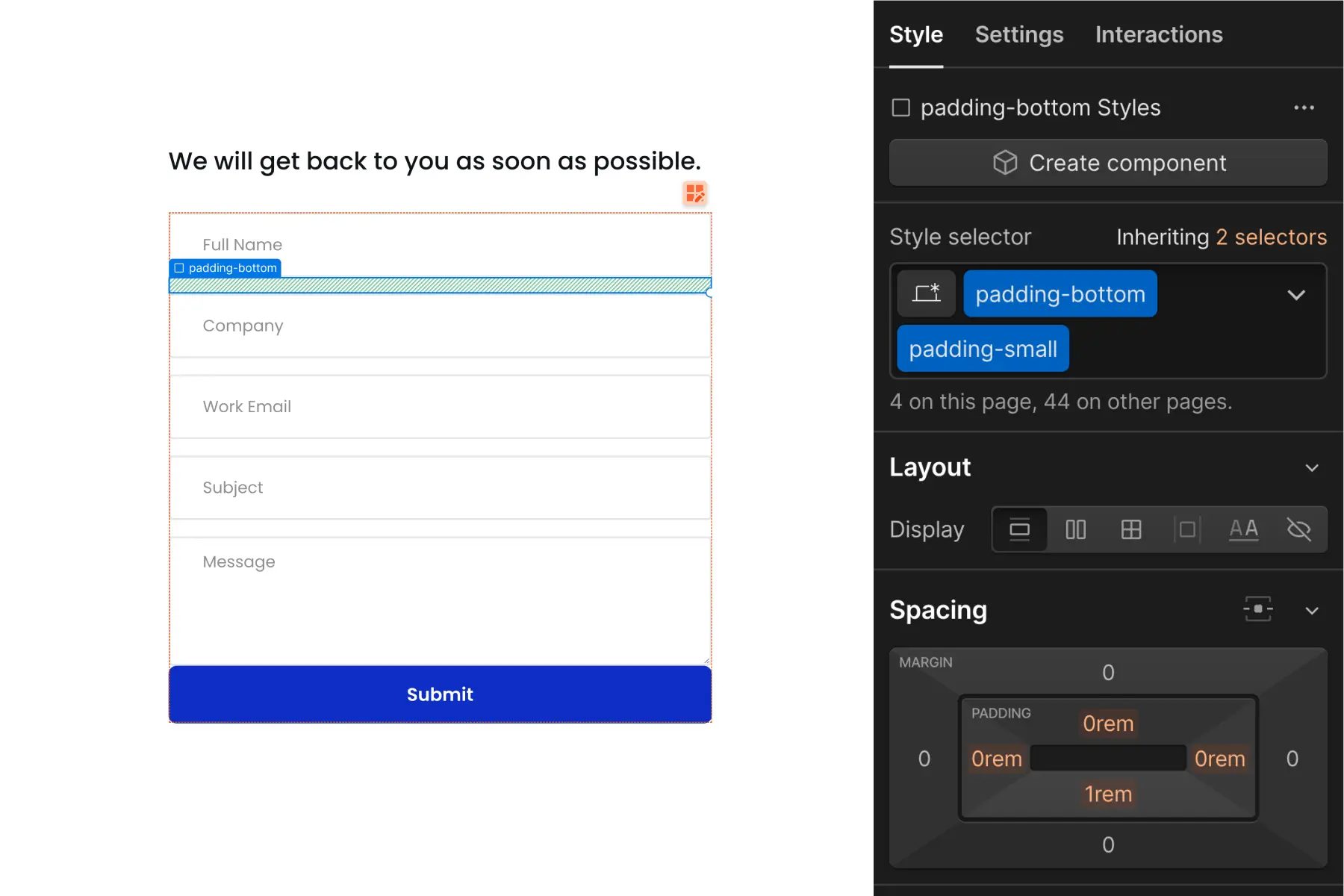
We do not want to do this:
The spacing block solves the issue of stacking spacing classes on the text element.
With our spacing classes separated from our typography classes, we can manage each separately without the issue of deep stacking.
4. Spacing for reused symbols and components
Benefit: We can create instance-specific spacing for symbols and components.
When we want to apply spacing to symbols, the spacing must be applied to all instances of the symbol.
Unified symbol spacing may be a problem if instances of our symbol require different spacing values.
Using spacing blocks or wrappers, we can have different spacing for different symbol instances.
No combo class required, no new classes created, no custom CSS needed. Our spacing system gives us instance-specific spacing while using the core content stored in the symbol.
Use cases for spacing block strategy
1. Create space between two elements
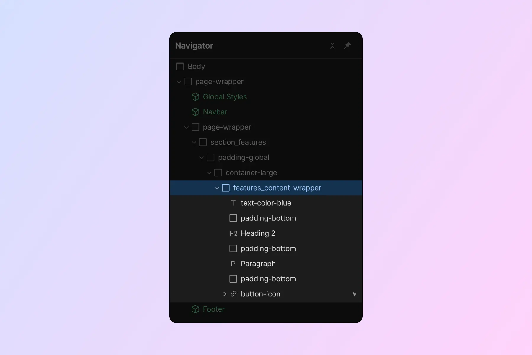
Spacing blocks are very useful when we create space between two elements. They're fast to implement, we have fewer nested levels, and our elements are more visible.
2. See children in Navigator
When we use spacing blocks, we create a clear view in Navigator. We can see all elements of the component.
Using too many spacing wrappers may "hide" too many of our important elements inside nested folders. Spacing blocks will create less nesting inside Navigator.
Spacing blocks show our important elements more visibly in Navigator.
3. Unique spacing for top and bottom of sections
When a section's padding-top and padding-bottom should be different, and we want to maintain the global utility class system, we can use spacing blocks.
We can apply a padding-large spacing block to the top of the section and a padding-small spacing block to the bottom of the section.
Use cases for: Spacing wrapper strategy
1. Use with CSS Grid spacing strategy
Using the CSS Grid spacing strategy, we can quickly create equal space between children elements.
We can use spacing wrappers to create unique spacing for one element in the list. When spacing wrappers are used together with CSS Grid strategy, we can apply custom spacing quickly with less effort.
For example, a content item has 1rem between each child element — except the last item in the list.
We can apply margin-top margin-small as a spacing wrapper for the last item in the list.
The spacing wrappers allow us to use CSS Grid spacing without creating multiple custom classes.
FAQ — Are empty divs bad for my website?
We are commonly asked about the impact of empty divs and spacing-only divs used in the Client-First spacing system.
- Will search engines have trouble reading my website?
- Will I generate too many elements on the web page?
- Will there be a problem with accessibility?
- Will my project be more difficult to maintain?
The short answer — No.
As long as the empty divs don't have any content or accessibility attributes (like aria-label) added to them, screen readers will omit them.
Search engines will not be confused by blank divs either. An empty div with a CSS class is easy to identify by us humans and by search engines.
"Excessive DOM size" is a common error alert found in many web performance tools. For example, Google's PageSpeed Insights. It is very unlikely that Client-First spacing system is the cause of this error. The most likely causes are layered animations, Lottie files, and embeds. These implementations can generate exponentially more DOM elements than Client-First spacing.
A web page built with Client-First guidelines has little or no impact in causing the "Excessive DOM size" performance alert.
Interested in further reading of empty divs? We loved reading Don't Fear Empty Divs by Cory Etzkorn.
Part 2: Custom classes
The Client-First utility spacing classes are not the only implementation method for spacing on our site.
We can apply margin and padding CSS properties directly to the custom class.
Inside the custom class mindset, we present 2 spacing strategies:
- Custom class on element
- CSS Grid parent spacing
Both strategies use a custom class to create space between elements.
When we use custom classes for spacing, we should have a good use case for the custom class. Fewer custom classes equals more consistency in spacing.
Custom class on element strategy
"Custom class on element" applies margin and padding values directly to the element that needs to be spaced.
For example, we apply faq_title to a Heading that requires unique spacing, which the utility class system can not achieve. A CSS property of margin-bottom: 0.75rem is applied directly to the faq_title class.
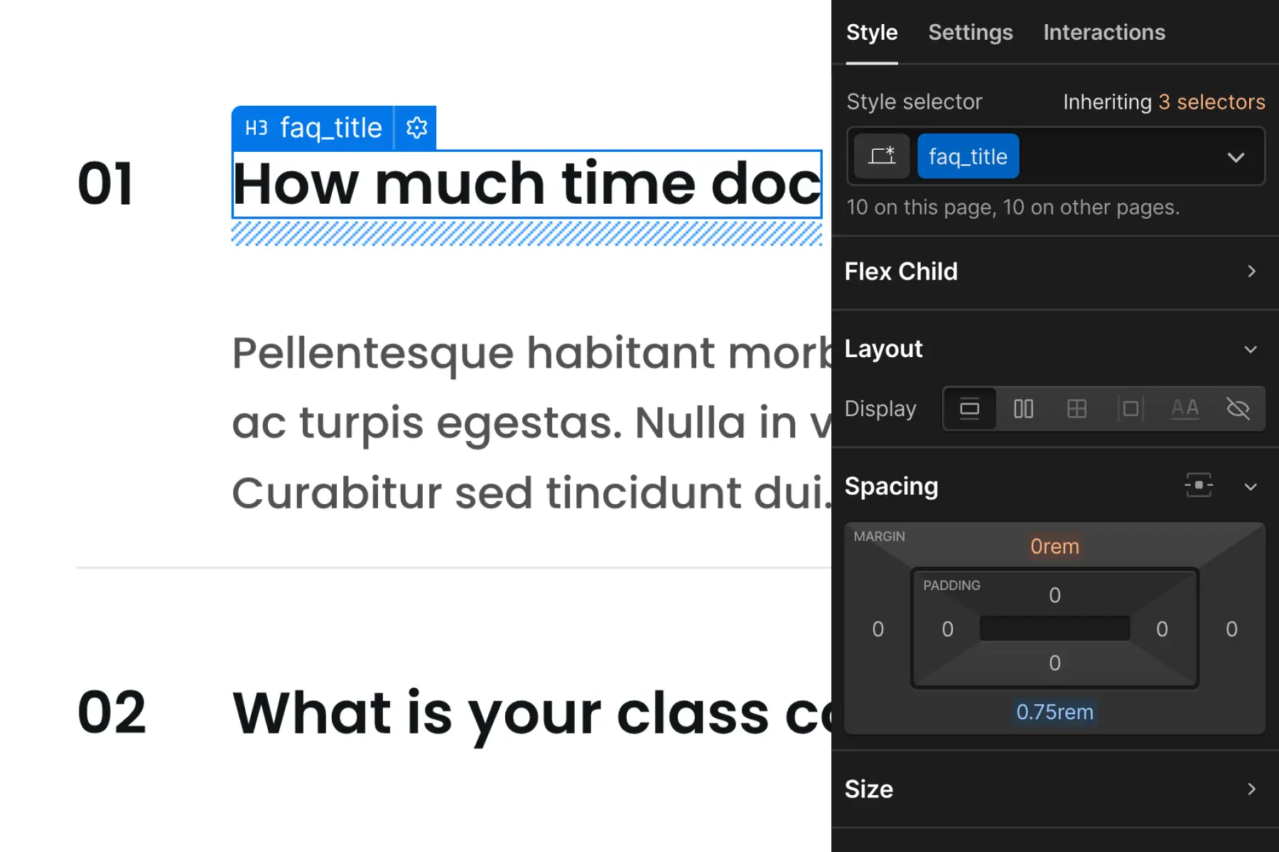
This graphic applies a custom class and custom spacing on the element.
This strategy is the most flexible. We have total control of a specific element across all breakpoints. We must use this power with purpose.
By overusing this strategy, we can create too many custom classes for spacing. This may result in a disorganized project spacing system and many manual breakpoint updates.
CSS Grid strategy
CSS Grid spacing strategy applies CSS Grid to a parent wrapper which creates space for the children inside it.
We can create vertical and horizontal space between child elements using CSS grid.
Instead of applying many blocks, wrappers, or custom classes on elements in a list, we can use CSS Grid strategy to manage all children with one controller — the parent wrapper.
Use cases: Custom class on element
1. Globally manage the spacing of a specific element
The key words are "of a specific element".
When we have recurring elements that should have the same spacing value across the project, it may be best to use a custom class to manage the spacing. A custom class allows us to make spacing updates for this recurring element.
Global spacing wrappers on recurring elements may slow us down and make project management more difficult to manage.
We can ask ourselves two important questions to understand if we should use utility class spacing or a custom class for a specific element.
How many instances of [this element] are in the project?
If there are many instances of this specific element, the element is a recurring element in the project. We can target each instance by using a custom class.
For example, if there are 25 instances of this element in the project, we can use one custom class to target all 25 instances.
How do we want to manage each instance of [this element]?
If we want to manage each instance of [this recurring element] as one group, a custom class will help us target that group of elements and apply changes to the group globally.
Custom class on input example
Let's look at an example use case with form inputs in our project. Form inputs are used across 4 pages of the project.
The setup below shows each form_input separated by a spacing block. This strategy is used across the entire project.
If we wanted to reduce the spacing between each form_input, we would need to update each spacing block individually.
This example above is not ideal, as this change may take unnecessary effort to update each form in the project. We must go input by input to update the spacing block value.
A change to all form inputs across the project can take seconds and require little effort with the proper setup.
A custom class on the form_input will allow us to manage all form_input elements as one unified element group.
This screenshot shows each form_input with margin-bottom: 1rem applied to it.
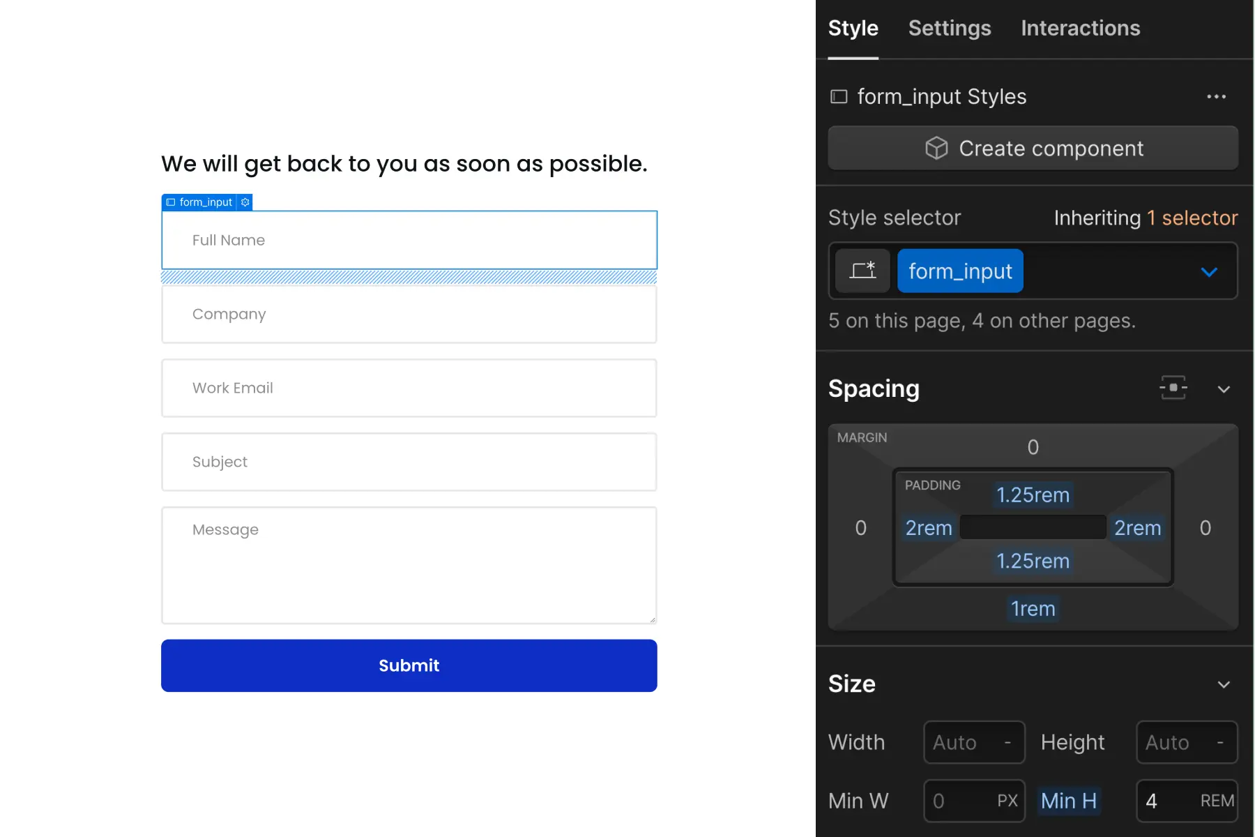
If we want to change the space between each input, we can make a single change to the form_input class. Changing the margin will change the value for all inputs across the project.
This example is ideal if we want all form inputs in the project to have a unified margin-bottom: 1rem value.
We have complete global control of spacing this specific element. We can change every form input on this page, and across the project, with a single change of the form_input margin-bottom CSS property.
2. Unique tablet and mobile spacing sizes
Spacing blocks and wrappers have the powerful benefit of maintaining default spacing across all breakpoints. However, we may not want default spacing across all breakpoints.
Sometimes we have elements that require unique spacing on tablet, mobile, or both. In this case, spacing blocks and wrappers will make our customizations more difficult.
Client-First utility class spacing is designed to unify spacing across all breakpoints. The system does not allow for customizations across breakpoints.
We can apply spacing directly to the custom class if we need spacing customizations across breakpoints. The custom class will allow us to manage the spacing across each breakpoint.
3. Unique one-off spacing
Sometimes we have an element that needs unique spacing. It's not part of a group of other elements, and doesn't have any specific mobile customizations. It's an element that requires a single use one-off spacing.
For example, a client insists that padding-small is too small and padding-medium is too large. They want something in the middle.
Instead of forcing this unique one-off into the utility spacing system, we can create a custom class for the element and continue with our build. For example, we can create about_testimonial-title with margin-bottom: 2.25rem as a one-off unique spacing class.
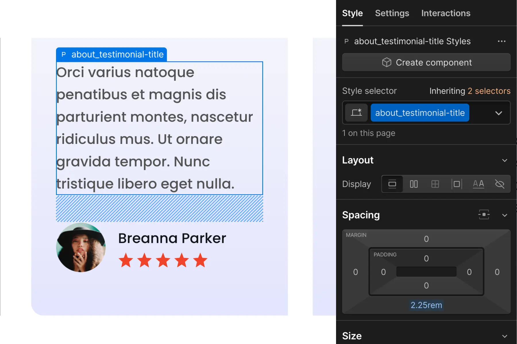
When we are not clear on integrating the utility spacing system into the layout, we can create a one-off spacing for this specific element.
It's important to understand that the more we create one-off custom classes for spacing, the less we follow a globally unified spacing system. This should not be a common practice for every element.
Use cases: CSS Grid spacing
1. Spacing children elements in a list
The core use case for CSS Grid is spacing items in a list. When there are sibling elements that need the same space between each other, applying CSS Grid to a parent wrapper is an efficient way to space these elements.
CSS Grid footer links example
Let's look at an example use case with links in the footer.
We have a parent wrapper called footer_links-column that wraps footer links. We can apply display: grid with rows to create equal space between all footer links.
If we want to change the space between each footer link, we can make a single change to the footer_links-column class. Adjusting the row distance will adjust the space between all footer links.
This is an excellent strategy for alist of items that require spacing. One adjustment gives us flexible control of the spacing between the items.
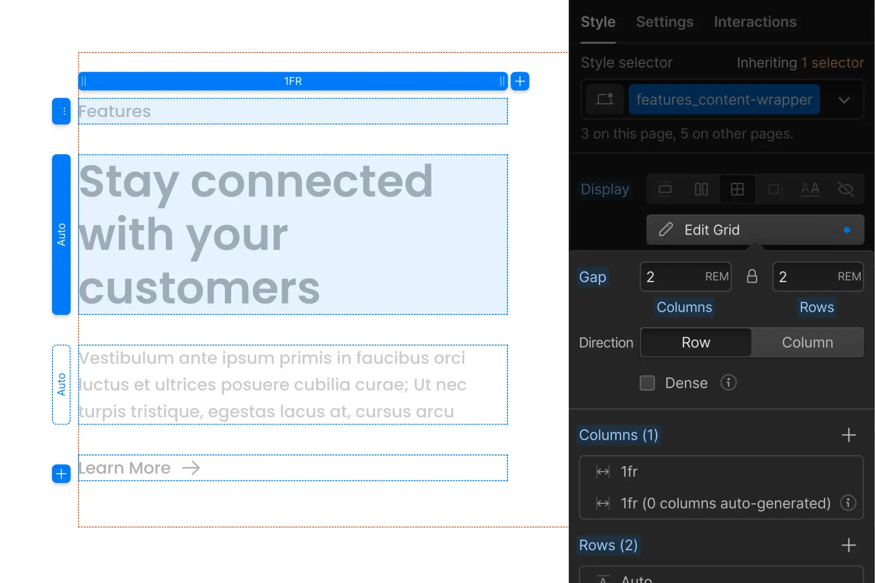
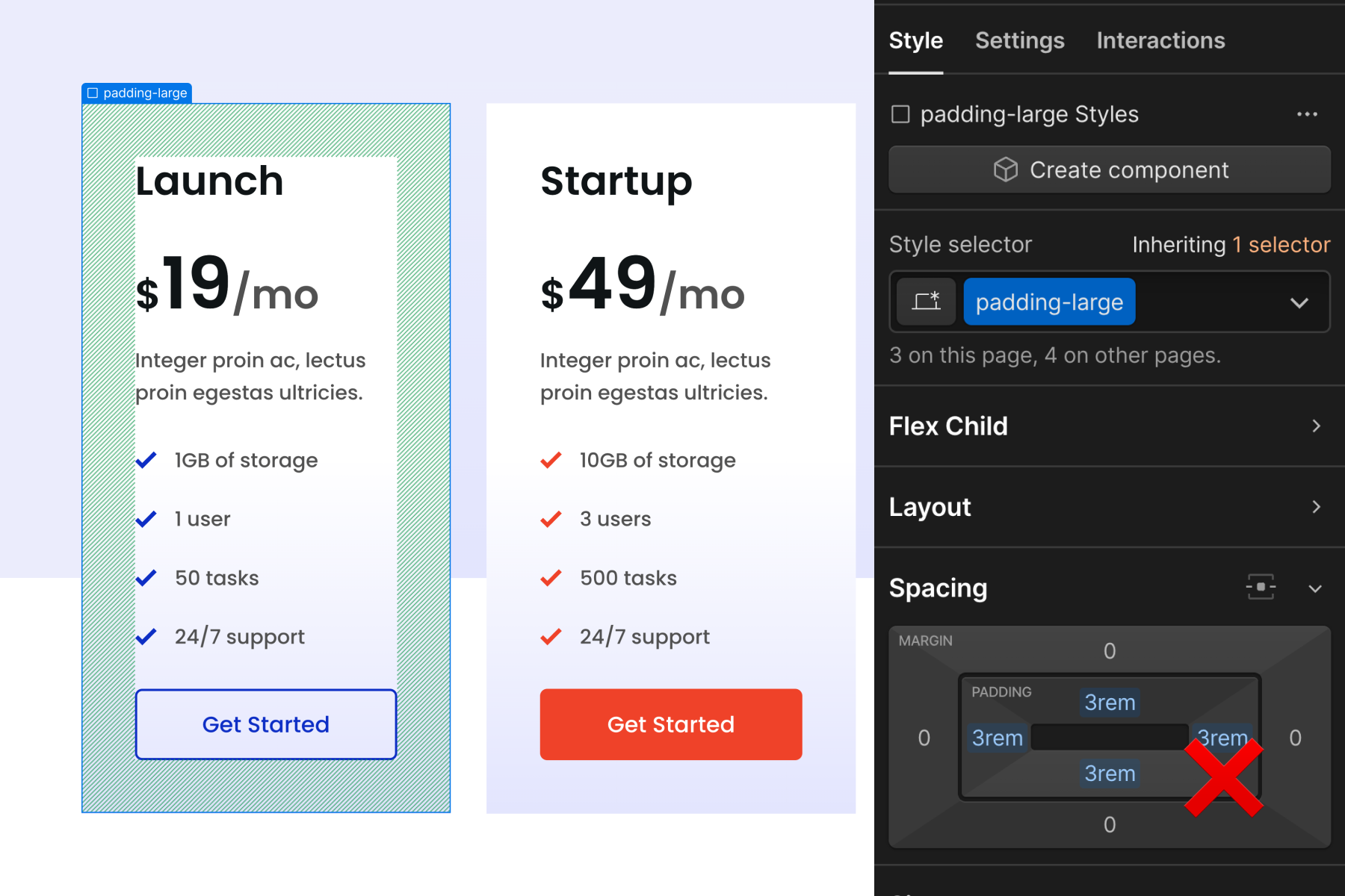
CSS Grid content card example
CSS Grid spacing also works with children of content items.
We have 'content card' items nested inside a list. Each content card has elements nested in it. We can apply CSS Grid directly to the content card to space the icon, title, and paragraph inside it.
CSS Grid is applied to the benefits_item, and the elements inside are influenced.
We can adjust the CSS Grid row values and adjust all benefits_item contents together with one controller.
This strategy works very well if the spacing between each child element is equal. In our example, the spacing between each child element of the benefits_item is 1rem. This scenario fits perfectly into CSS Grid row controls.
To add a child element with different spacing values in the CSS Grid, we can use our utility class spacing wrapper method together with the CSS Grid method.
In the example below, we add a button to the content card. This button requires 3rem distance below the paragraph. This does not work with the Grid values applied to benefits_item.
We can add a spacing wrapper under the paragraph that wraps the new button.
Now spacing wrapper padding-top padding-medium is creating additional space within the benefits_item CSS Grid system.
Spacing wrappers are excellent for using CSS Grid spacing strategy with flexibility and variation.
This works well for creating global controlled content spacing.
The benefits_item may be a recurring component throughout the site.
Some benefits_item cards have a CTA, some don't have a CTA, and some may have entirely new elements.
We can keep a global and unified benefits_item spacing with our CSS Grid controls while taking advantage of instance-specific elements and spacing variations.
Responsive spacing
Create responsive spacing variants is the spacer- class system.
The spacer- system uses only one class, so adding a second class to create a responsive variant combo class is Client-First approved.
The two-class strategies already have two classes applied to an element. Adding a third would start to create a long stack of classes (3 classes). More importantly creating a combo class from a stack of classes that is likely to change is not a good combo class creation strategy. We discourage and avoid responsive variants on two-class spacing block and spacing wrapper strategies.
spacer- tablet and mobile flexibility
Use is- combo classes to make customizations to base breakpoint utility spacing.
If an element needs spacer-large, but a small breakpoint needs a unique spacing size, we can add a combo class to the spacer- class to customize lower breakpoint spacing. For example, if we need smaller space on mobile only, we can use spacer-large is-mobile-small.
If the responsive customization is focused on a specific element, we can be more specific with our combo class naming, such as spacer-large is-home-tabs. The use of the combo class allows us to maintain global utility spacing across desktop and then make instance-specific customizations for smaller breakpoints.
Spacing tips
padding-section-[size]
padding-section-[size] is a set of utility classes that help us manage top and bottom padding for sections globally throughout the project.
The padding-section-[size] utility class should be used on the div block with the padding-global class applied to reduce nesting elements as example below:
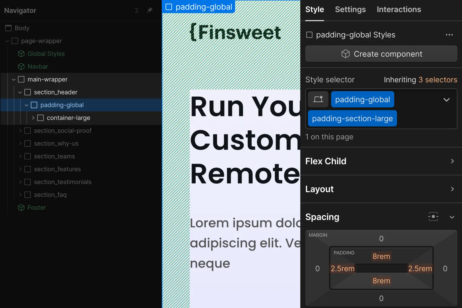
This is a hybrid approach between custom class and utility class. We can manage all of our section spacings as a global utility class.
A new folder called section- is added to our padding- utility class folder.
padding-section-small
padding-section-medium
padding-section-large
If a section's vertical padding is something custom or unique, we can:
- Recommended: Use spacing blocks to create unique space on the top and bottom of the section. This method maintains the utility spacing system.
- Apply the unique padding to the outer section layer, section_[section-identifier]
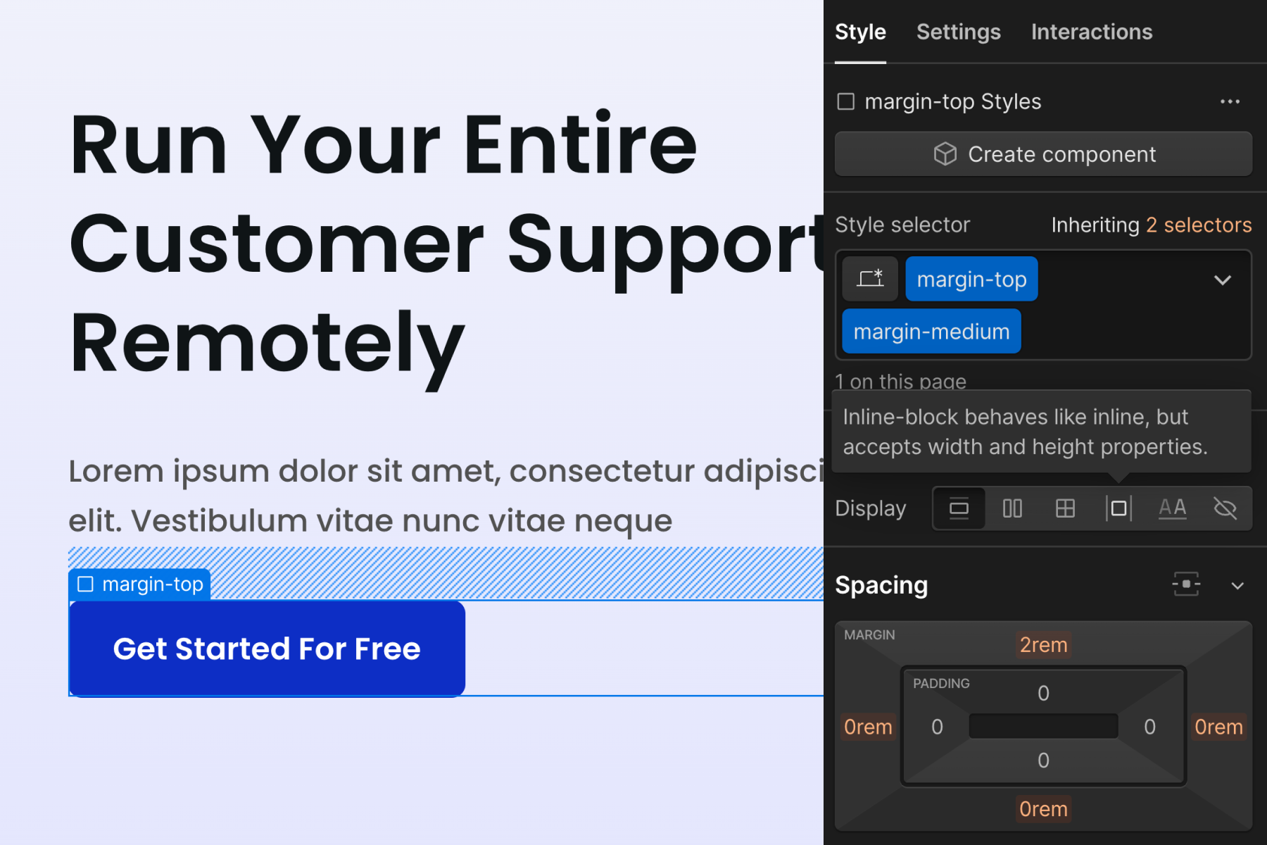
Optionally add margin on Heading tags
We may want each Heading tag to have the same amount of space above and below. We want to unify the spacing in our typography system.
For example, every H2 in the project has margin-bottom: 2rem
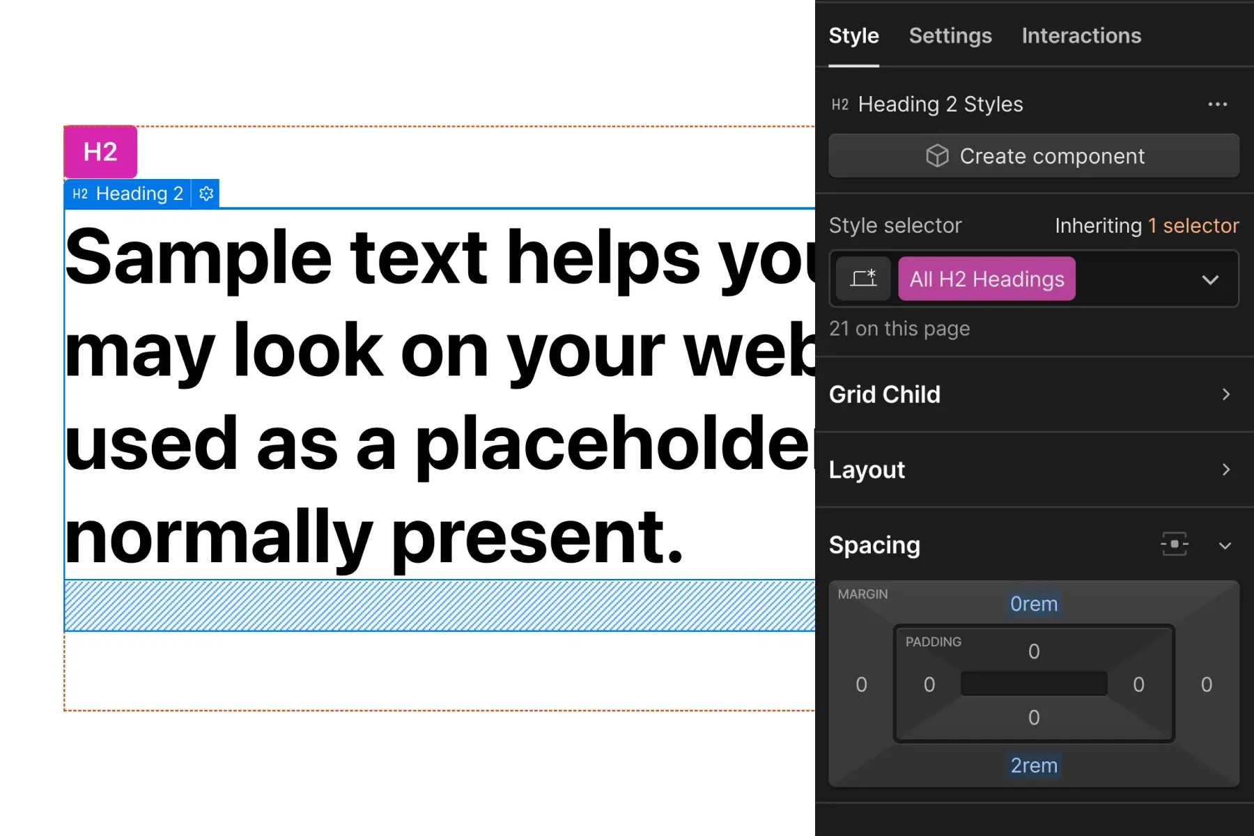
Applying margin to the Heading tag is an effort to unify spacing above and below our Heading tags. This is how we create global spacing rules for our typography.
Margin on Heading tags works well if we have design control over the project. We can choose to have a very formalized spacing system. This is a method to unify typography in the project further.
If we are working on a website with many variations in Headings and how Headings are used in the design, this may not be a good strategy.
If we continue overriding the default Heading margin values, we create more work for ourselves.
If all or most Headings should follow the same margin across the project, this may be an effective strategy.
We have a full explanation of this typography spacing method in Typography strategy.
Flex or grid for buttons and button rows
Use CSS flex or grid to create simple button layouts.
Button with icon example
Create a button with text and an icon. Apply flex or grid to button element to create space between the text and the icon.
This is a quick and simple way to implement a button with multiple nested elements.
Button row example
Create horizontal space between two buttons. Apply the horizontal space between the buttons through the parent wrapper.
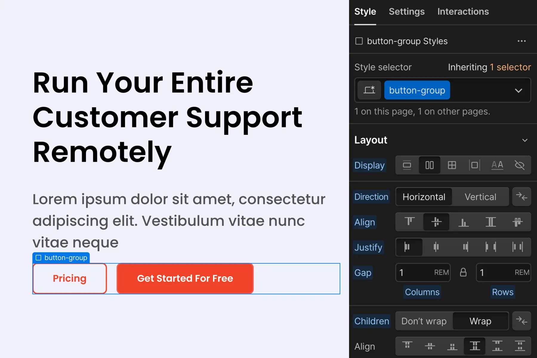
Using flex or grid on the parent wrapper of the buttons, we can create horizontal space between the buttons.
Applying margin-right directly to the button class will limit how we can use our button. We want our button to work in all instances, not only in a row of buttons.
Applying spacing blocks for horizontal margin may not work well for mobile. Many mobile designs require specific horizontal spacing. Spacing blocks do not allow us to make adjustments for mobile design.
We believe flex or grid for creating space in a row of buttons is ideal.
Avoid using utility padding to create size for inner elements
We don't recommend using the utility classes to create padding around the item content. This strategy works in terms of CSS and may achieve our required result, but we want to avoid this practice. It encourages deep class stacking and mobile styling conflicts.
Usually, the padding for inner elements will need specific size customizations through each breakpoint. Client-First spacing system has no control of spacing values across breakpoints.
Instead, apply the inner element padding directly on the custom class.
Create a custom class folder of spacers
The term "spacer" can be used for custom classes as well.
We formally use it as a utility class system: (spacer-)
We can also use it as a custom class to manage all custom unique spacings across the project (spacer_).
If there is a recurring element where spacing should be managed globally, we can use spacer_[element] to manage that custom element spacing. This new spacer_ folder is useful for organization of all custom element-specific spacing that should be kept global.
spacer_header
spacer_sticky-nav
spacer_title-primary
spacer_title-subtitle
spacer_footer
We can use this spacer_ folder for anything, even something custom like spacer_home-faq.