Core Structure strategy
Establish a unified, well-defined, and flexible structure that we can use for all pages across Client-First websites.
What is Core Structure?
Client-First core structure is a set of classes and principles to create a strong base of HTML around our page content.
Small sites, big sites, beginner sites, and advanced sites can use this same structure.
Client-First users will know a Client-First website's core structure immediately. For people who don't know Client-First, our human-readable class names will help them understand what each layer of the structure is doing.
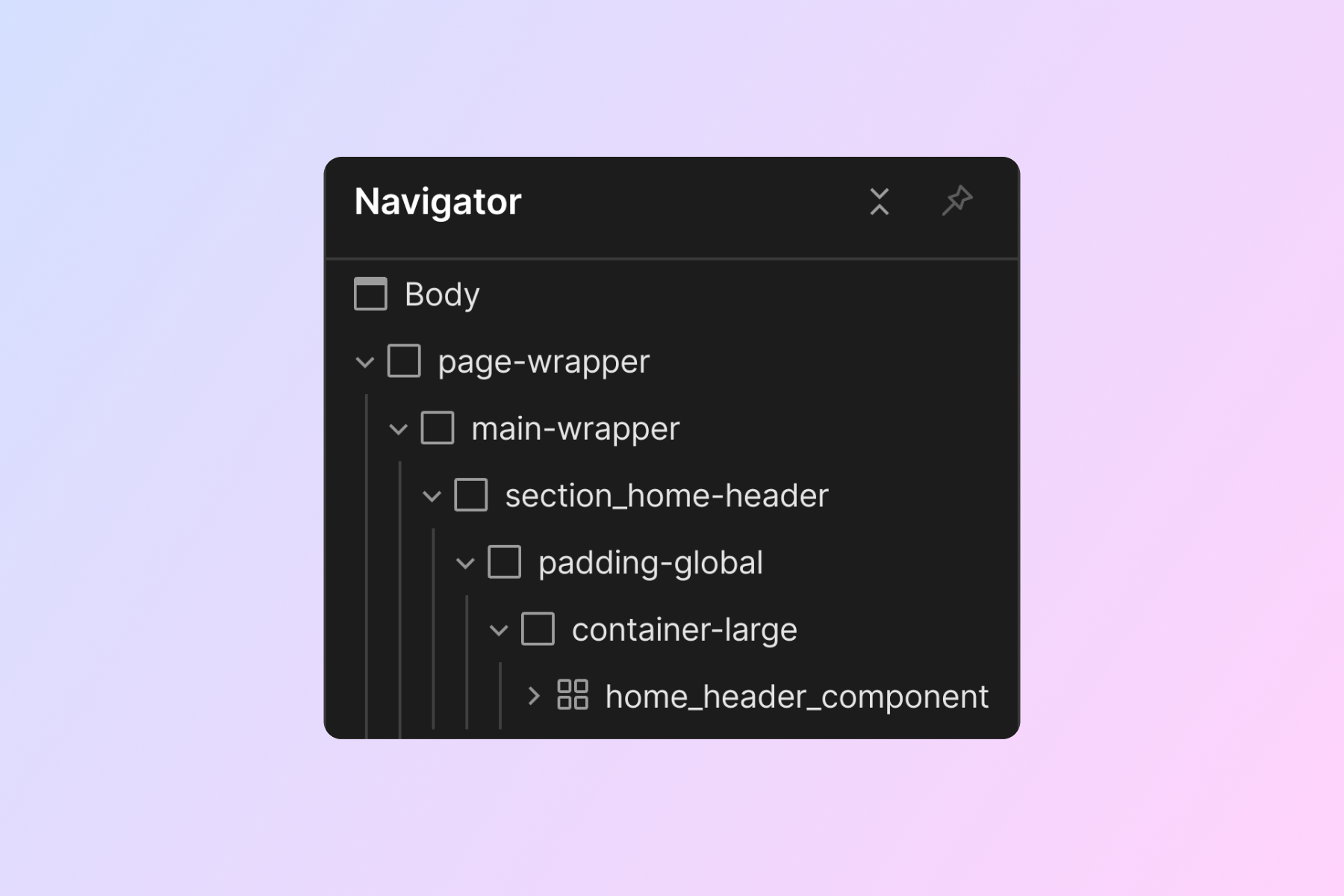
We can think of our core structure as "layers" of Div Blocks surrounding our page content. Each layer has a specific use to help us build a web page.
Explanation of each Core Structure class
A total of 6 different classes make up our Core Structure.
page-wrapper
Outermost parent of all elements on the page. This Div Block wraps every element on the page.
Styles:
Styles for page-wrapper are optional. Styles can be applied if needed. However, this element should not be heavily styled.
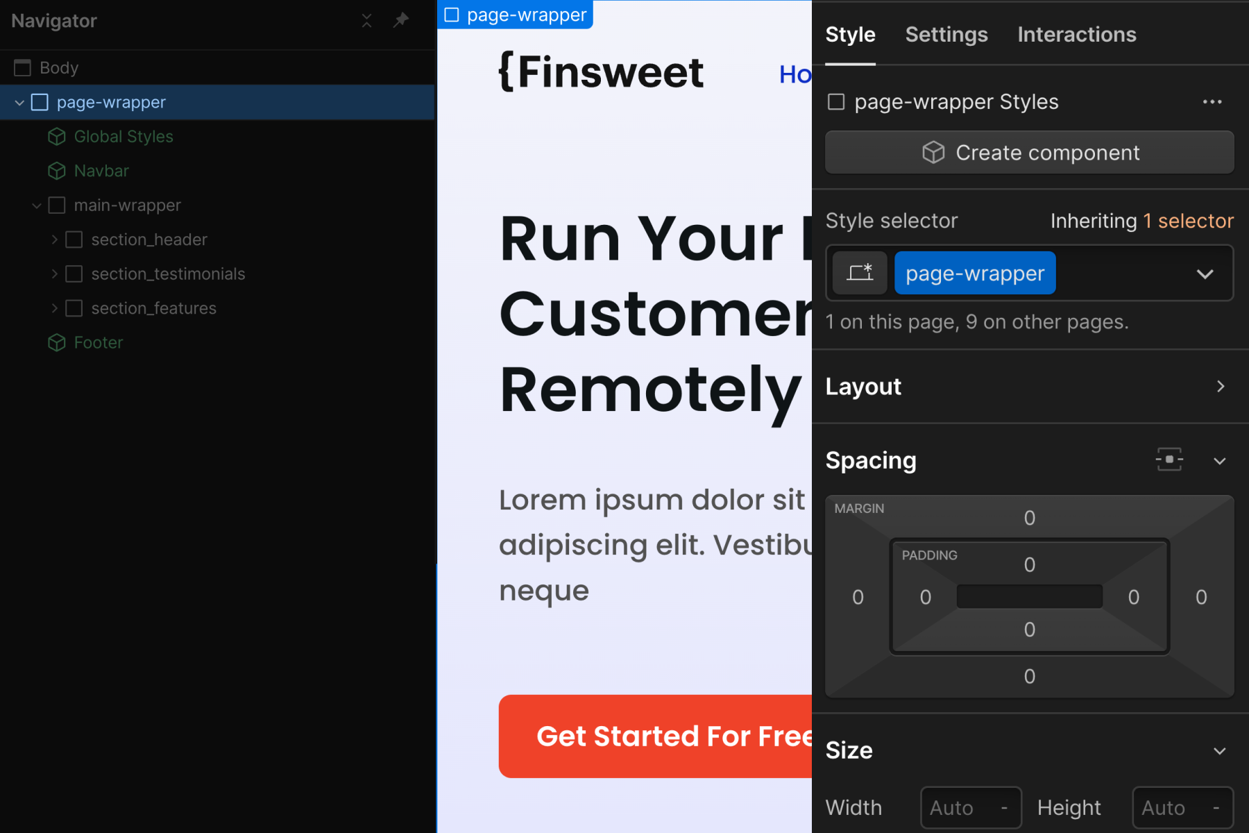
Primary use cases:
- Quick 'copy to clipboard' option for all elements on the page. We can then 'paste' the entire page to a different page.
- We have a site-wide global class available if we need to apply a style to the entire page. For example, applying overflow: hidden to the entire page to prevent horizontal scroll. Caution: While applying overflow: hidden stops all horizontal page scrolling issues, it also prevents CSS sticky from working on all nested elements.
- To prevent applying classes and unique styles directly on the <body> HTML tag. In Client-First, we limit body tag styles to typography and background-color properties. We can apply custom styles to the page-wrapper that wraps the entire page. This will keep our body styles limited to typography and background-color.
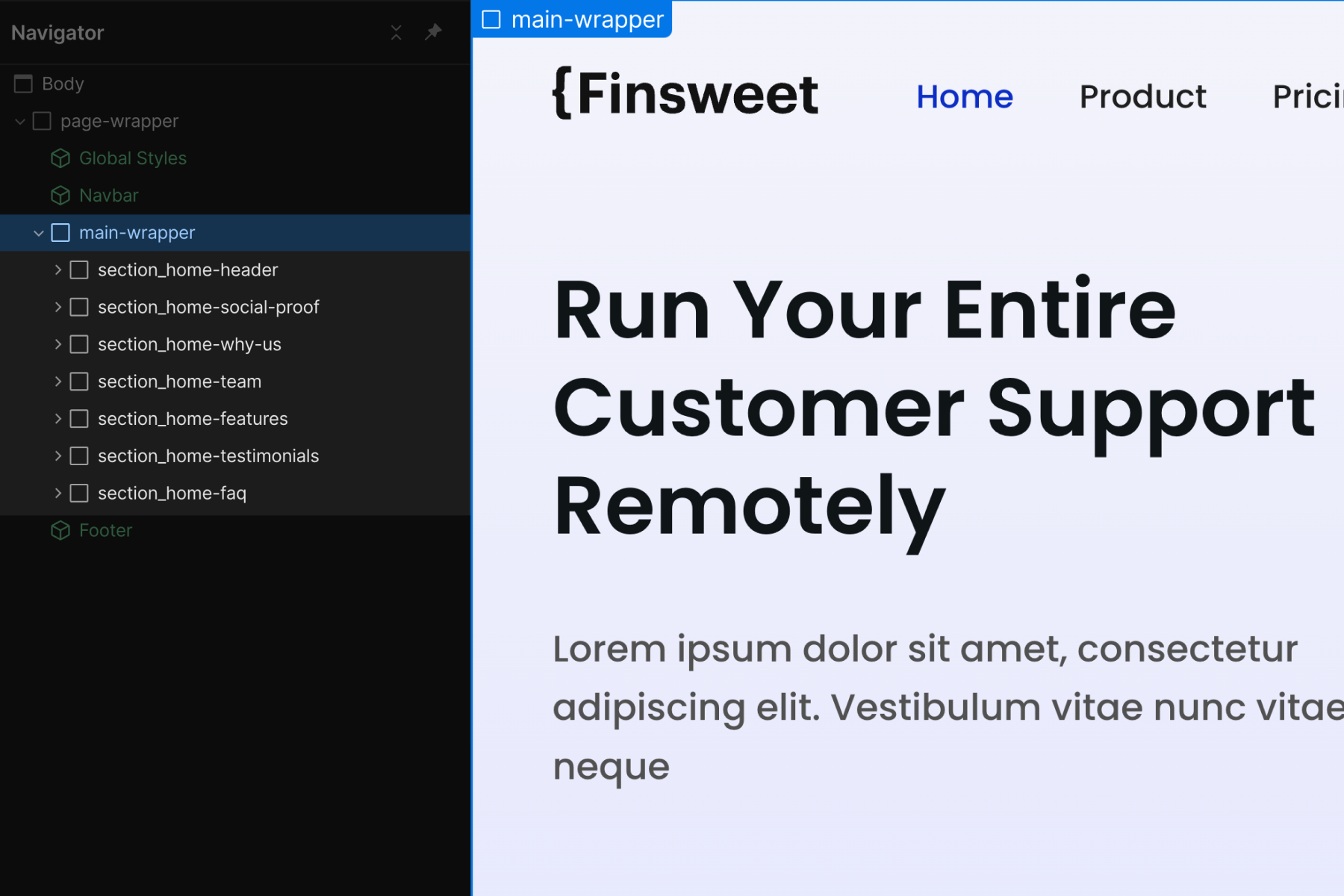
main-wrapper
The main content of the page. Use a <main> HTML tag that wraps all or most of our website content sections.
The nav and footer should not be inside this <main> tag.
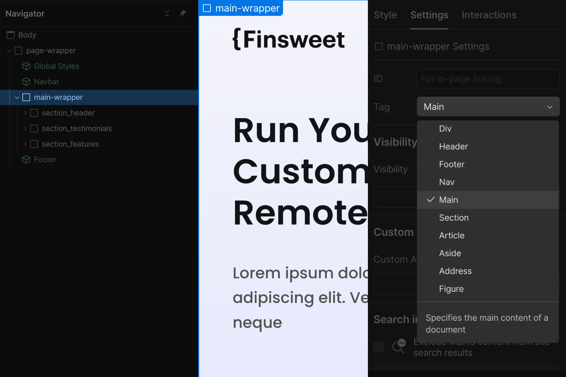
Styles:
Styles for main-wrapper are optional. Styles can be applied if needed.
Primary use case:
- Accessibility best practice. This layer of our core structure is here to help screen readers and search engines understand where our page's "main" content is.
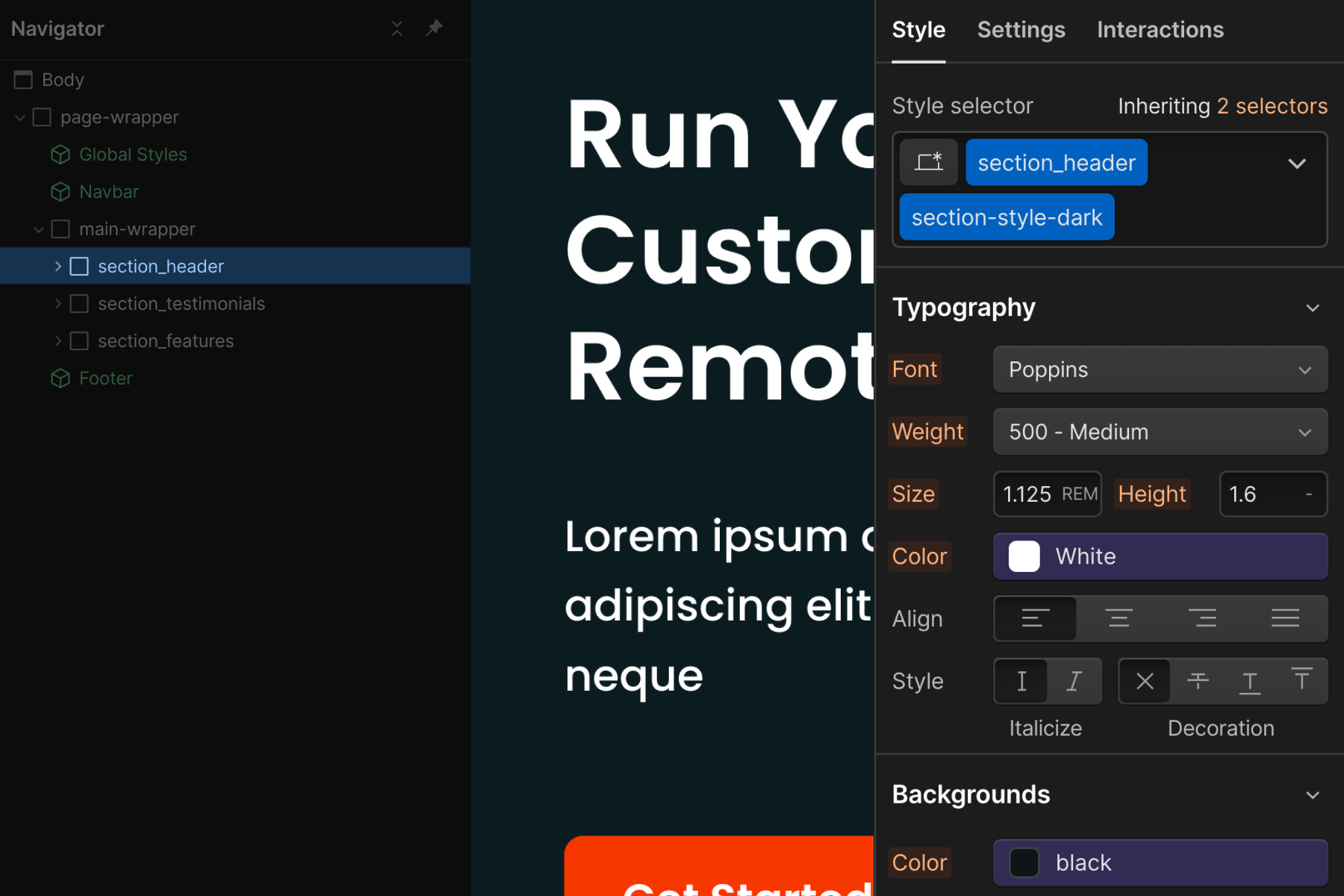
section_[section-identifier]
The primary use case of the section class is to give us a better workflow inside Webflow Designer. This element organizes our Navigator view and helps us quickly navigate inside the Designer canvas.
This Div Block wraps an entire section of content. It is recommended to set the HTML tag of this element to <section>. We do this on the Settings panel of section_[section-identifier] element.
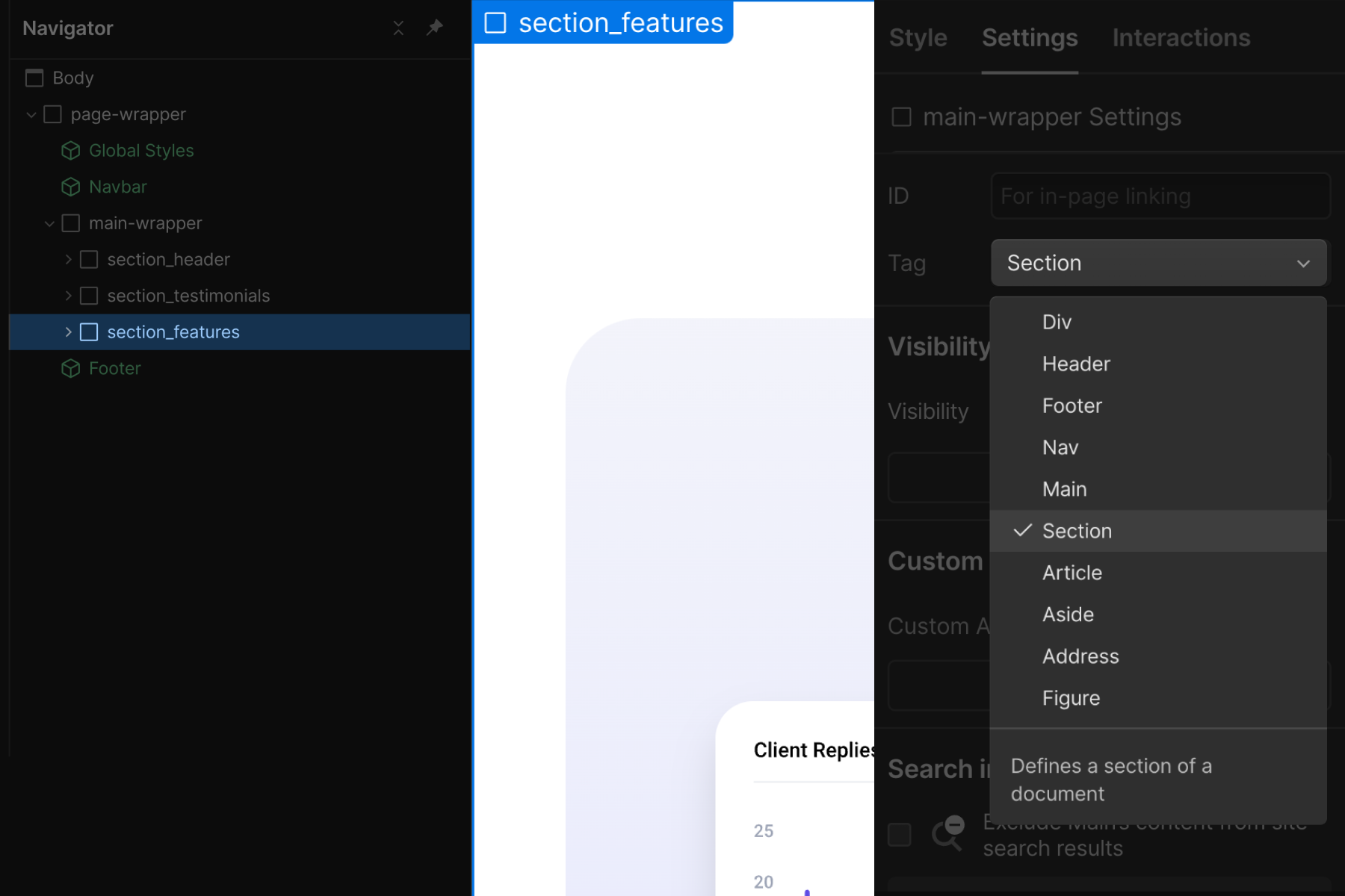
Understand that this section layer will be in a different folder than the contents inside of it. Based on the naming convention of section_[section-identifier], all section classes are inside the section_ folder.
Styles:
If possible, we should avoid applying styles to section_[section-identifier]. However, we can apply styles to it if we want.
Control global styles of sections:
Apply a global add-on class like section-style-dark to the section_[section-identifier] class to maintain global CSS properties across all sections. Each section_ class is a custom class. We do not want to continue applying the same CSS properties to each. If we need a "dark section", for example, we can apply our color: white and background-color: black classes to section-style-dark, and this class can act as a global add-on to our custom section_ class.
Primary use cases:
- Identify a section on a page from the Navigator panel. The goal is to create a type of sitemap for our page. This is a Webflow Designer UX decision.
- Anchor scrolling effect inside the Navigator panel. As we click on each section wrapper, the page will anchor scroll the section.
- We find it more difficult to onboard our clients to their Webflow without a visual or 'sitemap' of the page. This section naming gives our clients a clear view of the page's content.
- The anchor scrolling in Navigator improves our workflow as developers and helps us work faster.
Example:
A homepage may have sections like header, about, how it works, testimonials, and contact. We can name our sections with descriptive titles to understand what's on the page.
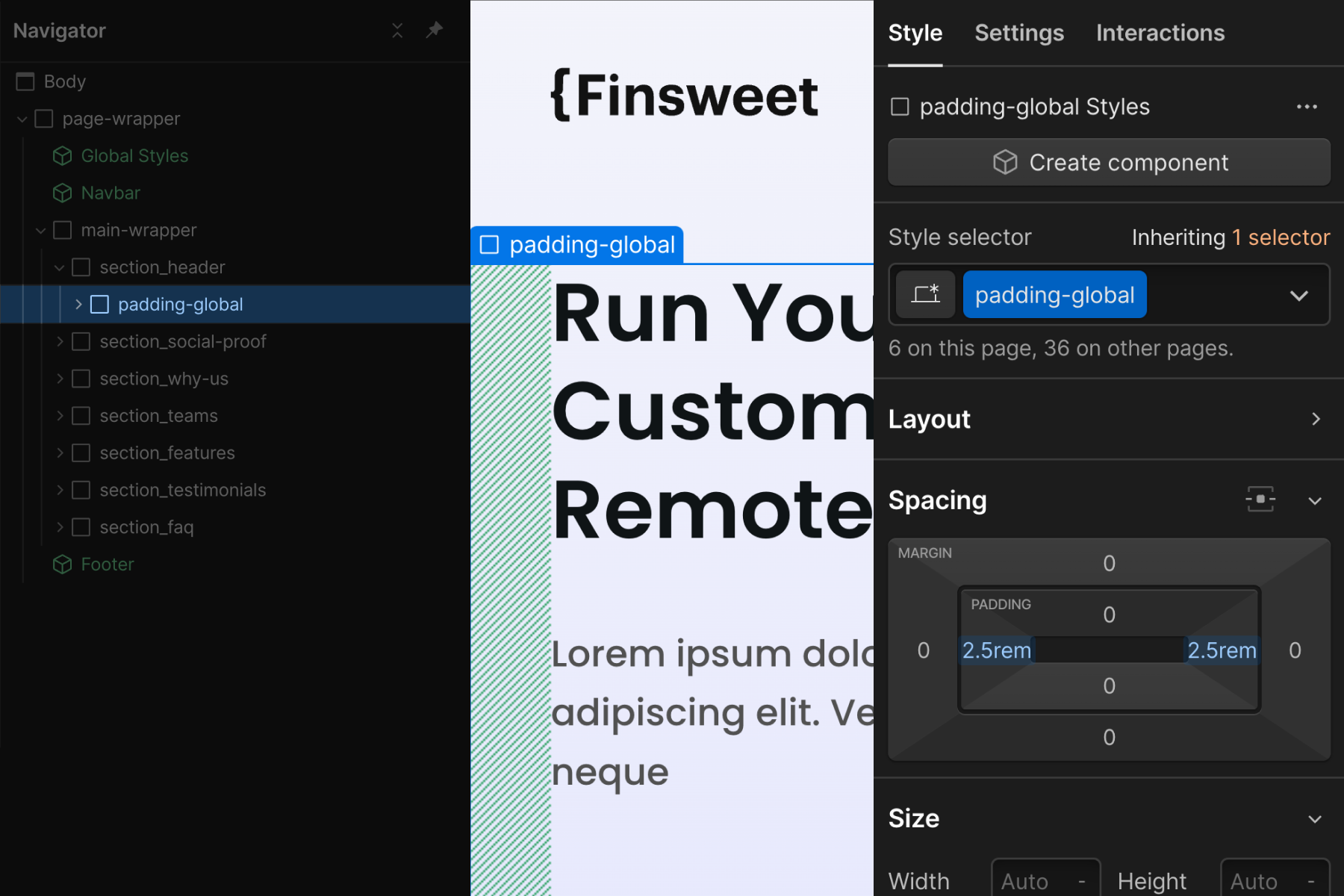
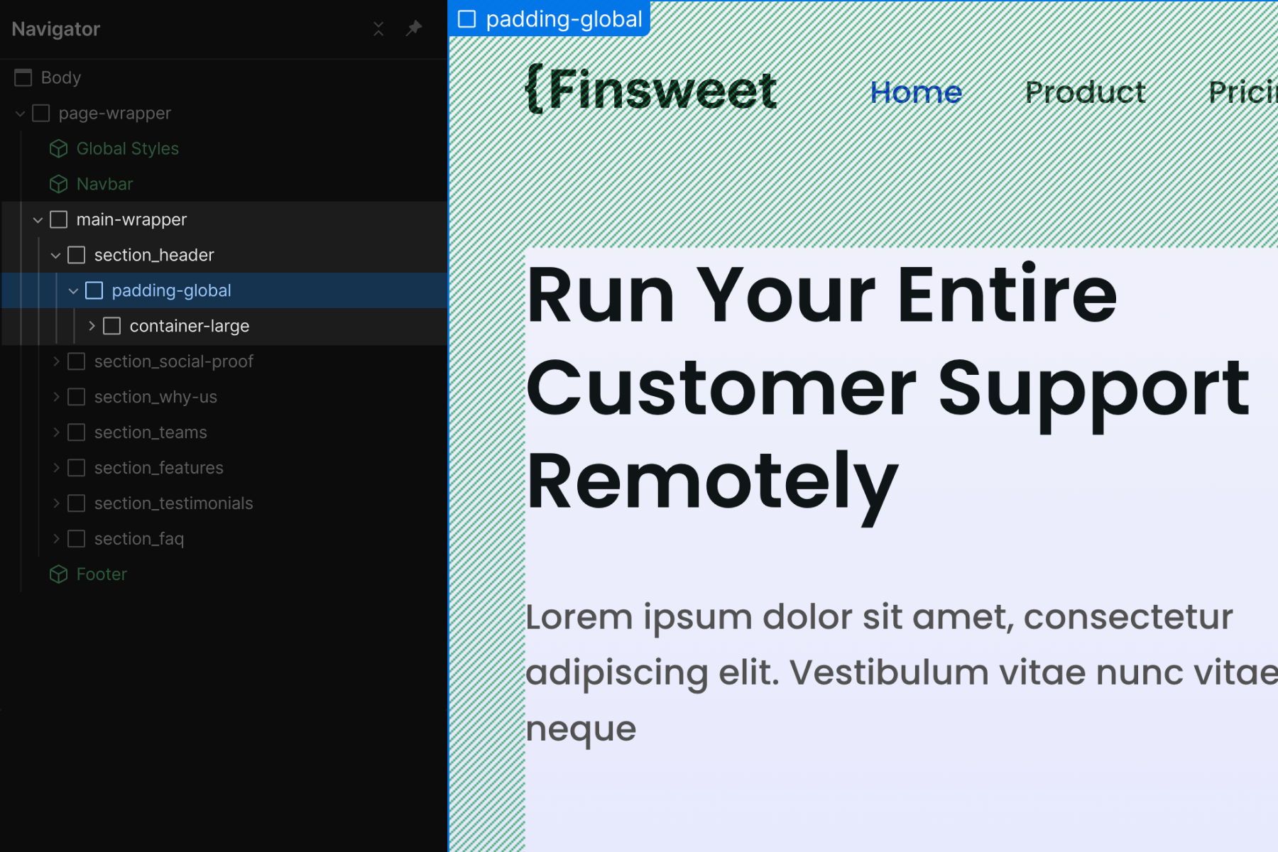
padding-global
Global horizontal spacing. This class manages the left and right padding of a page's content.
We do not want to use this class to add space to content items. For example, we do not want to use this class to style the padding of a content item in a list.
Styles:
padding-left and padding-right are the only CSS properties styles on the padding-global class. We do not want to add other CSS style properties to this class.
Primary use cases:
- Unified site-wide padding-left and padding-right
- Global controller to manage the entire website's universal left and right padding.
Default implementation:
There is flexibility in how we can use padding-global. Our recommended structure for padding-global is this:
- main-wrapper
- section_[section-identifier]
- padding-global
- container-large
...(e.g. components, elements, etc.)
Flexibility:
There is flexibility in where we can place padding-global.
We separate padding-global styles from other core structure styles so it can be used with or without other essential page structures. This is the power of layers.
Separating padding will allow us to add padding-global
- As a parent of container-large
- As a child of container-large
- Or both together
Each can result in a different end layout visual.
If we add padding CSS values to our container-large class, we are always locked into page padding styles when using a container. We may not always want this. By decoupling padding from max-width, we can use them independently.
container-[size]
A unified global container system for content on the page. All, or most, page content can go inside the container- class.
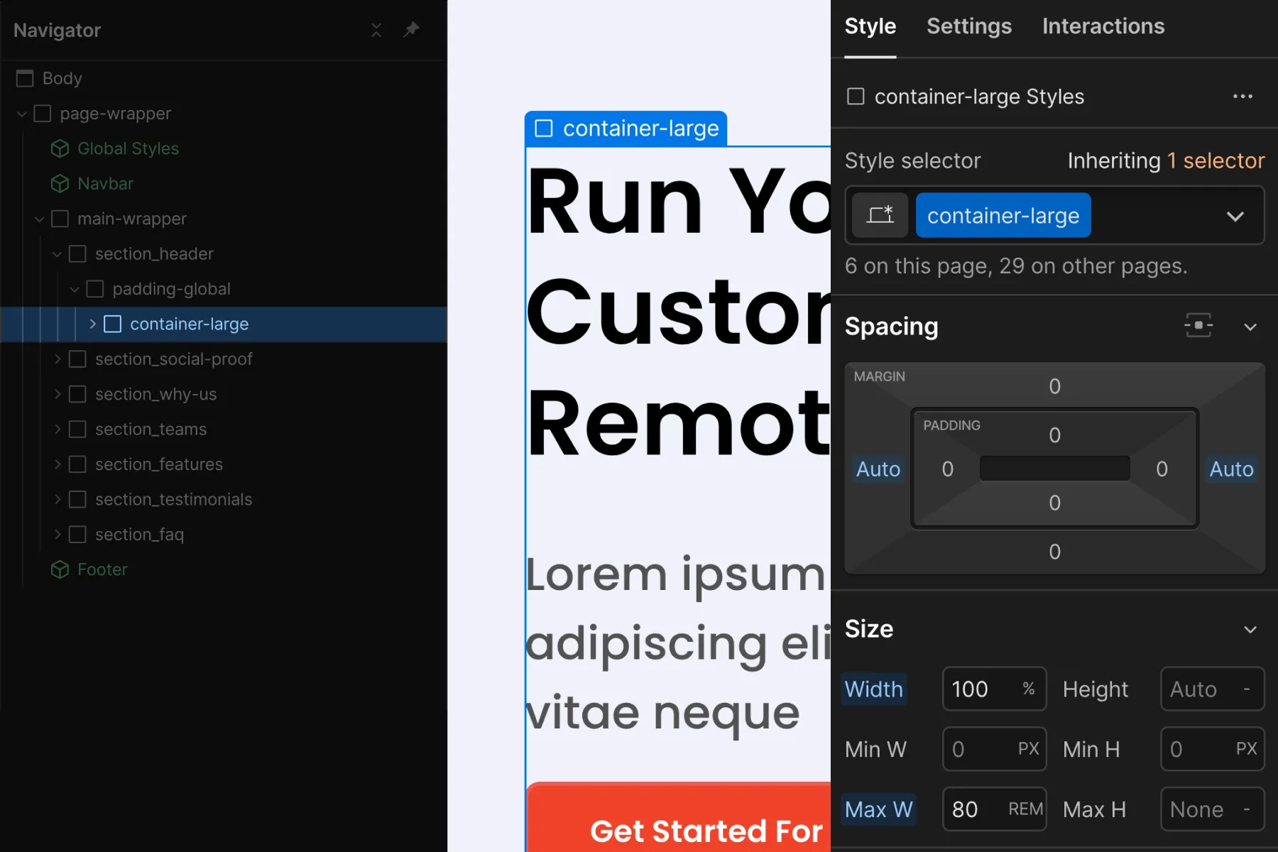
Styles:
- margin-left and margin-right set to auto for centering the Div Block on the page.
- width: 100% to ensure we always take up 100% of the available space.
- max-width value to contain the content within a certain width. Client-First includes three different container sizes — small, medium, and large. We can edit these values, add new values, or remove values.
Primary use cases:
- To center content on the page
- To set and maintain unified max-width values across the project.
Depending on our build, we can set 2, 3, or 4 different container classes.
Client-First comes with three different container sizes of max-width — small, medium, and large. We can edit these values, add new values, or remove the values based on our project.
padding-section-[size]
A unified global vertical spacing system for sections. Create top and bottom padding inside a section.
This core structure class should be used on the div block with padding-global class to reduce nesting elements as example below:
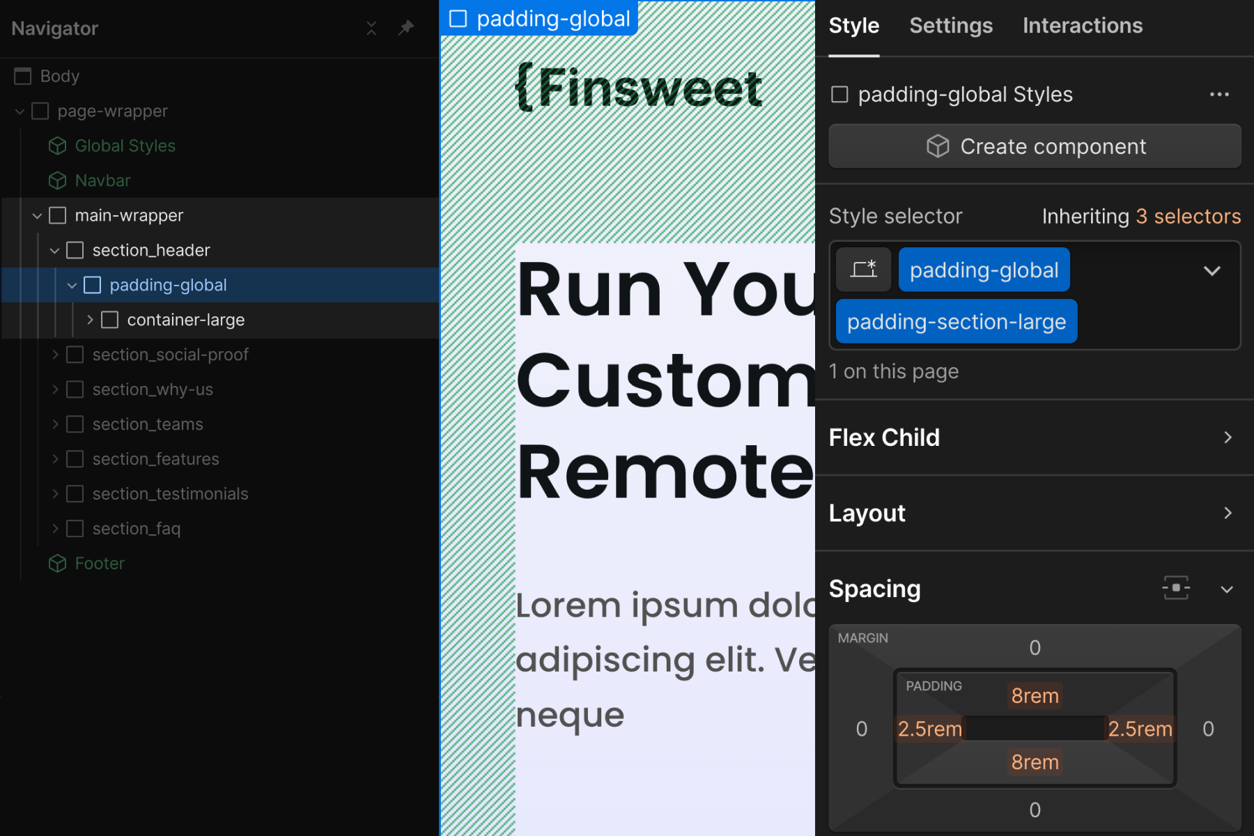
Styles:
- padding-top and padding-bottom to create vertical spacing for a section.
Primary use cases:
- To maintain unity across the spacing of sections in the project.
- Update all top and bottom paddings across all sections globally across the project.
We can set 2, 3, or 4 different section sizes in our project.
Client-First comes with three different sizes of section padding — small, medium, and large. We can edit these values, add new values, or remove the values based on our project.
If we have a unique section padding, we can apply unique styles to the section's section_[section-identifier] class.