Introduction
This article was released February 18 2022.
In this article, we compare two popular techniques for building fluid responsive websites in Webflow.
Wizardry is a responsive technique using em that scales like vw but with a max-width.
Client-first Fluid Responsive is a responsive technique that uses rem for all project scaling.
🚨 Disclaimer
We are Finsweet. Creators of the Client-First style system for Webflow. The most important parts of this article are objective and focus on fact-based information. This introduction section is our subjective opinion about Wizardry.
The subjective part of the article
The fluid-responsive topic has created a lot of questions from the community. This article aims to not only answer those questions but also explain why we are answering them the way we are.
Here at Finsweet, we have some of the top Webflow talents from around the world building websites and products for some of the biggest brands on the internet. Part of what makes us such a powerful team is that we are constantly looking for ways to improve our skills and become better at working with Webflow. It’s what drives our growth and what has led to a suite of products that are used by thousands of Webflow developers across the globe.
Over the last 6 months, we have discussed the Wizardry method as a team internally a number of times. We dissected the process, watched the videos, studied the code, and explored the system thoroughly.
While we have tremendous respect for its creator Timothy Ricks, we have to unanimously reject the Wizardry method for a number of reasons which we will outline in detail below.
Lowering the Webflow learning curve
Webflow has given us an amazing opportunity to build and ship websites in a simplified way. As a platform, they have made it easier to learn HTML and CSS by giving us a visual interface through which to write and manipulate the code. This aligns perfectly with their mission to democratize website creation.
Democratizing a skill means making it simple to adopt, and while Webflow might simplify the process of building websites, it still requires a deep knowledge of complicated code concepts in order to reach its full potential.
This brings us to one of the steeper parts of the Webflow learning curve. How styles and classes are managed inside of a project.
For a first-time Webflow user, the building style of a Webflow project can be the difference of loving or hating Webflow as a platform.
In that spirit, we created the Client-First Style System to lower the learning curve by providing a simplified naming convention and building a strategy that can be easily interpreted without having to dissect obscure abbreviations or learn complicated utility class structures.
Client-First lowers the learning curve
Client-First makes lowering the curve a priority. We want to give a person who doesn’t know Webflow the power to understand a Webflow project with as few barriers as possible.
Even if you’ve never heard of Client-First, a Client-First project will be neat and organized for anyone coming into the build. This is incredibly important for lowering the learning curve because it creates consistency across projects and workflows.
Client-First strategy compliments this mission.
- The naming convention is highly simplified and directed at non-technical users.
- HTML build structure is simple and well defined.
- Class usage prevents combo class stacking to optimize Webflow UX.
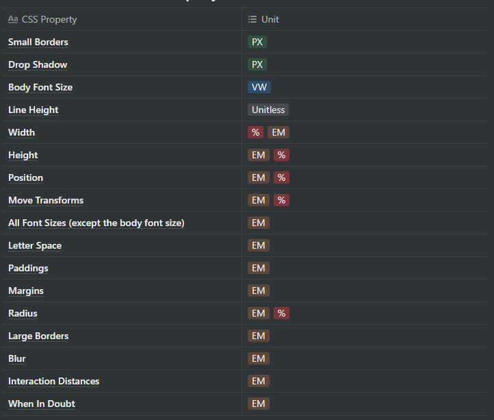
- Measurement units are unified into one unit — rem. Everything in the project is rems.
- Calculations are minimal and oftentimes not needed.
- Client-First Fluid Responsive method can be added or removed for any Client-First project with no extra configuration.
- Client-First Fluid Responsive is optional and turning it on does not change the core build strategy.
Wizardry increases the learning curve
We believe that Wizardry works against lowering the Webflow learning curve and actually makes the platform more complicated.
In order to work on a Webflow project built using the Wizardry method, the developer must first learn Wizardry.
This goes against our Client-First mentality and limits the end user’s potential experience with the platform. This may not present a problem for small companies or boutique websites, but when you are handing off projects to large marketing teams and need to have multiple developers accessing the same site, then this can become a major problem.
This added complexity presents itself in a number of ways throughout the project workflow.
- How does em work in this project?
- Why is the body set in vw? How does this interact with the project?
- How do parent relationships work with em?
- What is the artboard size? How do I change it?
- How do I use this calculator for every new size calculation?
- What are the scripts that are available to use in the project? What do the scripts do?
In addition to deciphering the naming convention, we now have to study all of these other variables in order to update a website.
Finsweet’s final thoughts
We believe Wizardry forces unnecessary calculations, introduces a confusing use of em units, adds JavaScript to fix fundamental system flaws, and presents a set of processes that feels unnatural for building websites in Webflow.
Throughout this article, we will give you objective facts about limitations in implementation, usability, and accessibility throughout the entire Wizardry method.
We believe that if an end result can be achieved through simpler means, then we should take the simple path.
For these reasons along with the examples below, we cannot recommend Wizardry for building with Webflow and the reason we will not take on projects which have been built using this method.
Examples
Throughout this article, we will show use cases of both products.
Below are three Wizardry options and two Client-First options for implementation. These are the ‘official examples’ of the article. Each example shows the result of their accessibility tests.
- Wizardry Option 1
- ~Uses JS to set the body to the correct REM font size on each screen width.
- ~Browser font settings: ✅ Success
- ~Browser zoom: ❌ Fail
- Wizardry Option 2
- ~Changes the body font size to a fixed REM unit when the user zooms.
- ~Browser font settings: ❌ Fail
- ~Browser zoom: ✅ Success
- Wizardry Option 3
- ~Uses on-screen controls to adjust the body font size.
- ~Browser font settings: ❌ Fail
- ~Browser zoom: ❌ Fail
- Client-First Option 1
- ~With fluid responsiveness
- ~Browser font settings: ✅ Success
- ~Browser zoom: ✅ Success
- Client-First Option 2
- ~Without fluid responsiveness
- ~Browser font settings: ✅ Success
- ~Browser zoom: ✅ Success
Overview of both systems
Wizardry
Wizardry’s fluid responsiveness is based on setting the font size of the page’s <span class="article_code"><body></span> to 1vw and making all child elements inherit it using em as the size unit.
With that, all elements automatically scale up/down when the viewport is resized, as the computed value of 1vw linearly scales with it.
<p class="article_caption">Basic Wizardry setup in Webflow’s Designer.</p>
There are a few key points that must be considered when using Wizardry:
- The system is not accessible out of the box and relies on JavaScript to make it so. And even using JavaScript, it still has some accessibility flaws that are not fully resolved. We’ll dive more into this specific topic later in this article.
- Size scaling is linear and allows little to no control.
- Each size value must be calculated based on a specific container width.
- Calculated size values are very inconsistent and hard to remember.
- em units are based on the parent’s font size, causing unexpected outputs.
Let’s explore each of these points:
Size scaling
Fluid responsiveness in Wizardry can only be linear as the entire system is relative to 1vw. This means that the only size scaling that you can achieve is linear. The video below shows linear scaling:
<p class="article_caption">Resizing a website built using Wizardry.</p>
There are no Wizardry controls to modify this behavior. It’s important to note:
- Not all websites require linear size scaling. Sometimes we may want to make things a little smaller as we scale down our design. For example, a slight and minor scaling of sizes between 1280px and 992px to prevent overflowing elements at the desktop breakpoint.
- This is a very aggressive scaling where all sizes become small and big very fast. Text can get small and less readable quickly as the user reduces the browser size.
- It may be required to use custom CSS in Webflow in order to override sizes for elements that are getting too small to read at certain breakpoints.
Size values
All sizes are calculated in relation to the desired range of breakpoints (for example, from 991px to 1920px). Wizardry refers to the maximum viewport width (1920px in this example) as the container of the canvas. Outside of the container’s defined viewport size, elements stop scaling.
For this process to work in em values, the Wizardry’s Calculator or Wizardry’s Chrome Extension will always be needed for your workflow.

In the above screenshot, there is a calculation of 16px. If a size needs to be 16px when the screen width is 1920px, the calculation would be:
(16px / 1920px) * 100% = 0.8333em
This calculation must be then repeated for any other size used in the project, including font sizes, widths, heights, margins, paddings, etc.
Each property that uses em requires a calculation:
As said before, all calculations use a specific container width as a reference or size. This means that changing this container width in the future can be a tricky task as all the sizes of the project will need to be recalculated to match it.
Using the previous example, if the project requires a switch of the container width from 1920px to 1440px, the new calculation of 16px would become:
(16px / 1440px) * 100% = 1.1111em
em units
Almost all element sizes are set to em in the project.
em units are proportional to the current font size of the element where they are applied. For instance, if an element is inheriting a computed font size of 12px:
- 1em equals 12px.
- 1.5em equals 18px.
- 2em equals 24px.
This is powerful when used for the right use case, but there are downsides to em units that need to be taken very carefully.
Using the following setup as an example:
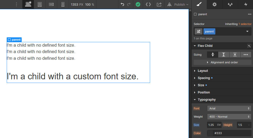
A .parent element is holding a group of children. Three of the children have the same font size. One child element has a larger font size.
CSS inheritance is a powerful way of styling layouts without having to create unnecessary classes. This may be a good use case for it.
The parent element is set to font-size: 1.25em and all of its children automatically inherit the font size without needing a custom class.
Following Wizardry’s guidelines, the body is set to have font-size: 1vw, so both the .parent and all the children’s font size is computed as:
1vw * 1.25em = 1.25vw
At the same time, under that same .parent element there’s a specific child that requires to have a different font size. This .child's font size is set to 2em:
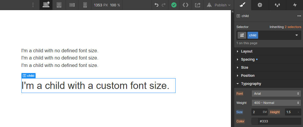
At first, it’s easy to imagine that the computed font-size of this element is 2vw, but it’s not. Remember, em units are based on the parent’s font size, so the browser computes it as 2.5vw:
1vw * 1.25em * 2em = 2.5vw
To get a real 2vw equivalence for the .child element, a new calculation is needed:
2vw / 1.25em = 1.6em
Which gets recursive when increasing the levels of nesting. For instance, if the .parent element was also nested under a .grandparent element that has font-size: 1.1em, the calculation would become:
2vw / 1.25em / 1.1em = 1.4545em
Another common situation where em units cause unexpected behaviors is when adding spacings to an element with specific font size. For instance, the following <span class="article_code"><h1></span> heading has font-size: 2.08em and margin-bottom: 1.67em applied to it:
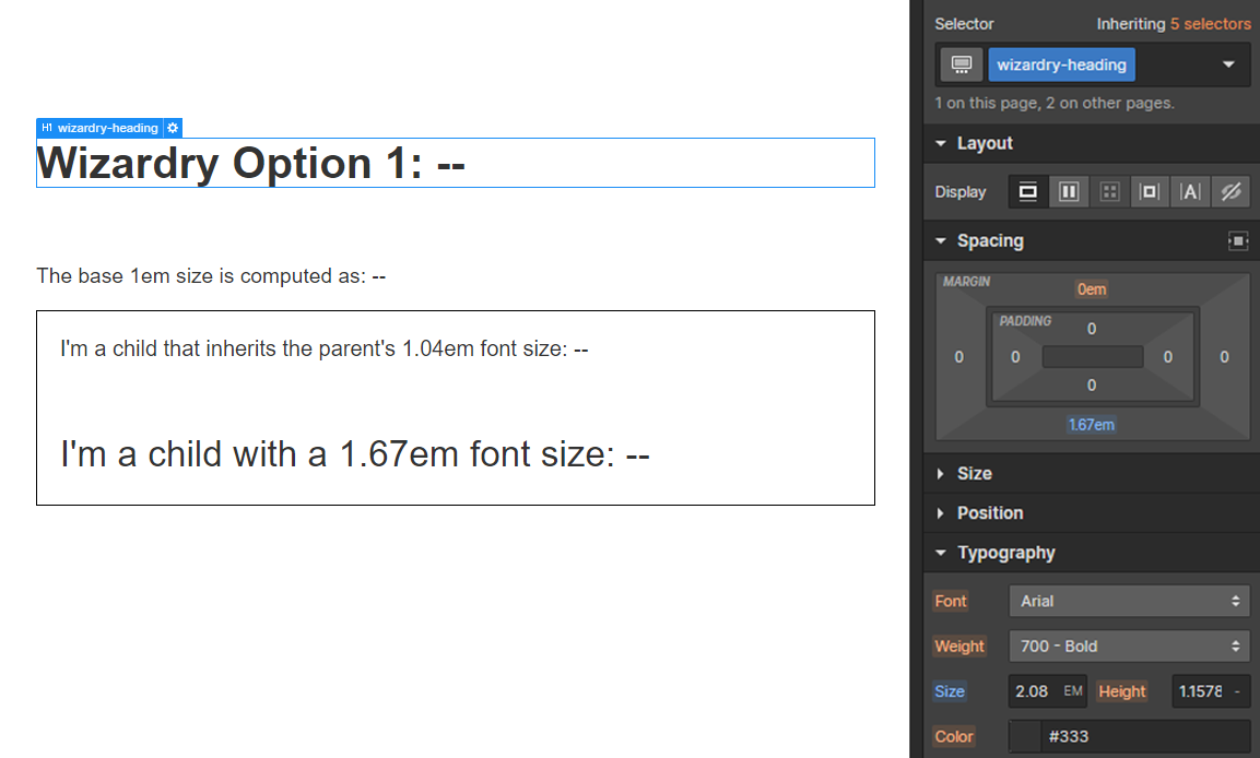
Same as before, the computed margin-bottom value could be expected to be 1.67vw, but as the font size of the element has been altered, the output becomes:
1vw * 2.08em * 1.67em = 3.4736vw
The issue can be appreciated in the following video:
<p class="article_caption">Updating the font size of a heading that also has some margin-bottom.</p>
In this video, we can see that as the font size is updated, the computed value of the margin changes, making it really hard to estimate what the final output will look like and how it will react.
Client-First
The first thing to understand is that Client-First is not a fluid design building technique, it’s a Webflow development technique. This means you can use the system with or without the fluid responsive add-on applied and the development process will always be the same.
💡 This means that fluid responsiveness is completely optional and seamlessly couples (and decouples) into any existing Client-First project.
Adding fluid-responsive
The next thing to note about fluid-responsiveness in Client-First is that you do not need to make any manual calculations and you are not limited to linear scaling.
To add fluid-responsiveness to a Client-First project you can access the Fluid Generator Tool in the Client-First Documentation or in Finsweet Extension.
ℹ️ Tip: If used inside Finsweet Extension, the fluid responsive settings of each project will be stored via your Google Account so you do not have to remember them for future modifications.
The default setup for the fluid responsive graph inside of Client-First documentation looks like this:

Let’s break it down:
- The graph at the top lets you decide what 1rem should equal to at any viewport size, we’ll explain more about this in the next section.
- You can add, update and remove any breakpoint you want, as well as visualize all inputs in different units.
- By default, all sizes will infinitely scale after your last defined breakpoint. You can decide to stop scaling by setting the “Stop scaling at max breakpoint” toggle on.
- The tool generates a CSS snippet based on your settings. You just need to copy and paste it into your project. With this one CSS snippet, your Client-First project becomes fluid responsive.
- Additionally, you can convert the CSS snippet to use CSS variables instead of hard-coded values, in case you’d like to manually update them in the future.
Now let’s see it in action using our Finsweet Extension:
<p class="article_caption">Converting a Client-First project to Fluid Responsive using the Finsweet Extension.</p>
Size scaling
Client-First is based in rem units. All fixed sizes are set using rem: font size, paddings, margins, widths, heights, etc.
We can use % units in some cases where a relative size is needed. For example, to make an element 50% the size of its parent.
But let’s get back to rem units. How do they work?
ℹ️ REM stands for "root em”, which means that its value is relative to the website’s root element (the <span class="article_code"><html></span> tag).
1rem equals the <span class="article_code"><html></span> font size.
What is the <span class="article_code"><html></span> font size?
The <span class="article_code"><html></span> tag inherits its font size from the browser’s settings. The browser’s settings inherit font size from the user’s device. So, the user defines the <span class="article_code"><html></span> font size through the settings on their device.
Unless the user updates the browser font size on their device, the root font size will likely be 16px. This is usually the browser’s default.
For example:
- 1rem equals to 16px.
- 1.5rem equals to 24px.
- 2rem equals to 32px.
✅ Accessibility win
Because the browser’s font settings directly affect the <span class="article_code"><html></span> tag, any website built using rem units will always be accessible out of the box. We always respect the user’s settings by building a purely rem-based website.
For instance, if a user updates their browser’s font size from the default 16px to 32px, all sizes in the project will scale up to double. 1rem will now be equal to 32px.
The root font size can also be modified by us, the website developers. By setting custom font size to the <span class="article_code"><html></span> tag using CSS we can effectively update the equivalence of 1rem in the website.
This is exactly what the Fluid Generator tool allows you to do. It lets you decide what you want 1rem to be equal to at any screen width, and how should it scale among breakpoints.
Going back to the default values image:
This chart can be translated to the following table:
Because rem units are relative to the root font size, the entire project will automatically scale up and down following the defined graph, effectively creating the fluid responsive effect and allowing the developers to:
- Have granular control of the scaling.
- Enable and disable fluid responsiveness without affecting the project setup.
- Modify the fluid values without having to update anything else in the project.
- Keep the website accessible without requiring any JavaScript. But we’ll dive more into this topic later in this article.
To achieve this scaling, Client-First uses a rem + vw formula. You can find a deep explanation of how it works in the Size scaling using rem + vw section of this article.
Size values
As fluid responsiveness in Client-First is fully optional and not a requirement in the system, you don’t have to worry about making calculations for each size in the project.
Once you plug in the Fluid Responsiveness CSS snippet generated by our tool, all rem values in the project will automatically scale up and down, maintaining the layout’s proportions.
So all you need to consider is that by default, 1rem = 16px. That’s it. You can continue your entire workflow with one calculation — YOUR_VALUE/16 rem.
- No unexpected size value behaviors like the ones caused when using em units.
- Easy to calculate and remember values. The most complex action you’ll have to do is type YOUR_VALUE/16 rem in the Designer.
<p class="article_caption">Performing a simple px to rem calculation in the Designer.</p>
- A really easy way to follow a common 4-point design system. Webflow agrees with a 4-point design system! Let’s compare the required values using Client-First and Wizardry for a 4-point system.
Browser font size settings
Introduction
The Success Criterion 1.4.4 in the WCAG Guidelines recommends ensuring that the text of a website can be zoomed up to 200%. Users should be able to achieve this by zooming in on the page or by updating the browser font size settings.
However, if we further inspect this criterion, we can find this paragraph in the Understanding Success Criterion 1.4.4 article:
User agents that satisfy UAAG 1.0 Checkpoint 4.1 allow users to configure text scale. The author's responsibility is to create Web content that does not prevent the user agent from scaling the content effectively. Authors may satisfy this Success Criterion by verifying that content does not interfere with user agent support for resizing text [...]
Which can be interpreted as:
Websites should avoid at all costs any conflicts with the user agent’s (the browser’s) settings, even if the scaling can still be achieved by other means like zooming.
Remember, accessibility means taking into consideration every single user who’s surfing the web, even the small portion of the population that defines a custom font size in their browser settings.
How many people use the font settings of their browser?
The team behind the Internet Archive ran an empirical study to see how many people change their browser’s font size settings, and it turned out that more than 3% of the population does so:
This 3.08% is comprised of users who have modified their default font setting in the browser, expecting to improve their experience when navigating the web.
How do users change browser’s font size settings?
Users can customize the base font size for all websites in the browser’s settings.
For instance, Google Chrome’s settings can be accessed from chrome://settings/appearance. The Appearance Settings look like this:
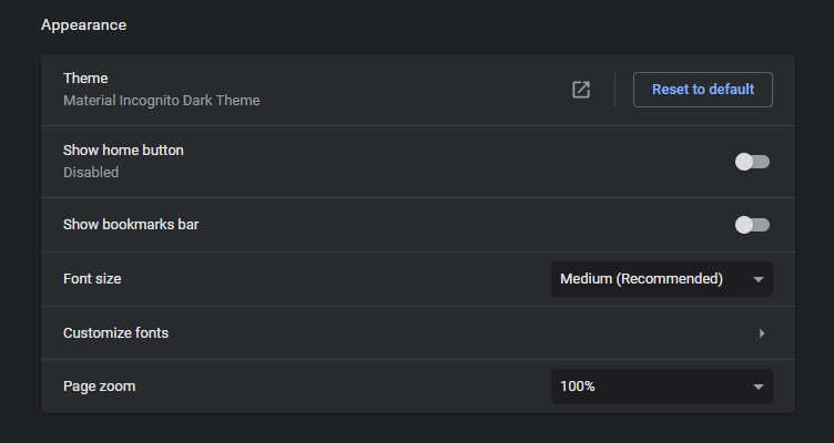
Where users can select from a set of predefined sizes:
<p class="article_caption">Selecting predefined sizes in Google Chrome’s appearance settings.</p>
Or can apply any custom font size:
<p class="article_caption">Applying custom font sizes in Google Chrome’s appearance settings.</p>
As the video shows, the fonts of websites should automatically react to the new settings by adapting their size accordingly.
But not only the font sizes should react to the changes. Let’s see another snippet of the Understanding Success Criterion 1.4.4 article:
[…] the author is responsible for ensuring that the content remains usable when the text is resized.
As the font size scales, it is required to adapt the layout of the pages to fit with it. This includes containers, spacing, widths, heights, etc.
Let’s compare both methods and see how they implement this criterion.
Wizardry
Wizardry’s fluid approach is based on using vw and adapting all elements proportionally by using em.
This means that all sizes will always be based on the current screen width, no matter the user’s font size settings in their browser.
For instance, let’s see what 1em equals to at the top level in different viewport sizes, considering that the <span class="article_code"><body></span> is set to 1vw:
This will effectively force these sizes instead of the one inherited from the browser.
Let’s see it in action:
<p class="article_caption">Updating the browser’s default font size while a website built using Wizardry is in view.</p>
Nothing happens. All sizes are bound to the screen width and will never react to the global settings update.
To solve this issue, Wizardry proposes three different solutions, all based on JavaScript:
- Option 1 (Recommended): Use JS to set the body to the correct REM font size on each screen width.
- Option 2: Change the body font size to a fixed REM unit when the user zooms.
- Option 3: Use on-screen controls to adjust the body font size.
Option 1: Use JS to set the body to the correct REM font size on each screen width
✅ Accessible with browser font settings
JavaScript Option 1 correctly works with browser font settings.
Wizardry’s proposed solution nº1 works like this:
- When the page loads, the script converts the <span class="article_code"><body></span> font size to a rem value based on the current window width.
- If the user resizes the screen, it recalculates the correspondent font size in rem and applies it again to the <span class="article_code"><body></span>.
- Essentially, throws away the vw units in favor of using rem, as it’s the only way to ensure that the font sizes are accessible.
Let’s see it in action:
<p class="article_caption">Resizing the screen and changing the browser font settings in a Wizardry Option 1 project.</p>
In the video you’ll see how the <span class="article_code"><body></span> font size is constantly being recalculated and set as an inline style using rem units while resizing the screen, achieving the fluid responsive behavior.
Further in the video, the browser font size is changed and, because the font size has now been set to rem, it scales up and down correctly.
There are a couple of downsides to this approach, the first being that it relies on JavaScript.
ℹ️ Unlike the WCAG 1.0 Guidelines, the WCAG 2.0 Guidelines do allow the use of JS to improve accessibility as long as the site is still useable when JavaScript is disabled. But as we’ll see, the UX can be affected for both JS enabled and disabled users.
For disabled JavaScript users, option 1 forces the body font size to be a fixed 1rem. This means that fluid responsiveness will be disabled for them and the layout might become smaller than expected when designing for large screens, or bigger than expected for small screens.
For enabled JavaScript users, option 1 forces the body font size to be a rem value only after the snippet runs when the page loads. This will effectively cause a Layout Shift every time that a user with a custom browser font size loads the website:
<p class="article_caption">Loading the Wizardry Option 1 website with a custom Very Large browser font size.</p>
Which becomes way worse on slower networks:
<p class="article_caption">Loading the Wizardry Option 1 website with a custom Very Large browser font size while simulating a slow 3G network.</p>
If the user starts interacting with the website and the entire layout suddenly shifts it can have a significant negative impact to the UX.
Option 2: Change the body font size to a fixed REM unit when the user zooms
❌ Not accessible with browser font settings
JavaScript Option 2 does not correctly work with browser font settings.
This option uses JavaScript to detect whenever the user is applying zoom to the page and replaces the 1vw body font size for a fixed 1rem value.
But in fact, updating the browser font size is not considered as a zoom action per se, so this JS snippet does nothing.
❗ The <span class="article_code"><body></span> font size will always be 1vw unless the user zooms in (we’ll get into this in the following section). Because of that, the website will still behave like we showed at the beginning of this section and won’t respect any custom font size set from the user’s browser.
Option 3: Use on-screen controls to adjust the body font size
❌ Not accessible with browser font settings
JavaScript Option 3 does not correctly work with browser font settings.
This option completely omits the browser’s scaling controls (font size and zooming) and instead implements a custom zooming system.
To do so, it creates two buttons (Zoom In + Zoom Out) that when clicked, a JavaScript snippet updates the body font size to fixed em values.
This approach was recommended many years ago when browsers like IE6 were still supported, as they didn’t offer zooming capabilities to the user. But absolutely all of the considered browsers in this article do allow the user to zoom in.
ℹ️ The last browser that required custom zooming controls to be accessible was IE6, which was deprecated in 2011 and has a current global usage of 0%.
Here’s how it works:
<p class="article_caption">Interacting with Wizardry Option 3.</p>
- Clicking the zoom buttons replaces the <span class="article_code"><body></span> font size for fixed em values.
- Browser font settings are not respected.
- User zoom is not respected (we’ll dive further into this in the next section).
❗ This option doesn’t perform any updates to the <span class="article_code"><body></span> font size unless the browser clicks on the custom buttons, effectively preserving the 1vw relationship. Because of that, the website will still behave like we showed at the beginning of this section and won’t respect any custom font size set from the user’s browser.
Client-First
✅ Accessible with browser font settings
Client-First fluid responsive CSS correctly works with browser font settings.
Client first is based on relative units (rem for most of the cases and % for some specific situations). As expected, all sizes in the project will automatically react to global font changes out of the box:
<p class="article_caption">Updating the browser’s default font size while a website built using Client-First is in view.</p>
As the video shows, Client-First will never create any impediment to increment the font size because rem units are directly tied to the root font size.
Not only do font sizes adapt to the browser font size settings, but also the rest of the elements — Containers, paddings, margins, widths, heights, and everything else that uses rem or %.
Everything flows gracefully and adapts, so the layout never breaks and remains usable at all times.
Because the solution uses CSS only, it will always work exactly the same for enabled and disabled JavaScript users. No JavaScript involved, no layout shifting on page load, no overheads when designing the website.
In the video below, the browser’s font size is modified from Medium (16px) to Large (20px) and we compare the computed output on two different projects — One is a Client-First build without fluid responsive. The other is an exact copy with the fluid responsive add-on.
<p class="article_caption">Switching the default font size from Main to Large in the browser, while comparing a regular Client-First site vs a Fluid version.</p>
You can see the two versions give different computed px values. Let’s understand how and why.
Medium (16px) to Large (20px) is a 125% increment.
(20px / 16px) = 125%
The version without fluid responsive scales linearly. This can be seen in the heading top which scales from 40px to 50px:
40px * 125% = 50px
The version with fluid responsive scales differently. The heading text computed font-size increments from 40px to 48.13px.
The size of the heading text doesn’t scale linearly as the fluid formula still has a relationship with the viewport width, which remained the same when toggling the browser setting.
Does it mean that the system is not accessible? Absolutely not, as users can still:
- Choose to see the website bigger than normal, which is the main goal of the browser’s settings.
- Reach a +200% increment from the default version.
<p class="article_caption">Incrementing the browser font size to the maximum allowed.</p>
It is not a requirement for the website to scale linearly as the user changes the browser font size. The Success Criterion requires a minimum increment of 200%.
Using the current example’s heading text, the font size can be increased from 40px to 153.78px, which is an increment of 385%, more than enough to comply with the Success Criterion.
The Fluid Generator Tool alerts you if you are at risk of failing the 200% scaling requirement.
User zoom
Introduction
As also mentioned in Success Criterion 1.4.4, people should be able to achieve a 200% scale when using the browser’s built-in zoom.
This study takes into consideration all the currently used user agents in the market and excludes the ones that are:
- Completely unused (0% of global usage).
- Not compatible with Webflow websites. This includes, for example, IE8 and below as it doesn’t support many commonly used CSS properties like Flexbox, as well as JavaScript ECMAScript 5 syntax that is used by Webflow’s core components. These sites would not be usable even if Success Criterion 1.4.4 was covered, so they are left out of the scope.
Among the considered browsers the currently supported zooming level is up to 500% in most of them and up to 300% in a small portion of browsers. As we want to make sure that the web is accessible for everyone, we’ll always consider as if 300% was the maximum supported zooming level for all user agents.
Before comparing Wizardry and Client-First, let’s see how browsers handle zooming.
How does browser zoom work?
Two actions happen simultaneously when the browser zoom is activated:
- The browser’s inner width is updated.
- The pixel ratio of the device is updated.
Let’s consider a user that performs a 150% zoom in a website that is currently viewed in a 1920px screen. First the browser resizes the Window.innerWidth to match this new size:
(1920px / 150%) * 100% = 1280px
And then it proceeds to scale the device’s pixel ratio to 1.5 to proportionally match the user’s screen size.
What happened essentially is the same that would happen if we took a 1280px picture and stretched it to be 1920px wide, the ratio of pixels in the image would scale up proportionally in order to match the new size.
ℹ️ It’s important to note that the change of the window’s inner width still affects CSS media queries, meaning that in the previous example all CSS will now be affected by any media query that targets the 1280px screen width instead of the previous 1920px one.
Wizardry
Wizardry is not accessible out of the box as vw units are completely unaffected by the browser zoom. vw is based on viewport width and the viewport width does not change with browser zoom.
To make the system accessible, Wizardry offers the same three JavaScript options that are mentioned in the Browser font size settings section.
Let’s see how each of these options behave when the user zooms in:
Option 1: Use JS to set the body to the correct REM font size on each screen width
❌ Not accessible with browser zoom
JavaScript Option 1 does not correctly work with browser zoom.
This option forces the <span class="article_code"><body></span> font size to be a fixed rem value based on the current screen width. This value is updated whenever the screen is resized by the user.
This approach works fine until the user decides to zoom in. Remember that two different actions happen when zooming in:
- The browser’s inner width is updated, and Wizardry’s JavaScript reacts to it by recalculating the body font size. This works as intended.
- The pixel ratio of the device is updated proportionally. What happens then? The new value of the body font size now is rendered as the previous value, essentially canceling the zoom effect.
<p class="article_caption">Zooming in Wizardry’s Option 1. Zooming is canceled until the tablet media query comes in.</p>
In the video, we can see how on each zoom increment, the body font size is recalculated accordingly but the rendered layout stays the same because of the new pixel ratio.
⚠️ It’s not until the user zooms in enough for the CSS media query to become lower than the fluid container that the ability to zoom is restored, as the JavaScript no longer updates the body.
This issue seems to be simple to fix with a small tweak of the JavaScript snippet offered by Wizardry, but we prove this wrong in the Why JavaScript can’t fix the accessibility issues of the linear scaling section.
In conclusion, although this method respects the user’s browser font settings, it doesn’t allow the user to zoom in on the fluid container.
Option 2: Change the body font size to a fixed REM unit when the user zooms
✅ Accessible with browser zoom
JavaScript Option 2 correctly works with browser zoom.
As explained before, this option uses JavaScript to detect whenever the user is applying zoom to the page and replaces the 1vw body font size for a fixed 1rem value that ensures that all sizes can scale up.
Before going any further, we must state that this proposed JavaScript solution by Wizardry does not work as intended:
- It is supposed to modify the body font size whenever the user zooms in.
- But it doesn’t perform the action until the user has zoomed in more than 200%.
The script is the following one:
<p class="article_caption">Wizardry’s proposed JavaScript snippet for Option 2.</p>
And when used in a project, this happens:
<p class="article_caption">Zooming in Wizardry’s Option 2 using the proposed JavaScript snippet.</p>
Nothing until a 200% zoom is reached, vw units are still set to the <span class="article_code"><body></span> and the user isn’t able to perform any scaling.
Below is an updated script better suited for this Wizardry solution. This script almost works as expected and has been rewritten following best coding practices:
<p class="article_caption">Finsweet’s proposed rewrite of Wizardry’s snippet.</p>
- No repeated code.
- No unnecessary calculations.
- No variables are exposed to the global scope.
- No jQuery.
❗ The JavaScript snippet of Option 2 is incorrect by default in Wizardry. However, we’re using our updated version to make a fair comparison between the two systems.
But why do we say that it almost works as expected? Because as we prove later in this article, it is currently not possible to make linear scaling 100% accessible with JavaScript.
This Finsweet snippet does what it is supposed to do based on Wizardry’s proposal.
<p class="article_caption">Zooming in Wizardry’s Option 2. Zooming is enabled after we fixed the JavaScript snippet.</p>
In the video, once the user zooms in the JavaScript snippet switches the font size to be a fixed 1rem, enabling the browser to correctly scale the sizes.
Note that the first levels of zoom are a little bit unusual. When the user starts zooming in the font size shrinks instead of growing, and after that zooming starts scaling up linearly.
Why does that happen? Because up until the JavaScript snippet replaced the body font size to a fixed 1rem, the computed font size was still based on the viewport width. In the video, the screen width is 1920px, which means that 1em corresponds to 19.2px:
1em = 1vw =1920px / 100% = 19.2px
But when switching to the 1rem value, 1em suddenly becomes 16px (considering that the browser font size is set to default):
1em = 1rem = 16px
This change causes the entire layout to shrink a 16.6% its size.
ℹ️ The amount of shrinking depends of course on the current screen width and the browser font size, potentially being way higher than this example.
In conclusion, although Option 2 allows the user to zoom in:
- It doesn’t respect the browser font size settings.
- It does not perform a linear scaling as the system claims to do.
Option 3: Use on-screen controls to adjust the body font size
❌ Not accessible with browser zoom
JavaScript Option 3 does not correctly work with browser zoom.
As explained in the browser font settings section, this option only updates the <span class="article_code"><body></span> font size whenever the user clicks on one of the buttons. Without user action, this option:
- Doesn’t react to any browser font settings change.
- Doesn’t enable zooming because the website scaling is still 1vw based.
Although this option is already classified as 100% non-accessible, let’s study this custom zooming functionality. Going back to the same video that we studied in the browser font settings section:
<p class="article_caption">Zooming with Wizardry Option 3.</p>
In the video, after unsuccessfully trying to zoom using the native built-in zooming feature, the user is able to scale the website by clicking on the custom zoom buttons.
When this happens:
- The JavaScript snippet sets the <span class="article_code"><body></span> font size is set to a fixed em value.
- Same as happened in Option 2 and for the same exact reasons explained there, the first level of zoom actually causes a shrinking of the entire website. So even with this custom zooming system, Wizardry is not able to provide a 1:1 zoom scaling as it claims.
Client-First
✅ Accessible with browser zoom
Client-First fluid responsive CSS correctly works with browser zoom.
As previously mentioned in the browser font settings section, Client-First uses a pure CSS approach without any JavaScript involved. The system is based on a rem value plus a small portion of vw.
Because of that, zooming works out of the box without further requirements:
<p class="article_caption">Zooming in Client-First responsive example.</p>
No font sizes updated with JavaScript, no sudden shrinking of the layout, no issues to zoom in whatsoever.
As stated earlier in this article, scaling does not maintain a 1:1 relationship with the applied zoom value. Scaling does not happen linearly.
This is expected and completely accessible when the system is used correctly. We talk more about this in the next section, Size scaling using rem + vw.
In conclusion, Client-First’s fluid responsive method allows users to zoom in on their browser without any overheads when developing the website.
Size scaling using rem + vw
There are many different ways we can update the <span class="article_code"><html></span> font size with CSS, but to be sure it’s accessible we should always pick the right units for it.
Units in CSS can be classified into two different groups:
- Absolute units: they are not relative to anything and they are generally considered to be always the same size. Some examples are px, pt, mm or cm.
- Relative units: they are relative to something else. Examples are rem, em or vw.
If we use an absolute unit like px, it will override the font size inheritance from the browser and force it to always be this fixed value.
<p class="article_caption">This will remove the user’s ability to update the global font-size settings in the browser.</p>
If we use a relative unit like vw, it will also make the site non-accessible by forcing its value to always be based on the current screen width.
<p class="article_caption">This will remove the user’s ability to update the global font-size settings in the browser and to zoom in/out.</p>
If we use a relative unit to the website root (rem), it will still respect inheritance. For instance, by setting the following custom CSS we are effectively telling the browser to convert the root font size to the double inherited from the browser:
Setting the <span class="article_code"><html></span> tag to be double.
- If the user has the default 16px font size set in the browser settings, 1rem will equal the double 32px.
16px * 2 = 32px = 1rem
- If the user has a custom 24px font size set in the browser settings, 1rem will equal the double 48px.
24px * 2 = 48px = 1rem
What if we convert the root font size to be a sum of a rem value + a small vw value?
- The rem portion will inherit from the browser’s font settings and allow users to zoom.
- The vw portion will scale the final computed value based on the current screen width.
✅ As mentioned during this article, Client-First’s fluid responsiveness is based on a rem + vw approach. This combination lets us achieve any kind of scaling that ensures the font sizes specified by a designer at any given screen width.
Let’s see how it works and if it can be accessible.
When working with the Fluid Generator tool we can specify the desired equivalence of 1rem at any specific viewport width, giving full control of the fluid design to the user.
For instance, let’s examine the following setup:
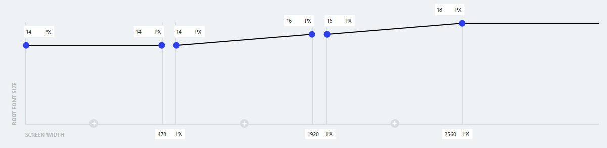
Let’s break it down:
- From 0px to 478px, 1rem will always be computed as 14px. There is no change from 0px to 478px.
- At 1920px, 1rem will be computed as 16px. Between 478px and 1920px, the computed value will linearly scale from 14px to 16px.
This means that halfway between the two breakpoints (specifically at 1199px) the font size will be computed as 15px as it’s a linear slope.
- At 2560px, 1rem will be computed as 18px. Same as before, the size will scale linearly from the previous breakpoint to this one.
- After 2560px, the font size remains computed as a fixed 18px.
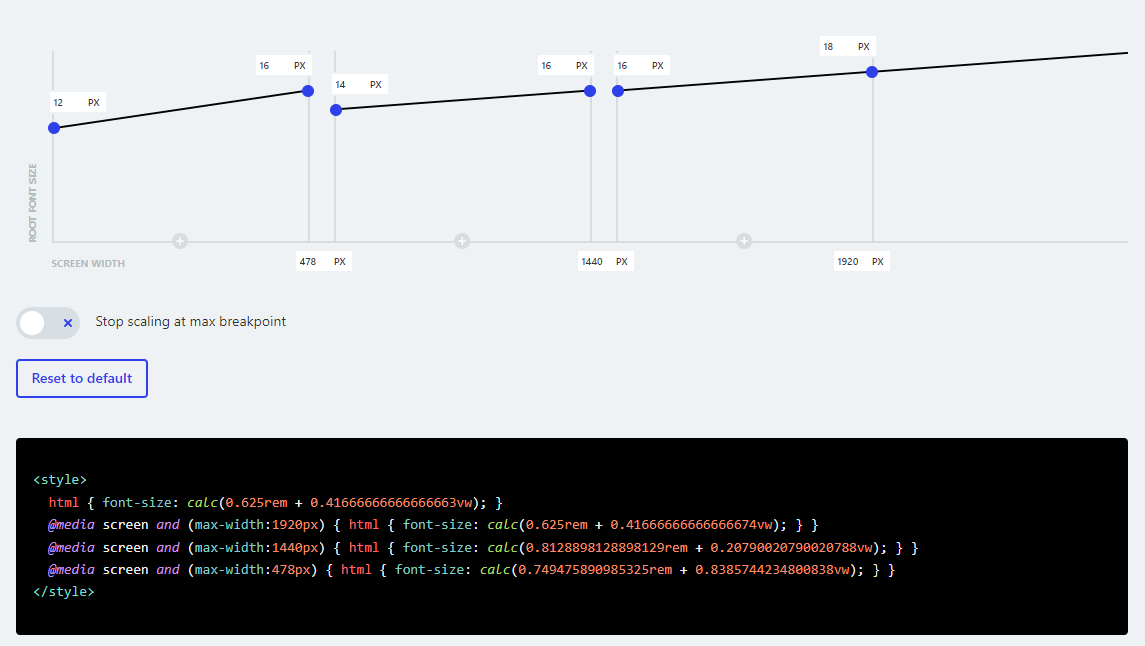
And the generated CSS looks like this:
<p class="article_caption">Generated CSS from the current example.</p>
Let’s break this snippet down. We’re going to get a little bit technical, but it’ll be worth it if you want to fully understand how the system works.
The easiest part first —
On the breakpoints where the sizes should not scale (below 478px and over 2560px) there isn’t any math at all. Just a plain and simple fixed rem value as the HTML font size.
Below 478px, the value corresponds to 0.875rem, because:
14px / 16px = 0.875rem
<p class="article_caption">Generated CSS for screen widths up to 478px.</p>
Over 2560px, the value corresponds to 1.125rem, because:
18px / 16px = 1.125rem
<p class="article_caption">Generated CSS for screen widths over 2560px.</p>
Now, let’s go to the fluid breakpoints with the long number values. As you’ve seen, the output is a sum of a rem value + a vw value. To achieve this, we set the following system of equations (based on the 478px to 1920px scaling):

Where we specify that we want to find a rem value (x) that summed to a vw value (y) equals the desired size at both breakpoints. The result of this system is:
x = 0.8335644937586685
y = 0.1386962552011096
Or translated to the CSS syntax:
<p class="article_caption">Generated CSS for screen widths between 478px and 1920px.</p>
You don’t have to understand how or why this math works. This is why we have the Fluid Generator tool. It’s best to understand the underlying concepts of how the tool works. Let’s continue reviewing the Client-First method.
Browser font size
✅ Accessibility win
Browser font settings size always works on a Client-First project
We’ve explained how vw units are not accessible, as they are always computed as a fixed portion of the current viewport width.
We also know that rem units scale up and down as the browser font size changes. Let’s see how the browser behaves when updating the default font size in this current example:
<p class="article_caption">Updating the browser font size in the current example from 16px to 32px.</p>
When the browser font size is set to 16px, the <span class="article_code"><h1></span> heading’s font size is computed as 38px, but when the font size is set to the double (32px), the heading is computed as 71.35px instead of 76px. The scaling values are not scaling in a linear path.
It is important to note that this is not an accessibility issue, as the user can still scale the size of the browser more than the required minimum of 200%.
Can it be an accessibility issue? Yes, in some rare cases. Anything can go from accessible to inaccessible if implemented incorrectly. Let’s define them so you know how to avoid them and be sure that your websites are fully compliant.
Let’s look at this 4-quadrant graph showing the ideal relationship between screen width ranges and font size:

As the graph shows, we want to avoid setups where the font size increments a lot in a short range of screen widths, like this one:
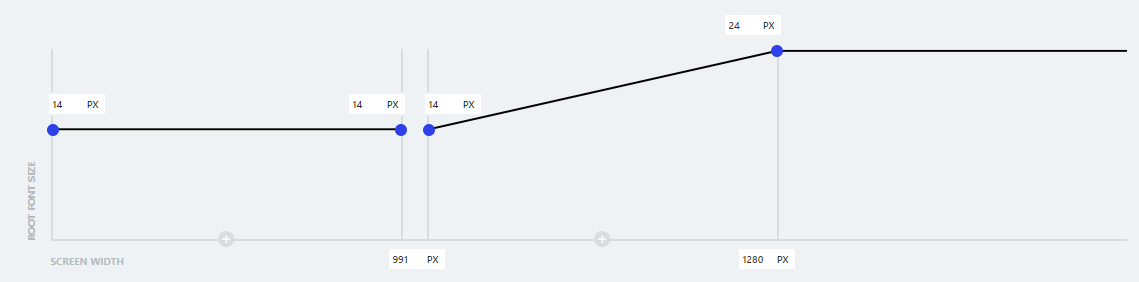
The change from 14px to 24px is dramatic scaling from 991px to 1280px.
As a rule of thumb, we recommend always trying to keep the output rem portion higher than 0.25rem to ensure that users can achieve a +200% scaling just by incrementing their font size.
We have added a visual alert inside the Fluid Generator tool to tell you if a scaling configuration has a potential accessibility issue. If scaling is too dramatic, it will be flagged for a potential bad UX.
Browser zoom
✅ Accessibility win
Zooming always works on a Client-First project
Our Client-First project always zooms with the browser. Note that the size scaling when zooming is not linear because of the vw portion of the CSS. However, it is very easy to make sure your website is always accessible.
As previously explained in the User zooming section, the max zooming that we should consider for all browsers is 300% (although most of them can zoom up to 500%). In this 300% max range, we need to ensure that all sizes can scale at least up to 200%.
Because the media queries change when zooming in, it’s very difficult to account for all possible situations, but an easy rule of thumb to follow is:
- For any breakpoint, try to at least have a rem portion higher than 0.25rem.
- If the “Stop scaling at max breakpoint” option is not selected (thus the font sizes will infinitely scale), make sure that the rem portion of the last breakpoint is at least 0.5rem.
For instance, the default values in the generator are completely accessible:
In the generated CSS output:
- All of the breakpoints have a rem portion higher than the recommended 0.25rem minimum value.
- The rem portion in the infinite scaling tram is 0.625rem, which is higher than the recommended 0.5rem minimum value.
But you don’t have to worry much about all these numbers! We’ve just released a new feature that warns you whenever you are using a potentially non-accessible scaling 💪
<p class="article_caption">The Fluid Generator tool will now warn you if you try to apply a potentially non-accessible scaling.</p>
Linear scaling can not be accessible
Many people like the idea of size scaling your website linearly. As you scale the website up and down, the sizes change in equal proportion. This is a default sizing strategy for Wizardry.
This section explains why linear scaling can never be accessible.
Why JavaScript can’t fix the accessibility issues of linear scaling
This article has proven how Wizardry is not accessible out of the box. To patch the issues that the system creates, it relies on JavaScript to alter how the browser behaves.
The article has also proven how the proposed JavaScript solutions currently offered by Wizardry are not 100% accessible. In each option, either the zooming is disabled or the browser font size settings are not being respected.
❗ Linear scaling (Wizardry’s approach) cannot become accessible with JavaScript.
Let’s remember how Wizardry’s Option 1 tries to solve a11y issues:
- When the page loads, the script converts the <span class="article_code"><body></span> font size to a rem value based on the current window width.
- If the user resizes the screen, it recalculates the correspondent font size in rem and applies it again to the <span class="article_code"><body></span>.
As explained before, this solution doesn’t allow users to zoom in because the device pixel ratio is not taken into consideration.
But what if it did?
The JavaScript code would need to detect the current zoom status and scale the generated rem value proportionally.
But there’s a problem — there’s currently no reliable way to detect the user’s zoom using JS.
Detecting the user’s zoom with JavaScript
We’re about to get technical on why this won’t work.
When running a Google Search, the first answer that will pop up everywhere is to use window.devicePixelRatio to deduce the current zooming value with the following assumptions:
- When there isn’t any zoom applied, window.devicePixelRatio equals 1.
- When the user zooms in, window.devicePixelRatio scales up to match the new proportions.
But in fact, none of the previous assumptions are always true.
window.devicePixelRatio defaults to the device’s pixel ratio. This value is usually 1 except for denser screens like Apple’s Retina Display. For those cases window.devicePixelRatio equals the real density of the screen, usually being 2.
This means that we can’t assume that window.devicePixelRatio = 1 is because the user hasn’t zoomed in. Maybe the user is using a Retina Display and is zooming at 50%.
Nor we can’t assume that window.devicePixelRatio = 2 is because the user has zoomed up to 200%. Maybe the user is using a Retina Display which has this pixel ratio by default.
ℹ️ Even if we could make accurate assumptions, window.devicePixelRatio doesn’t scale up in Safari when zooming, so this property is completely unusable.
Many other solutions are suggested around the web, all having downsides:
- Using the Screen API is only reliable if the user’s browser is taking up the entire screen, as the API only returns the entire screen size, not the browser’s.
- Using the VisualViewport API only works for detecting if a user is doing a Pinch-To-Zoom action, which is completely different than regular zooming.
- Using window.outerWidth / window.innerWidth doesn’t work in Firefox, as the outerWidth is also resized when zooming in.
- Any other approach comparing element widths will fail across different browsers, as scaling is computed differently.
⚠️ In conclusion, there is currently no reliable way of knowing the current zoom using JavaScript, which is 100% necessary to calculate a valid rem output that respects both the browser font size and the user’s zoom.
This means there is no JavaScript solution that can make Wizardry accessible.
Add-on to Client-First’s Fluid Generator
Finsweet is dedicated to best accessibility practices. This article is centered around the concept of web accessibility.
To continue to prove our dedication to the topic, we’ve given you a Fluid Generator add-on that alerts you when your size slope may produce a non-accessible project.
When your slope becomes too large between two breakpoints, the tool alerts you with a red caution icon. This means the size slope in your configuration is likely to break accessibility practices.
It’s important to us that our users have a tool that can be reliably used to follow best accessibility practices.
Conclusion
There is a lot of powerful education in this article. Take the time to understand the concepts to take your web experience to the next level.
We hope this comparison content gives you the information you need to pick your Webflow development technique.
We have an article that explains why we prepared this and other comparison case studies. You can read it here.
A recap of your options:
- Wizardry Option 1
- ~Uses JS to set the body to the correct REM font size on each screen width.
- ~Browser font settings: ✅ Success
- ~Browser zoom: ❌ Fail
- Wizardry Option 2
- ~Changes the body font size to a fixed REM unit when the user zooms.
- ~Browser font settings: ❌ Fail
- ~Browser zoom: ✅ Success
- Wizardry Option 3
- ~Uses on-screen controls to adjust the body font size.
- ~Browser font settings: ❌ Fail
- ~Browser zoom: ❌ Fail
- Client-First Option 1
- ~With fluid responsiveness
- ~Browser font settings: ✅ Success
- ~Browser zoom: ✅ Success
- Client-First Option 2
- ~Without fluid responsiveness
- ~Browser font settings: ✅ Success
- ~Browser zoom: ✅ Success
Watch live stream of this article
